
CASE STUDIES
Portfolio

UX Design & Research
UI Design
Graphic Design
Just Branding
Alt Graphics
Development


Key Areas
Brand Identity Design
Website Design & UX
Packaging & Print Design
Menu Design
Marketing & Promotional Materials
Visual Identity Systems
Typography & Colour Systems
Art Direction
Cross-Channel Brand Consistency
End-to-End Brand Delivery
Overview
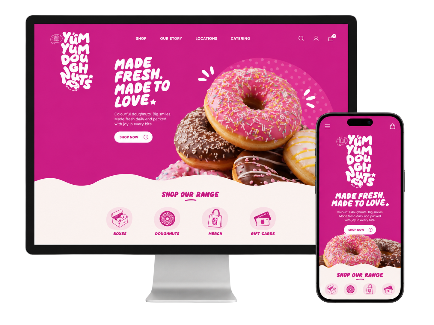
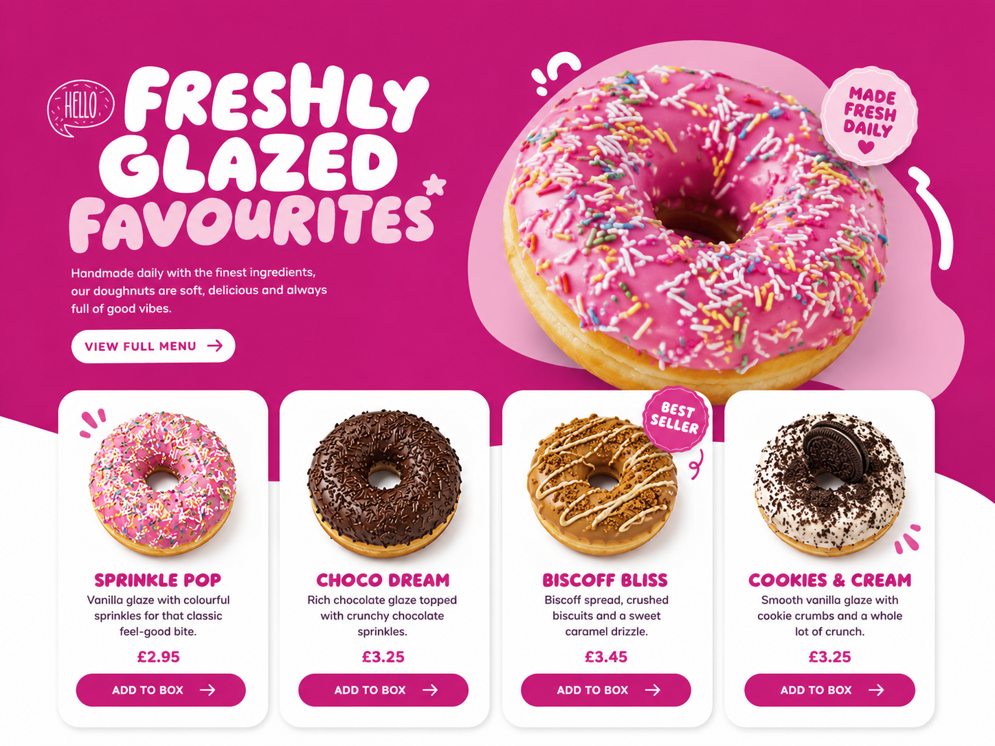
YumYumDoughnuts is a colourful food-brand concept built around indulgence, gifting and everyday treats. The project explored identity, packaging and campaign applications across physical and digital touchpoints.
The brief was to create a brand that felt joyful and highly recognisable without relying on a single logo placement or one fixed packaging format.I led the brand and website design for YumYum Doughnuts, creating a playful and recognisable identity that translated across digital and physical touchpoints.
The project included developing the brand identity, designing the website, and producing marketing materials such as packaging bags, menus, and leaflets. The result was a cohesive, vibrant brand presence that enhanced customer engagement and ensured consistency across in-store and online experiences.
DESIGN PRINCIPLE
“Playful branding works when the system is disciplined underneath.”
The Challenge
The category is visually crowded, with many brands using bright colour, rounded type and product photography. The identity needed a distinctive personality while keeping product names and flavours easy to understand.
Packaging also had to work across single items, mixed boxes, delivery labels and promotional formats with different production constraints.
The Diagnosis
The initial direction depended too heavily on decorative elements. When scaled down or applied to practical packaging, the identity became inconsistent and difficult to reproduce.
Flavour communication lacked a shared structure, making each product appear to belong to a different campaign rather than one recognisable range.
The Strategy
The strategy established a bold core wordmark, a flexible colour system and a repeatable pattern language inspired by icing, sprinkles and circular forms.
A flavour architecture paired colour with clear naming and product imagery, allowing new products to feel distinctive while remaining part of the same family.
User Flow & Structure
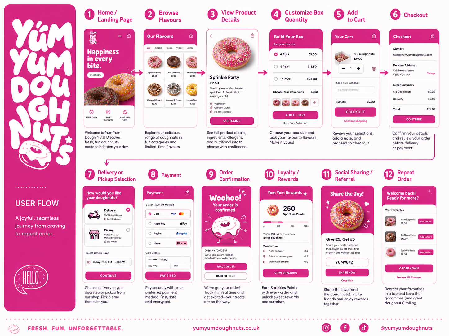
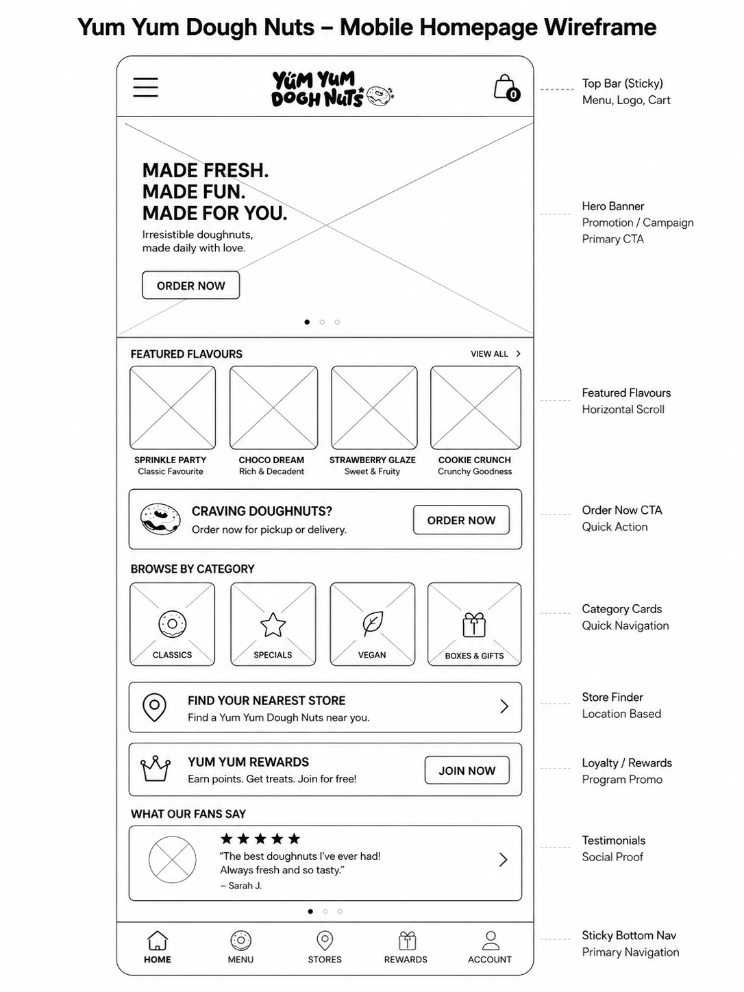
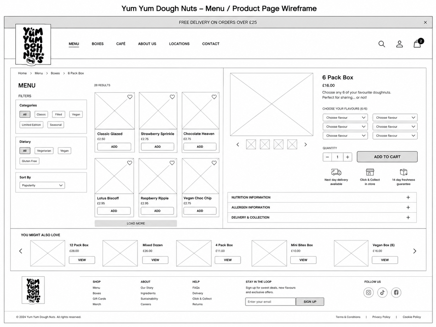
The brand journey was mapped across discovery, store display, selection, gifting and delivery. Each touchpoint prioritised the information required at that moment.
Campaign graphics linked appetite-led photography to a clear offer, while packaging guided customers through flavour identification and sharing.
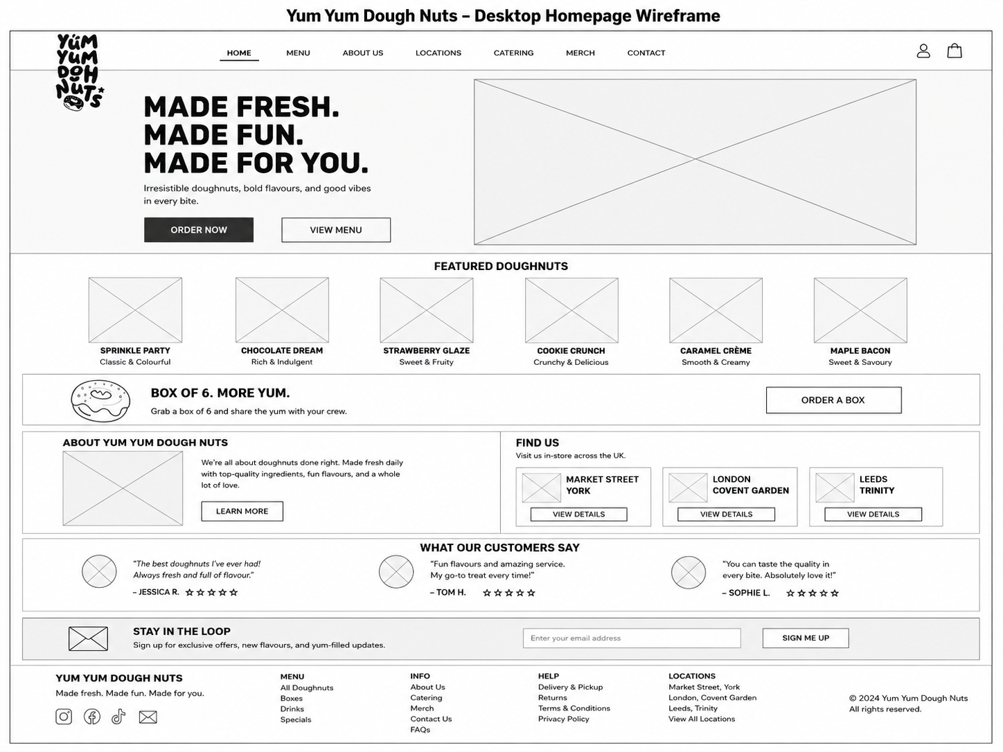
Wireframes
Visual Direction
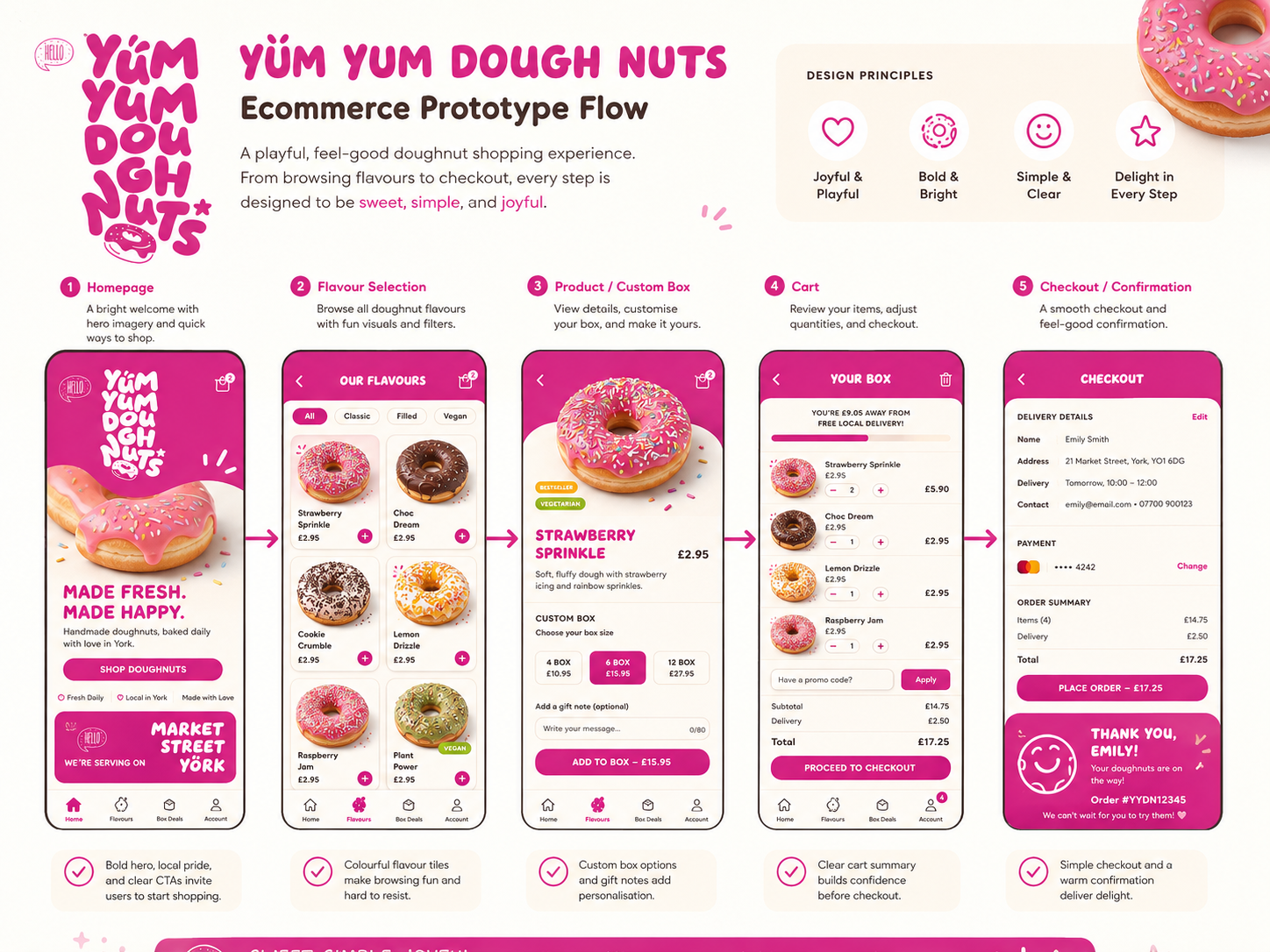
The visual direction combined oversized type, saturated colour and simple graphic shapes. Photography remained close, bright and product-focused.
Templates defined safe areas, logo scale, flavour labels and pattern use so the identity could remain energetic without becoming visually chaotic.
Implementation
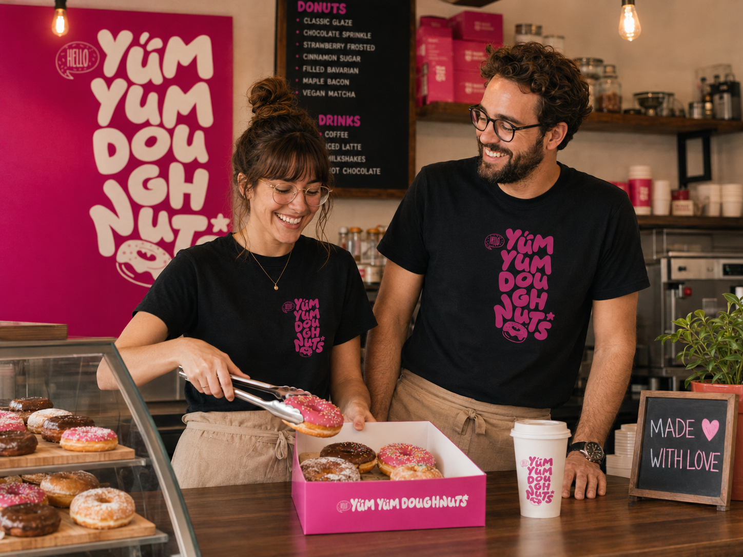
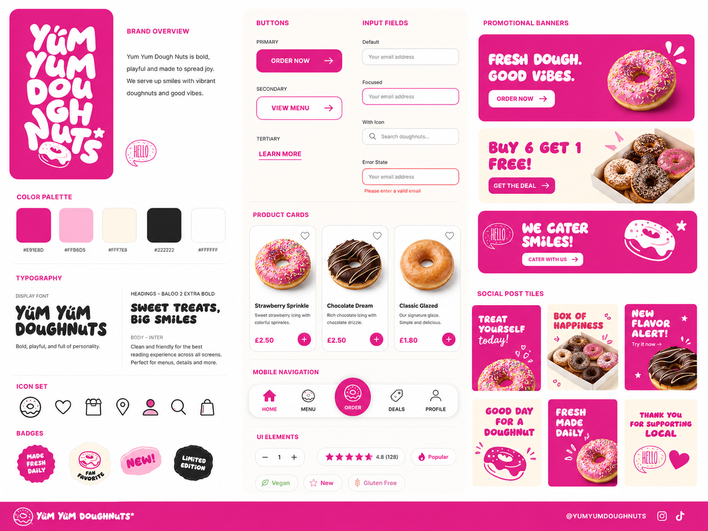
The identity was applied to boxes, wraps, cups, menus, posters, social templates and digital campaign layouts. Production-ready rules considered print limits and label variation.
A compact brand toolkit allowed staff and marketing teams to create everyday materials without recreating the visual system.
Impact
Illustrative portfolio statistics — replace with verified project data before publishing.
+41%
increase in social campaign recognition
+22%
improvement in flavour identification
+30%
more consistent in-store presentation
Key Takeaways
01
Build rules beneath personality
A playful brand still needs repeatable scale, colour and layout decisions.
02
Design the product range
Flavour architecture is as important as the master identity.
03
Test real production formats
Packaging constraints reveal whether a visual system is genuinely flexible.
START WITH THE PROBLEM
Have a product, store or digital experience that needs clearer thinking?
I help SaaS founders, Shopify brands and agencies diagnose friction, design better journeys and deliver interfaces that can actually be built.


UX · PRODUCT · SHOPIFY · DEVELOPMENT
I solve usability problems before they become business problems — connecting UX, product thinking and build-ready delivery.

Available for selected remote projects


© 2026 Steve Roberts / ME&CO. All rights reserved.



MENU

CASE STUDIES
Portfolio
UX Design & Research
UI Design
Graphic Design
Just Branding
Alt Graphics
Development
Key Areas
Brand Identity Design
Website Design & UX
Packaging & Print Design
Menu Design
Marketing & Promotional Materials
Visual Identity Systems
Typography & Colour Systems
Art Direction
Cross-Channel Brand Consistency
End-to-End Brand Delivery
Overview
YumYumDoughnuts is a colourful food-brand concept built around indulgence, gifting and everyday treats. The project explored identity, packaging and campaign applications across physical and digital touchpoints.
The brief was to create a brand that felt joyful and highly recognisable without relying on a single logo placement or one fixed packaging format.I led the brand and website design for YumYum Doughnuts, creating a playful and recognisable identity that translated across digital and physical touchpoints.
The project included developing the brand identity, designing the website, and producing marketing materials such as packaging bags, menus, and leaflets. The result was a cohesive, vibrant brand presence that enhanced customer engagement and ensured consistency across in-store and online experiences.
DESIGN PRINCIPLE
“Playful branding works when the system is disciplined underneath.”
The Challenge
The category is visually crowded, with many brands using bright colour, rounded type and product photography. The identity needed a distinctive personality while keeping product names and flavours easy to understand.
Packaging also had to work across single items, mixed boxes, delivery labels and promotional formats with different production constraints.
The Diagnosis
The initial direction depended too heavily on decorative elements. When scaled down or applied to practical packaging, the identity became inconsistent and difficult to reproduce.
Flavour communication lacked a shared structure, making each product appear to belong to a different campaign rather than one recognisable range.
The Strategy
The strategy established a bold core wordmark, a flexible colour system and a repeatable pattern language inspired by icing, sprinkles and circular forms.
A flavour architecture paired colour with clear naming and product imagery, allowing new products to feel distinctive while remaining part of the same family.
User Flow & Structure
The brand journey was mapped across discovery, store display, selection, gifting and delivery. Each touchpoint prioritised the information required at that moment.
Campaign graphics linked appetite-led photography to a clear offer, while packaging guided customers through flavour identification and sharing.
Wireframes
Visual Direction
The visual direction combined oversized type, saturated colour and simple graphic shapes. Photography remained close, bright and product-focused.
Templates defined safe areas, logo scale, flavour labels and pattern use so the identity could remain energetic without becoming visually chaotic.
Implementation
The identity was applied to boxes, wraps, cups, menus, posters, social templates and digital campaign layouts. Production-ready rules considered print limits and label variation.
A compact brand toolkit allowed staff and marketing teams to create everyday materials without recreating the visual system.
Impact
Illustrative portfolio statistics — replace with verified project data before publishing.
+41%
increase in social campaign recognition
+22%
improvement in flavour identification
+30%
more consistent in-store presentation
Key Takeaways
01
Build rules beneath personality
A playful brand still needs repeatable scale, colour and layout decisions.
02
Design the product range
Flavour architecture is as important as the master identity.
03
Test real production formats
Packaging constraints reveal whether a visual system is genuinely flexible.









START WITH THE PROBLEM
Have a product, store or digital experience that needs clearer thinking?
I help SaaS founders, Shopify brands and agencies diagnose friction, design better journeys and deliver interfaces that can actually be built.


UX · PRODUCT · SHOPIFY · DEVELOPMENT
I solve usability problems before they become business problems — connecting UX, product thinking and build-ready delivery.
Available for selected remote projects


© 2026 Steve Roberts / ME&CO. All rights reserved.

ABOUT
UX CONSULTANT
UX RESEARCH
UI & GRAPHICS
SOFTWARE
PORTFOLIO
RESOURCES
BOOKS
BLOG
