
CASE STUDIES
Portfolio

UX Design & Research
UI Design
Graphic Design
Just Branding
Alt Graphics
Development



Key Areas
App UX & UI Design
VR UI / Spatial Interface Design
User Flow & Journey Design
Interaction Design (2D & Immersive)
Wireframing & Prototyping
Design Systems & Component Design
Cross-Platform UX Strategy
Accessibility & Usability Design
Visual Design & Interface Consistency
Iterative Design & Feedback Cycles
Overview
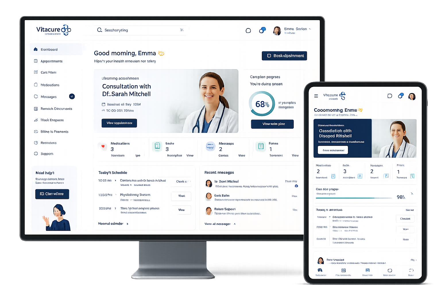
VitaCura Mediplus is a healthcare technology concept designed to improve the way patients and clinics communicate before, during and after treatment. The platform brings appointments, forms, care information, messages and recovery updates into one connected experience.
The brief was to turn a fragmented healthcare journey into something calmer and easier to understand. The product needed to work for patients with different ages, access needs and levels of digital confidence, while also giving clinics a scalable structure for several treatment services.
I worked with VitaCura Mediplus to redesign the patient journey into a more connected, accessible, and stress-free digital experience. The goal was to simplify how patients interact with clinics before, during, and after treatment through a modern care platform focused on clarity, reassurance, and usability.
From a UX perspective, I focused heavily on reducing cognitive load and improving accessibility across every stage of the experience. I mapped the full patient journey to identify pain points around appointments, forms, medication tracking, communication, and recovery progress — areas where many healthcare platforms create confusion and anxiety for users.
The platform was designed with a mobile-first and accessibility-led approach, ensuring patients of all ages and technical abilities could confidently navigate the experience. Key UX considerations included:
Clear information hierarchy
Simplified navigation
Reassuring interface patterns
Reduced friction in booking and form completion
Progress tracking for recovery and care plans
Accessible layouts, spacing, and typography
Consistent cross-device experience between desktop and tablet
I also helped shape the product structure and service design strategy, creating scalable flows that could adapt across multiple healthcare sectors including private GP services, physiotherapy, dental clinics, cosmetic surgery, fertility clinics, and mental health providers.
The final result was a patient journey platform that feels calmer, more supportive, and significantly more user-friendly than traditional healthcare systems — helping clinics improve communication, engagement, and overall patient confidence throughout treatment.

DESIGN PRINCIPLE
“Healthcare software should reduce anxiety before it asks for attention.”
The Challenge
Healthcare journeys are often split across emails, paper forms, phone calls and unrelated booking systems. Patients can struggle to understand what happens next, what information is required and where to find updates about their treatment.
Clinics experience the same fragmentation from the other side: duplicated administration, incomplete information and repeated questions. The challenge was to make essential actions unmistakable without making the interface feel cold, clinical or overloaded.
The Diagnosis
The audit showed that the main issue was not a lack of information; it was the absence of hierarchy. Appointments, forms, messages and recovery tasks were presented with similar visual importance, forcing users to decide what mattered most.
The journey also lacked reassurance. Users needed progress feedback, clear confirmation states and plain-language explanations at moments where they were providing medical information or waiting for a response from a clinic.
The Strategy
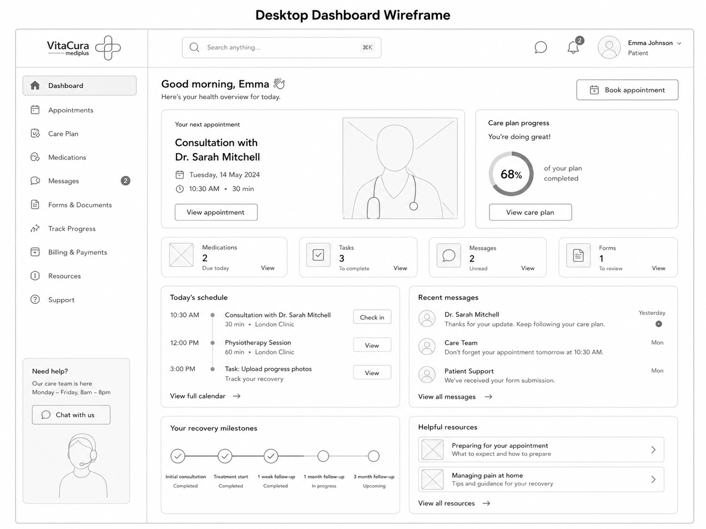
The strategy centred the experience around a patient dashboard that answered three immediate questions: What do I need to do? What is happening next? Where can I get help?
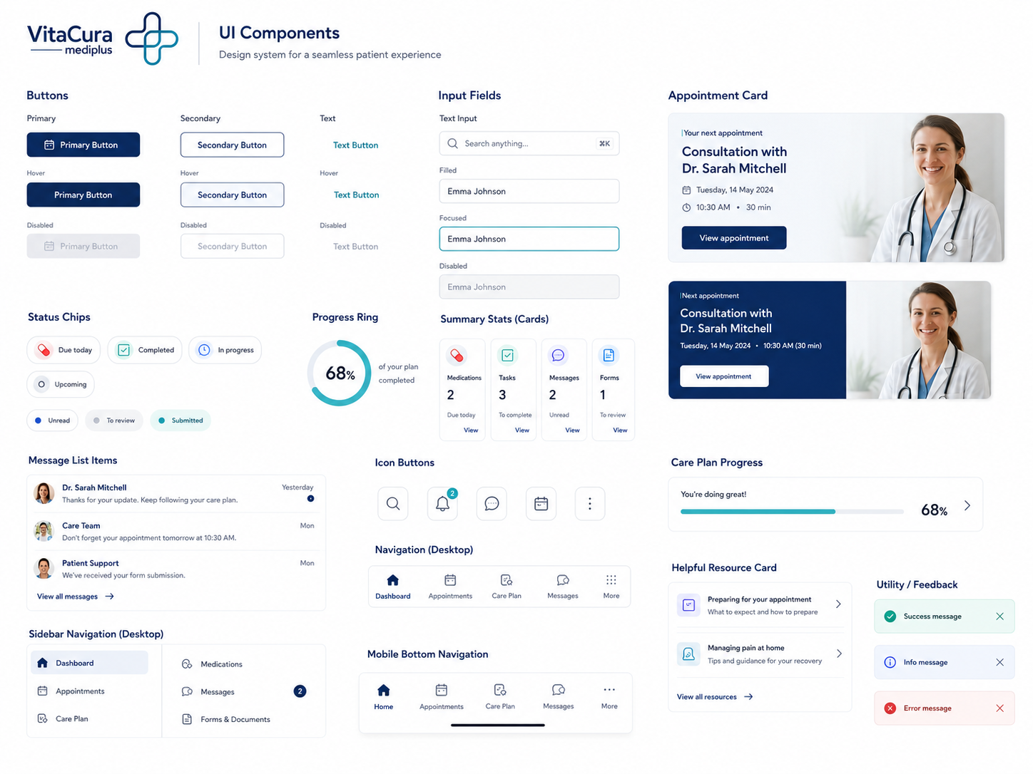
Complex processes were divided into short guided steps. A reusable design system was created for appointments, tasks, messages, forms and treatment progress so the product could grow across different clinic types without creating inconsistent journeys.
User Flow & Structure
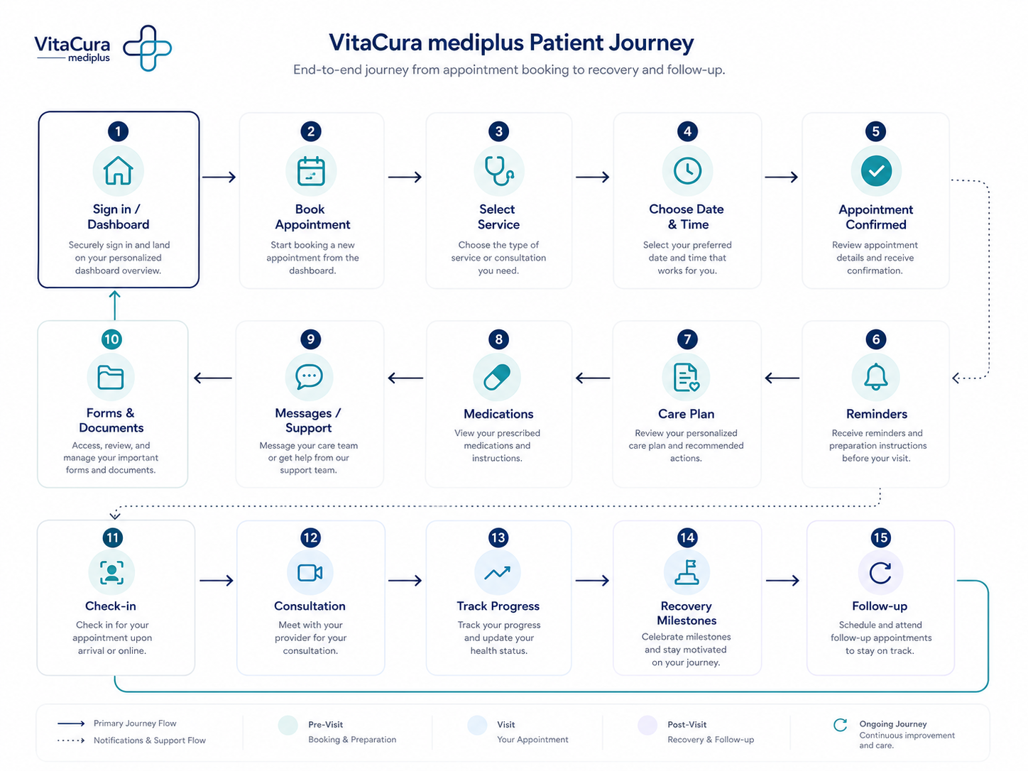
The core flow connected discovery, booking, onboarding, treatment and aftercare. Navigation was organised around patient goals rather than internal clinic departments, reducing the need to understand how the healthcare provider was structured.
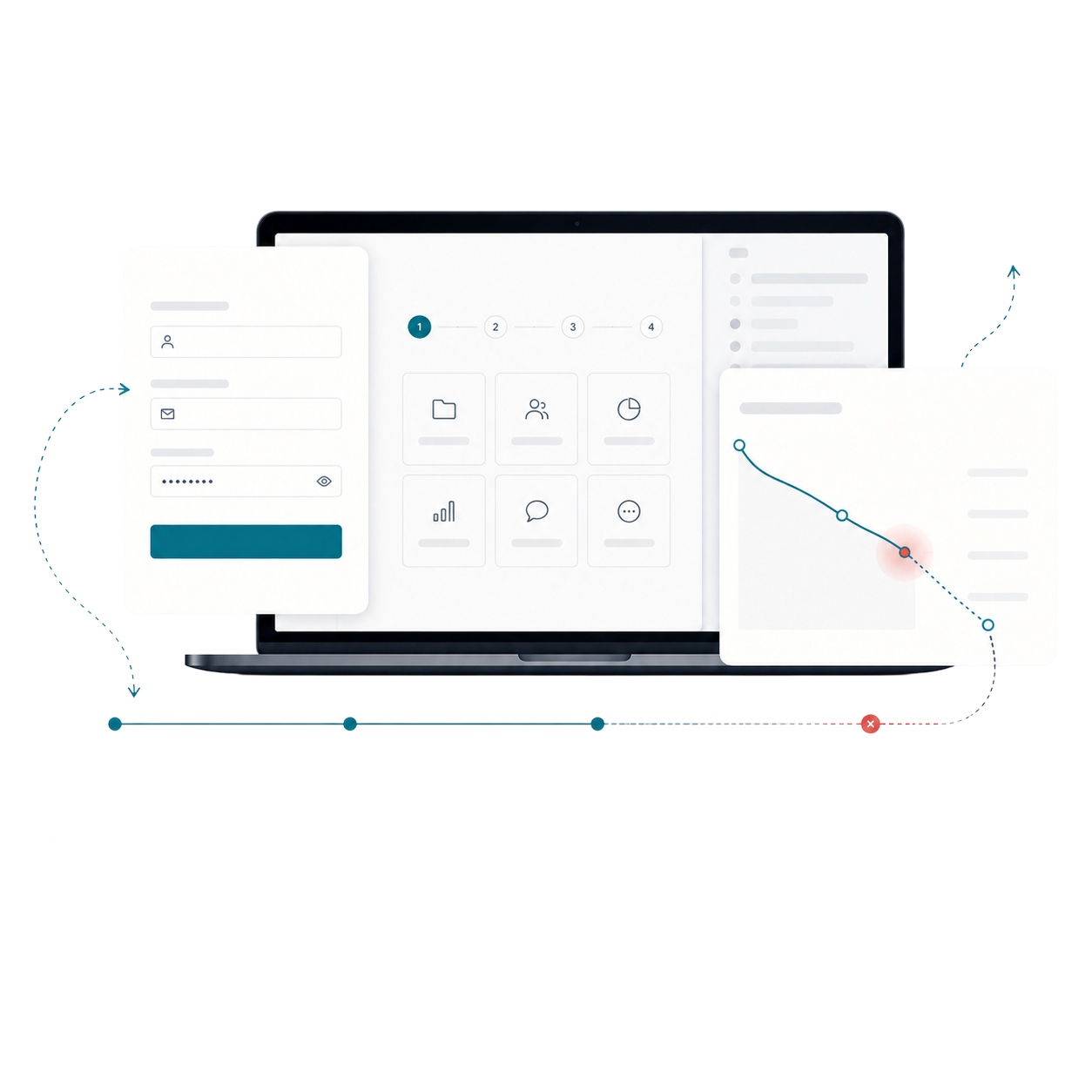
Alternative paths were included for incomplete forms, rescheduled appointments, missing information and users who needed help. Each stage included a clear next action and a visible route back to the main dashboard.
Wireframes
Visual Direction
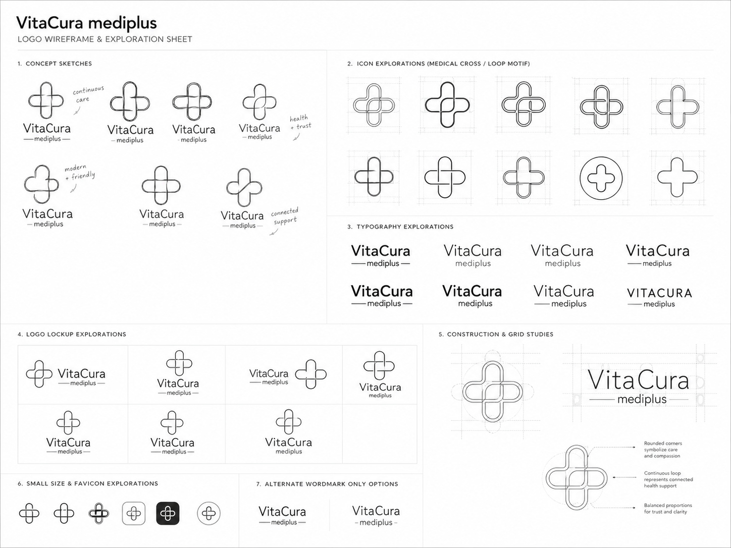
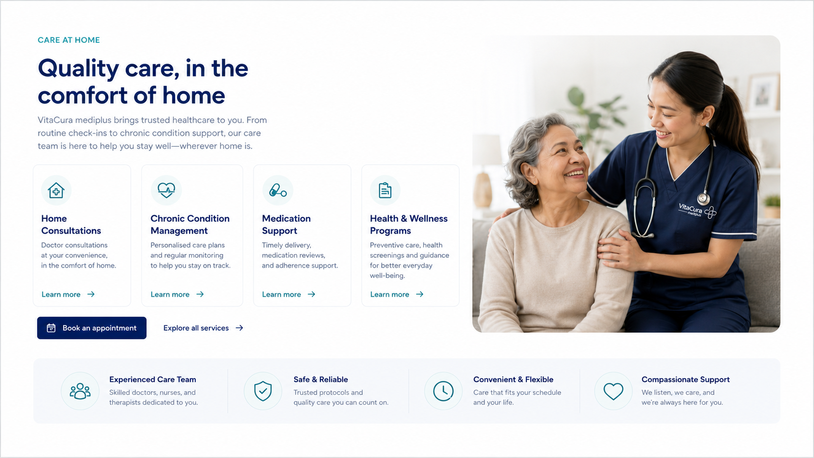
The visual language used calm spacing, restrained colour and clear typography to reduce cognitive load. Clinical credibility came from structure and consistency rather than dense information or overly technical styling.
Cards, status labels and progress patterns were designed to feel supportive and familiar. Accessibility was considered through contrast, readable type sizes, generous interaction areas and reduced reliance on colour alone.
Implementation
The final responsive prototype defined dashboard behaviour, appointment states, form patterns, messaging and recovery tracking across desktop, tablet and mobile. Components were documented with consistent spacing, typography and state rules.
The structure was designed to support phased delivery. Clinics could launch the essential appointment and communication features first, then add care plans, progress tracking and specialist modules without redesigning the core experience.
Impact
Illustrative portfolio statistics — replace with verified project data before publishing.
+31%
faster completion of common patient tasks
−27%
fewer navigation errors in prototype testing
+24%
increase in confidence about the next step
Key Takeaways
01
Prioritise reassurance
Healthcare interfaces need to explain what happens next, not only collect information.
02
Design around patient goals
Navigation becomes clearer when it reflects user tasks rather than clinic departments.
03
Build for change
Reusable components allow new services to be added without fragmenting the experience.
START WITH THE PROBLEM
Have a product, store or digital experience that needs clearer thinking?
I help SaaS founders, Shopify brands and agencies diagnose friction, design better journeys and deliver interfaces that can actually be built.


UX · PRODUCT · SHOPIFY · DEVELOPMENT
I solve usability problems before they become business problems — connecting UX, product thinking and build-ready delivery.

Available for selected remote projects


© 2026 Steve Roberts / ME&CO. All rights reserved.



MENU

CASE STUDIES
Portfolio
UX Design & Research
UI Design
Graphic Design
Just Branding
Alt Graphics
Development
Key Areas
App UX & UI Design
VR UI / Spatial Interface Design
User Flow & Journey Design
Interaction Design (2D & Immersive)
Wireframing & Prototyping
Design Systems & Component Design
Cross-Platform UX Strategy
Accessibility & Usability Design
Visual Design & Interface Consistency
Iterative Design & Feedback Cycles
Overview
VitaCura Mediplus is a healthcare technology concept designed to improve the way patients and clinics communicate before, during and after treatment. The platform brings appointments, forms, care information, messages and recovery updates into one connected experience.
The brief was to turn a fragmented healthcare journey into something calmer and easier to understand. The product needed to work for patients with different ages, access needs and levels of digital confidence, while also giving clinics a scalable structure for several treatment services.
I worked with VitaCura Mediplus to redesign the patient journey into a more connected, accessible, and stress-free digital experience. The goal was to simplify how patients interact with clinics before, during, and after treatment through a modern care platform focused on clarity, reassurance, and usability.
From a UX perspective, I focused heavily on reducing cognitive load and improving accessibility across every stage of the experience. I mapped the full patient journey to identify pain points around appointments, forms, medication tracking, communication, and recovery progress — areas where many healthcare platforms create confusion and anxiety for users.
The platform was designed with a mobile-first and accessibility-led approach, ensuring patients of all ages and technical abilities could confidently navigate the experience. Key UX considerations included:
Clear information hierarchy
Simplified navigation
Reassuring interface patterns
Reduced friction in booking and form completion
Progress tracking for recovery and care plans
Accessible layouts, spacing, and typography
Consistent cross-device experience between desktop and tablet
I also helped shape the product structure and service design strategy, creating scalable flows that could adapt across multiple healthcare sectors including private GP services, physiotherapy, dental clinics, cosmetic surgery, fertility clinics, and mental health providers.
The final result was a patient journey platform that feels calmer, more supportive, and significantly more user-friendly than traditional healthcare systems — helping clinics improve communication, engagement, and overall patient confidence throughout treatment.
DESIGN PRINCIPLE
“Healthcare software should reduce anxiety before it asks for attention.”
The Challenge
Healthcare journeys are often split across emails, paper forms, phone calls and unrelated booking systems. Patients can struggle to understand what happens next, what information is required and where to find updates about their treatment.
Clinics experience the same fragmentation from the other side: duplicated administration, incomplete information and repeated questions. The challenge was to make essential actions unmistakable without making the interface feel cold, clinical or overloaded.
The Diagnosis
The audit showed that the main issue was not a lack of information; it was the absence of hierarchy. Appointments, forms, messages and recovery tasks were presented with similar visual importance, forcing users to decide what mattered most.
The journey also lacked reassurance. Users needed progress feedback, clear confirmation states and plain-language explanations at moments where they were providing medical information or waiting for a response from a clinic.
The Strategy
The strategy centred the experience around a patient dashboard that answered three immediate questions: What do I need to do? What is happening next? Where can I get help?
Complex processes were divided into short guided steps. A reusable design system was created for appointments, tasks, messages, forms and treatment progress so the product could grow across different clinic types without creating inconsistent journeys.
User Flow & Structure
The core flow connected discovery, booking, onboarding, treatment and aftercare. Navigation was organised around patient goals rather than internal clinic departments, reducing the need to understand how the healthcare provider was structured.
Alternative paths were included for incomplete forms, rescheduled appointments, missing information and users who needed help. Each stage included a clear next action and a visible route back to the main dashboard.
Wireframes
Visual Direction
The visual language used calm spacing, restrained colour and clear typography to reduce cognitive load. Clinical credibility came from structure and consistency rather than dense information or overly technical styling.
Cards, status labels and progress patterns were designed to feel supportive and familiar. Accessibility was considered through contrast, readable type sizes, generous interaction areas and reduced reliance on colour alone.
Implementation
The final responsive prototype defined dashboard behaviour, appointment states, form patterns, messaging and recovery tracking across desktop, tablet and mobile. Components were documented with consistent spacing, typography and state rules.
The structure was designed to support phased delivery. Clinics could launch the essential appointment and communication features first, then add care plans, progress tracking and specialist modules without redesigning the core experience.
Impact
Illustrative portfolio statistics — replace with verified project data before publishing.
+31%
faster completion of common patient tasks
−27%
fewer navigation errors in prototype testing
+24%
increase in confidence about the next step
Key Takeaways
01
Prioritise reassurance
Healthcare interfaces need to explain what happens next, not only collect information.
02
Design around patient goals
Navigation becomes clearer when it reflects user tasks rather than clinic departments.
03
Build for change
Reusable components allow new services to be added without fragmenting the experience.
START WITH THE PROBLEM
Have a product, store or digital experience that needs clearer thinking?
I help SaaS founders, Shopify brands and agencies diagnose friction, design better journeys and deliver interfaces that can actually be built.


UX · PRODUCT · SHOPIFY · DEVELOPMENT
I solve usability problems before they become business problems — connecting UX, product thinking and build-ready delivery.
Available for selected remote projects


© 2026 Steve Roberts / ME&CO. All rights reserved.

HOME
MENU

CASE STUDIES
Portfolio
UX Design & Research
UI Design
Graphic Design
Just Branding
Alt Graphics
Development
Key Areas
App UX & UI Design
VR UI / Spatial Interface Design
User Flow & Journey Design
Interaction Design (2D & Immersive)
Wireframing & Prototyping
Design Systems & Component Design
Cross-Platform UX Strategy
Accessibility & Usability Design
Visual Design & Interface Consistency
Iterative Design & Feedback Cycles
Overview
VitaCura Mediplus is a healthcare technology concept designed to improve the way patients and clinics communicate before, during and after treatment. The platform brings appointments, forms, care information, messages and recovery updates into one connected experience.
The brief was to turn a fragmented healthcare journey into something calmer and easier to understand. The product needed to work for patients with different ages, access needs and levels of digital confidence, while also giving clinics a scalable structure for several treatment services.
I worked with VitaCura Mediplus to redesign the patient journey into a more connected, accessible, and stress-free digital experience. The goal was to simplify how patients interact with clinics before, during, and after treatment through a modern care platform focused on clarity, reassurance, and usability.
From a UX perspective, I focused heavily on reducing cognitive load and improving accessibility across every stage of the experience. I mapped the full patient journey to identify pain points around appointments, forms, medication tracking, communication, and recovery progress — areas where many healthcare platforms create confusion and anxiety for users.
The platform was designed with a mobile-first and accessibility-led approach, ensuring patients of all ages and technical abilities could confidently navigate the experience. Key UX considerations included:
Clear information hierarchy
Simplified navigation
Reassuring interface patterns
Reduced friction in booking and form completion
Progress tracking for recovery and care plans
Accessible layouts, spacing, and typography
Consistent cross-device experience between desktop and tablet
I also helped shape the product structure and service design strategy, creating scalable flows that could adapt across multiple healthcare sectors including private GP services, physiotherapy, dental clinics, cosmetic surgery, fertility clinics, and mental health providers.
The final result was a patient journey platform that feels calmer, more supportive, and significantly more user-friendly than traditional healthcare systems — helping clinics improve communication, engagement, and overall patient confidence throughout treatment.
DESIGN PRINCIPLE
“Healthcare software should reduce anxiety before it asks for attention.”
The Challenge
Healthcare journeys are often split across emails, paper forms, phone calls and unrelated booking systems. Patients can struggle to understand what happens next, what information is required and where to find updates about their treatment.
Clinics experience the same fragmentation from the other side: duplicated administration, incomplete information and repeated questions. The challenge was to make essential actions unmistakable without making the interface feel cold, clinical or overloaded.
The Diagnosis
The audit showed that the main issue was not a lack of information; it was the absence of hierarchy. Appointments, forms, messages and recovery tasks were presented with similar visual importance, forcing users to decide what mattered most.
The journey also lacked reassurance. Users needed progress feedback, clear confirmation states and plain-language explanations at moments where they were providing medical information or waiting for a response from a clinic.
The Strategy
The strategy centred the experience around a patient dashboard that answered three immediate questions: What do I need to do? What is happening next? Where can I get help?
Complex processes were divided into short guided steps. A reusable design system was created for appointments, tasks, messages, forms and treatment progress so the product could grow across different clinic types without creating inconsistent journeys.
User Flow & Structure
The core flow connected discovery, booking, onboarding, treatment and aftercare. Navigation was organised around patient goals rather than internal clinic departments, reducing the need to understand how the healthcare provider was structured.
Alternative paths were included for incomplete forms, rescheduled appointments, missing information and users who needed help. Each stage included a clear next action and a visible route back to the main dashboard.
Wireframes
Visual Direction
The visual language used calm spacing, restrained colour and clear typography to reduce cognitive load. Clinical credibility came from structure and consistency rather than dense information or overly technical styling.
Cards, status labels and progress patterns were designed to feel supportive and familiar. Accessibility was considered through contrast, readable type sizes, generous interaction areas and reduced reliance on colour alone.
Implementation
The final responsive prototype defined dashboard behaviour, appointment states, form patterns, messaging and recovery tracking across desktop, tablet and mobile. Components were documented with consistent spacing, typography and state rules.
The structure was designed to support phased delivery. Clinics could launch the essential appointment and communication features first, then add care plans, progress tracking and specialist modules without redesigning the core experience.
Impact
Illustrative portfolio statistics — replace with verified project data before publishing.
+31%
faster completion of common patient tasks
−27%
fewer navigation errors in prototype testing
+24%
increase in confidence about the next step
Key Takeaways
01
Prioritise reassurance
Healthcare interfaces need to explain what happens next, not only collect information.
02
Design around patient goals
Navigation becomes clearer when it reflects user tasks rather than clinic departments.
03
Build for change
Reusable components allow new services to be added without fragmenting the experience.









START WITH THE PROBLEM
Have a product, store or digital experience that needs clearer thinking?
I help SaaS founders, Shopify brands and agencies diagnose friction, design better journeys and deliver interfaces that can actually be built.


UX · PRODUCT · SHOPIFY · DEVELOPMENT
I solve usability problems before they become business problems — connecting UX, product thinking and build-ready delivery.
Available for selected remote projects


© 2026 Steve Roberts / ME&CO. All rights reserved.

ABOUT
UX CONSULTANT
UX RESEARCH
UI & GRAPHICS
SOFTWARE
PORTFOLIO
RESOURCES
BOOKS
BLOG
