
CASE STUDIES
Portfolio

UX Design & Research
UI Design
Graphic Design
Just Branding
Alt Graphics
Development



Key Areas
UX Audit & Usability AnalysisUser Journey MappingCompetitor AnalysisUser Research (Interviews & Surveys)Conversion-Focused UX DesignInformation ArchitectureForm Design & OptimisationTrust & Credibility DesignUI Design & Visual ClarityAccessibility (WCAG Compliance)Responsive & Mobile-First DesignStakeholder & Business Alignment
Overview
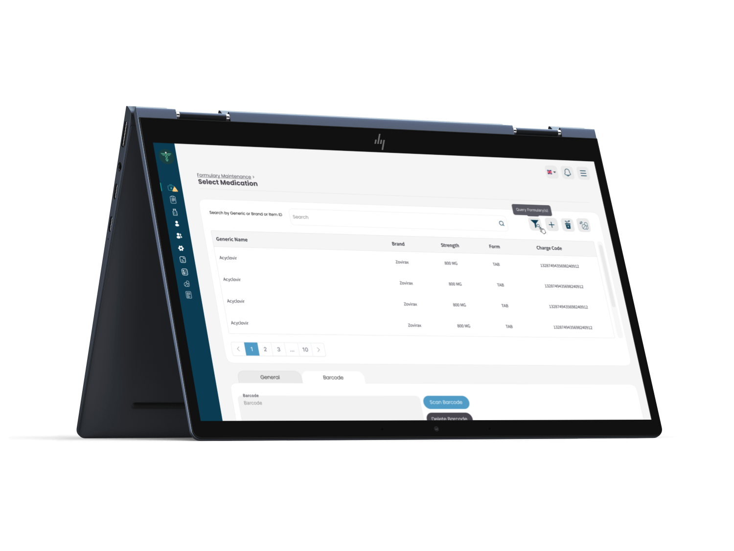
TouchPoint Medical develops technology and equipment for healthcare environments. This project explored a management platform used by operational teams to coordinate records, tasks, equipment and service activity.
The client needed an interface that could present dense operational information without becoming difficult to scan. It had to support experienced administrators, occasional users and role-specific responsibilities across desktop and tablet.I delivered a UX audit, competitor analysis, and end-to-end redesign focused on simplifying workflows, improving navigation, and introducing role-based, mobile-optimised experiences.
I led a UX audit and competitor analysis of a medical management application, identifying issues with cluttered navigation, complex workflows, and a lack of role-specific views. Using competitor insights and user personas, I redesigned key flows to simplify access to stock, team, and patient data. The solution introduced clearer navigation, role-based dashboards, task prioritisation, and mobile optimisation to improve efficiency and usability.
DESIGN PRINCIPLE
“Operational complexity should live in the system, not in the user’s memory.”
The Challenge
The original experience contained deep navigation, inconsistent terminology and too many actions competing for attention. Users had to remember where information lived and repeatedly switch context to complete related tasks.
Important exceptions, overdue actions and routine records were visually similar. In a healthcare environment this created unnecessary effort and increased the risk that urgent work could be missed.
The Diagnosis
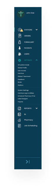
The audit showed that the platform had grown around features rather than user responsibilities. Navigation reflected technical modules, while users thought in terms of patients, equipment, locations and tasks.
Dashboards also reported large quantities of data without prioritising what required action. The system needed clearer role-based views, stronger status patterns and a more predictable information structure.
The Strategy
The strategy reorganised the product around the most common operational goals. Each role received a dashboard focused on outstanding work, exceptions and recent changes rather than a generic list of every available feature.
Common patterns were defined for records, filters, task status, approvals and notifications. This reduced the need to relearn interactions in different parts of the platform.
User Flow & Structure
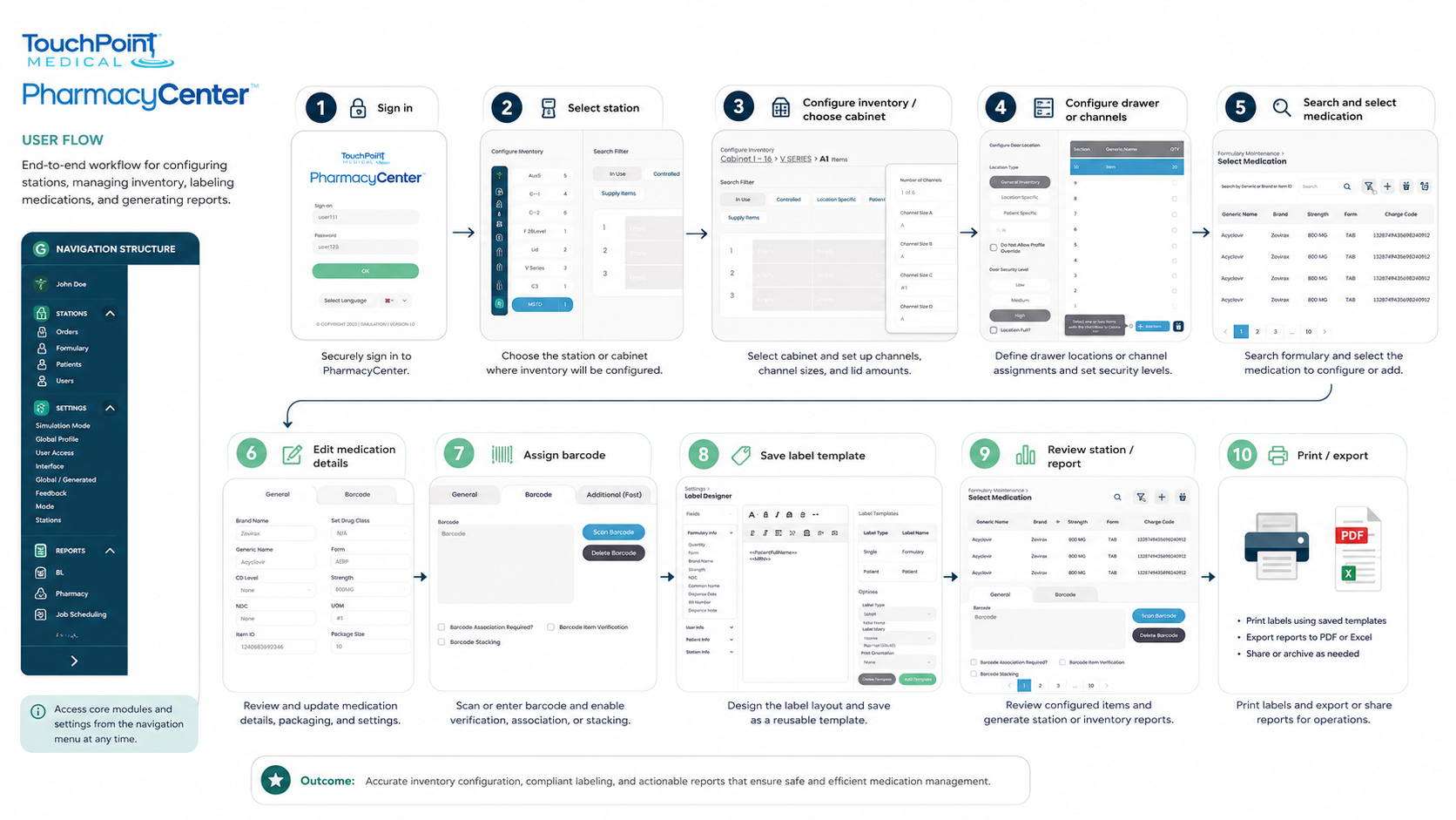
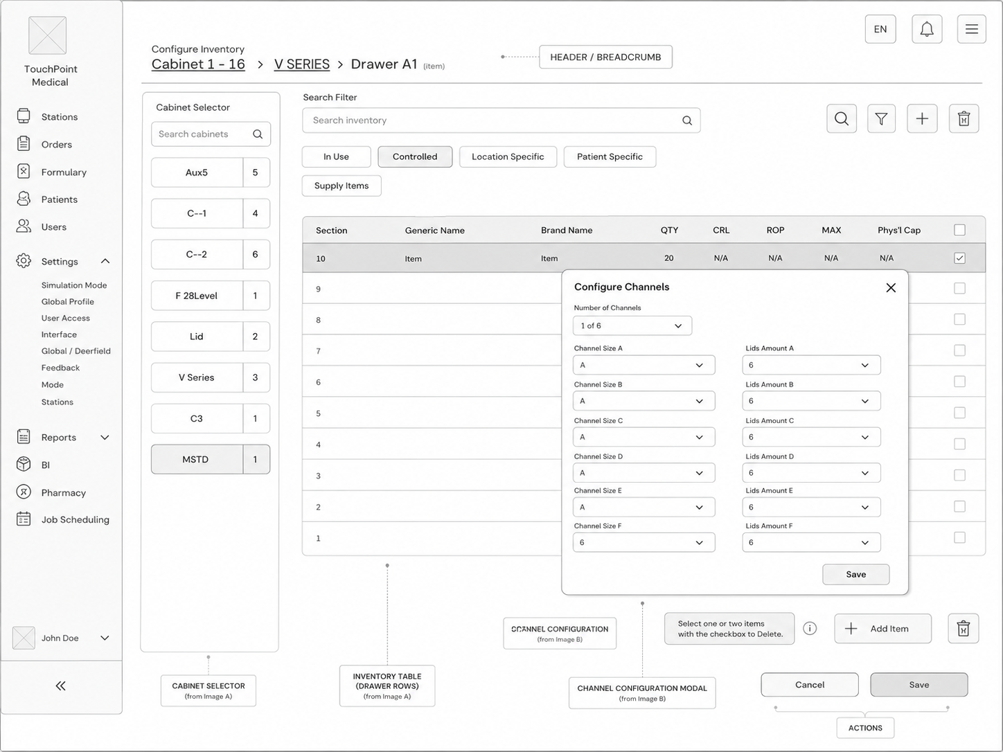
The core structure connected dashboard priorities to detailed records and then to the action required. Users could move from an exception summary into the correct patient, equipment item or service task without rebuilding the context.
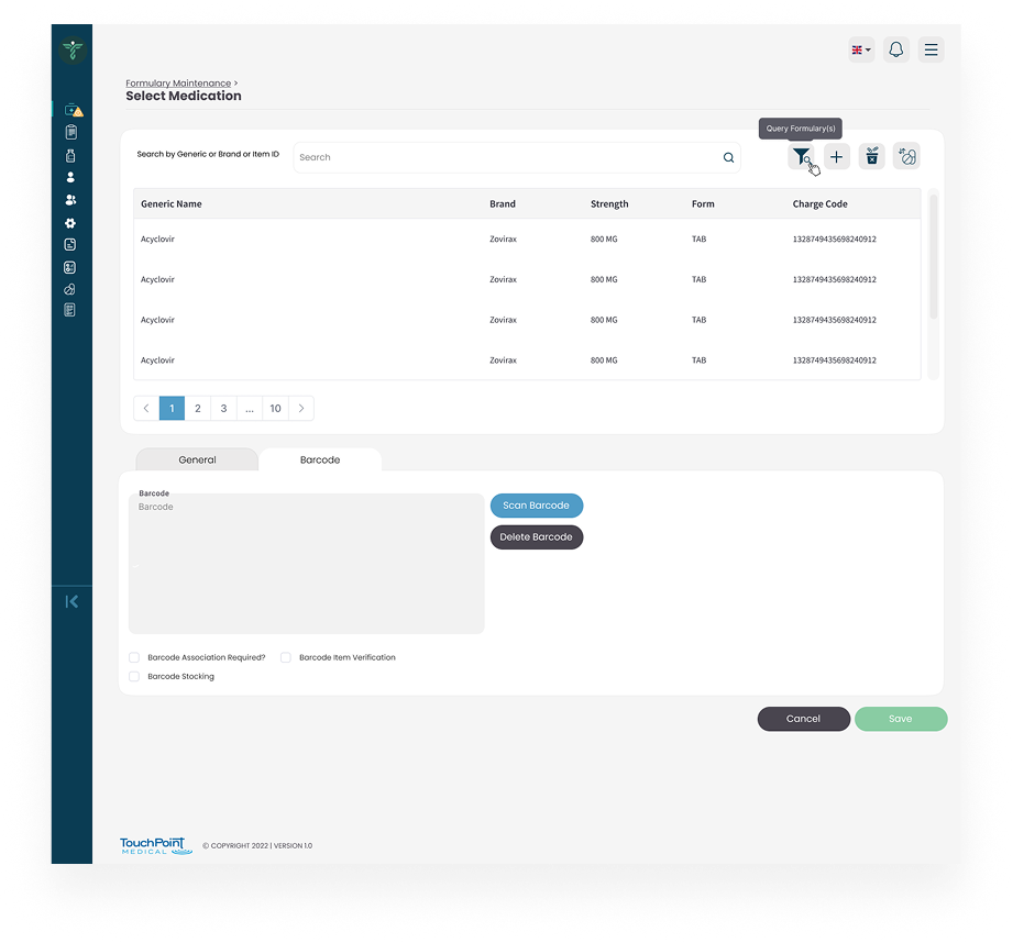
Bulk actions, saved filters and persistent search supported high-volume work, while confirmations and audit history protected more sensitive operational changes.
Wireframes
Visual Direction
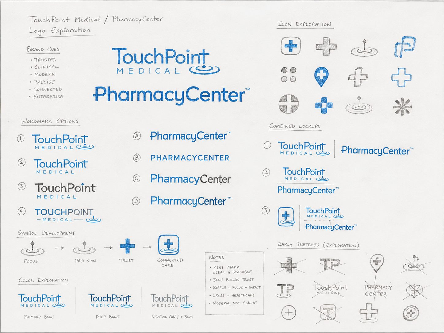
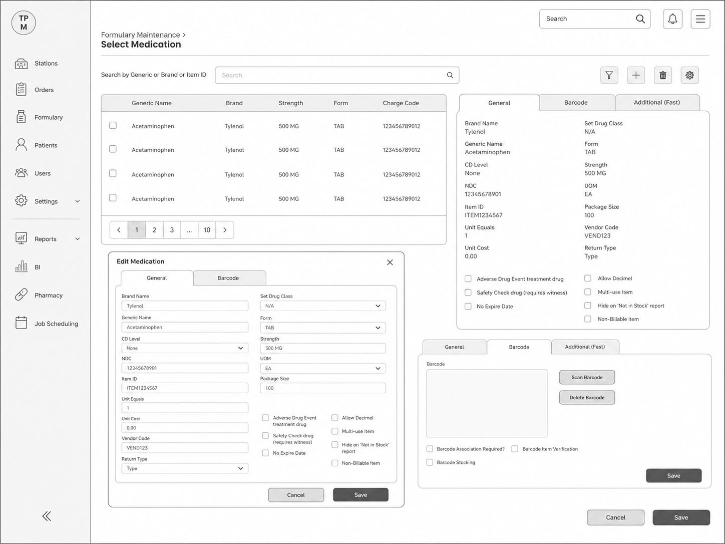
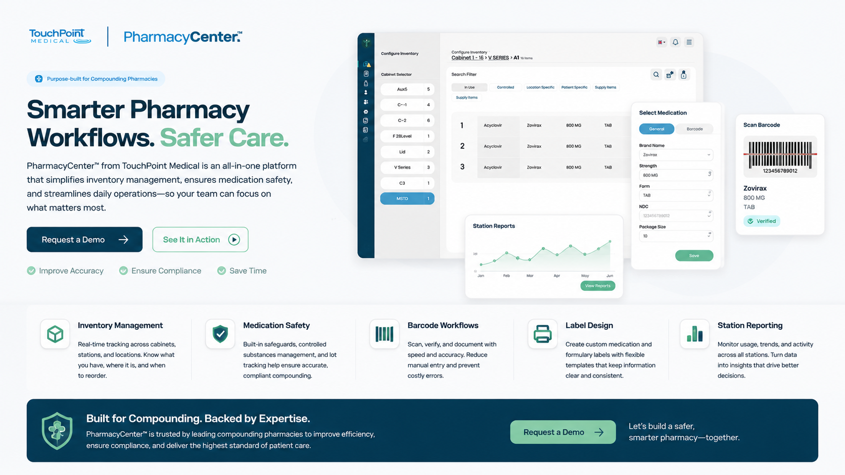
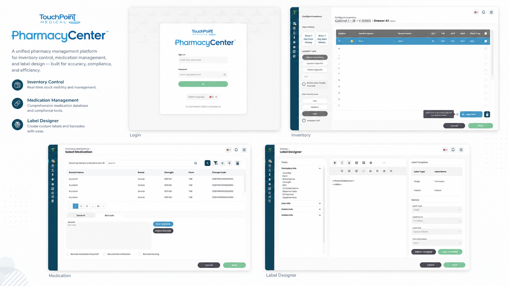
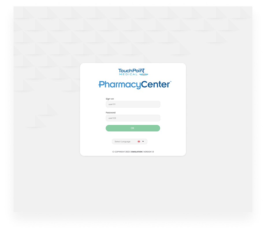
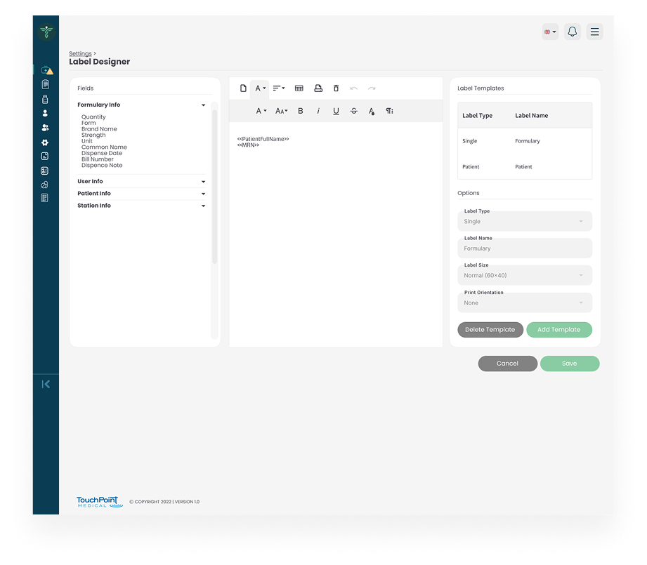
The visual direction used clear density rules rather than simply making the interface larger. Tables, cards and panels were designed with consistent spacing, alignment and status hierarchy.
Colour was reserved for meaningful states such as overdue, blocked or completed. Responsive tablet views prioritised touch targets and task completion while preserving access to detailed records.
Implementation
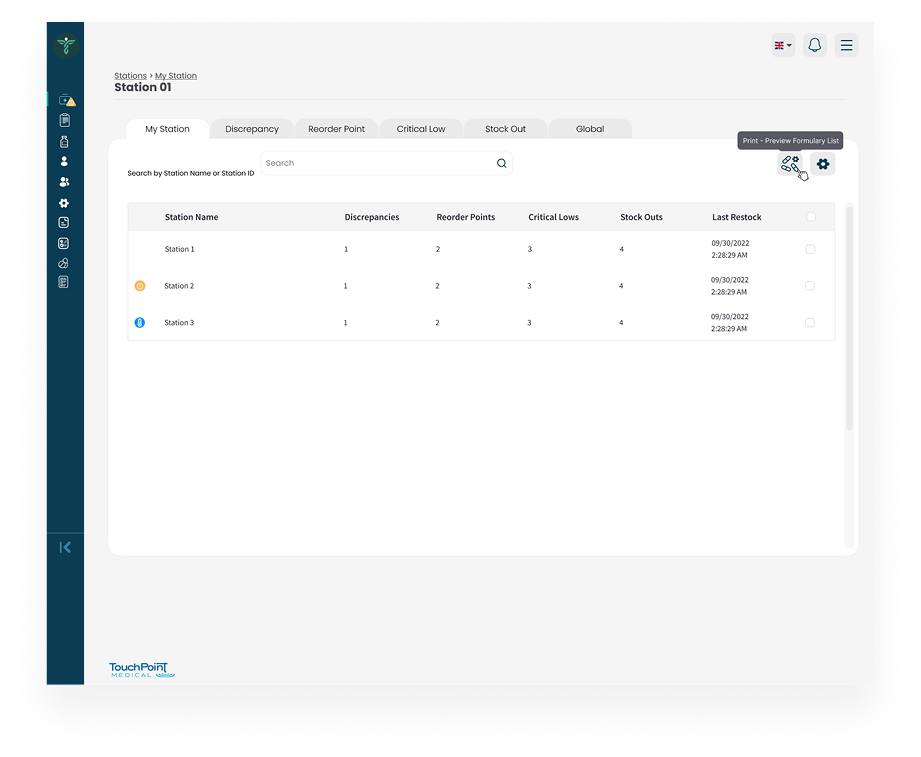
The final prototype included role-based dashboards, record views, advanced filtering, task panels and responsive table behaviour. Interaction notes documented sorting, empty states, loading, validation and permission differences.
The component approach allowed the product team to extend the platform while maintaining consistent patterns across new healthcare-management modules.
Impact
Illustrative portfolio statistics — replace with verified project data before publishing.
−35%
time spent locating priority records
+26%
faster completion of routine tasks
−22%
reduction in navigation errors
Key Takeaways
01
Prioritise exceptions
Operational dashboards should surface what requires action, not every available data point.
02
Match the user’s language
Navigation becomes easier when it reflects real responsibilities and objects.
03
Control density consistently
Complex products need deliberate rules for spacing, tables and hierarchy.
START WITH THE PROBLEM
Have a product, store or digital experience that needs clearer thinking?
I help SaaS founders, Shopify brands and agencies diagnose friction, design better journeys and deliver interfaces that can actually be built.


UX · PRODUCT · SHOPIFY · DEVELOPMENT
I solve usability problems before they become business problems — connecting UX, product thinking and build-ready delivery.

Available for selected remote projects


© 2026 Steve Roberts / ME&CO. All rights reserved.



MENU

CASE STUDIES
Portfolio
UX Design & Research
UI Design
Graphic Design
Just Branding
Alt Graphics
Development

Key Areas
UX Audit & Usability AnalysisUser Journey MappingCompetitor AnalysisUser Research (Interviews & Surveys)Conversion-Focused UX DesignInformation ArchitectureForm Design & OptimisationTrust & Credibility DesignUI Design & Visual ClarityAccessibility (WCAG Compliance)Responsive & Mobile-First DesignStakeholder & Business Alignment
Overview
TouchPoint Medical develops technology and equipment for healthcare environments. This project explored a management platform used by operational teams to coordinate records, tasks, equipment and service activity.
The client needed an interface that could present dense operational information without becoming difficult to scan. It had to support experienced administrators, occasional users and role-specific responsibilities across desktop and tablet.I delivered a UX audit, competitor analysis, and end-to-end redesign focused on simplifying workflows, improving navigation, and introducing role-based, mobile-optimised experiences.
I led a UX audit and competitor analysis of a medical management application, identifying issues with cluttered navigation, complex workflows, and a lack of role-specific views. Using competitor insights and user personas, I redesigned key flows to simplify access to stock, team, and patient data. The solution introduced clearer navigation, role-based dashboards, task prioritisation, and mobile optimisation to improve efficiency and usability.
DESIGN PRINCIPLE
“Operational complexity should live in the system, not in the user’s memory.”
The Challenge
The original experience contained deep navigation, inconsistent terminology and too many actions competing for attention. Users had to remember where information lived and repeatedly switch context to complete related tasks.
Important exceptions, overdue actions and routine records were visually similar. In a healthcare environment this created unnecessary effort and increased the risk that urgent work could be missed.
The Diagnosis
The audit showed that the platform had grown around features rather than user responsibilities. Navigation reflected technical modules, while users thought in terms of patients, equipment, locations and tasks.
Dashboards also reported large quantities of data without prioritising what required action. The system needed clearer role-based views, stronger status patterns and a more predictable information structure.
The Strategy
The strategy reorganised the product around the most common operational goals. Each role received a dashboard focused on outstanding work, exceptions and recent changes rather than a generic list of every available feature.
Common patterns were defined for records, filters, task status, approvals and notifications. This reduced the need to relearn interactions in different parts of the platform.
User Flow & Structure
The core structure connected dashboard priorities to detailed records and then to the action required. Users could move from an exception summary into the correct patient, equipment item or service task without rebuilding the context.
Bulk actions, saved filters and persistent search supported high-volume work, while confirmations and audit history protected more sensitive operational changes.
Wireframes
Visual Direction
The visual direction used clear density rules rather than simply making the interface larger. Tables, cards and panels were designed with consistent spacing, alignment and status hierarchy.
Colour was reserved for meaningful states such as overdue, blocked or completed. Responsive tablet views prioritised touch targets and task completion while preserving access to detailed records.
Implementation
The final prototype included role-based dashboards, record views, advanced filtering, task panels and responsive table behaviour. Interaction notes documented sorting, empty states, loading, validation and permission differences.
The component approach allowed the product team to extend the platform while maintaining consistent patterns across new healthcare-management modules.
Impact
Illustrative portfolio statistics — replace with verified project data before publishing.
−35%
time spent locating priority records
+26%
faster completion of routine tasks
−22%
reduction in navigation errors
Key Takeaways
01
Prioritise exceptions
Operational dashboards should surface what requires action, not every available data point.
02
Match the user’s language
Navigation becomes easier when it reflects real responsibilities and objects.
03
Control density consistently
Complex products need deliberate rules for spacing, tables and hierarchy.









START WITH THE PROBLEM
Have a product, store or digital experience that needs clearer thinking?
I help SaaS founders, Shopify brands and agencies diagnose friction, design better journeys and deliver interfaces that can actually be built.


UX · PRODUCT · SHOPIFY · DEVELOPMENT
I solve usability problems before they become business problems — connecting UX, product thinking and build-ready delivery.
Available for selected remote projects


© 2026 Steve Roberts / ME&CO. All rights reserved.

ABOUT
UX CONSULTANT
UX RESEARCH
UI & GRAPHICS
SOFTWARE
PORTFOLIO
RESOURCES
BOOKS
BLOG
