
CASE STUDIES
Portfolio

UX Design & Research
UI Design
Graphic Design
Just Branding
Alt Graphics
Development



Key Areas
UX Audit & Usability TestingCompetitor AnalysisSaaS Product UX DesignWorkflow OptimisationInformation ArchitectureAI Feature Integration (UX Strategy)
Content Creation & Publishing UXTemplate System DesignInteraction DesignCalendar & Scheduling UXUI Design & Visual ConsistencyUser-Centred Product Strategy
Overview
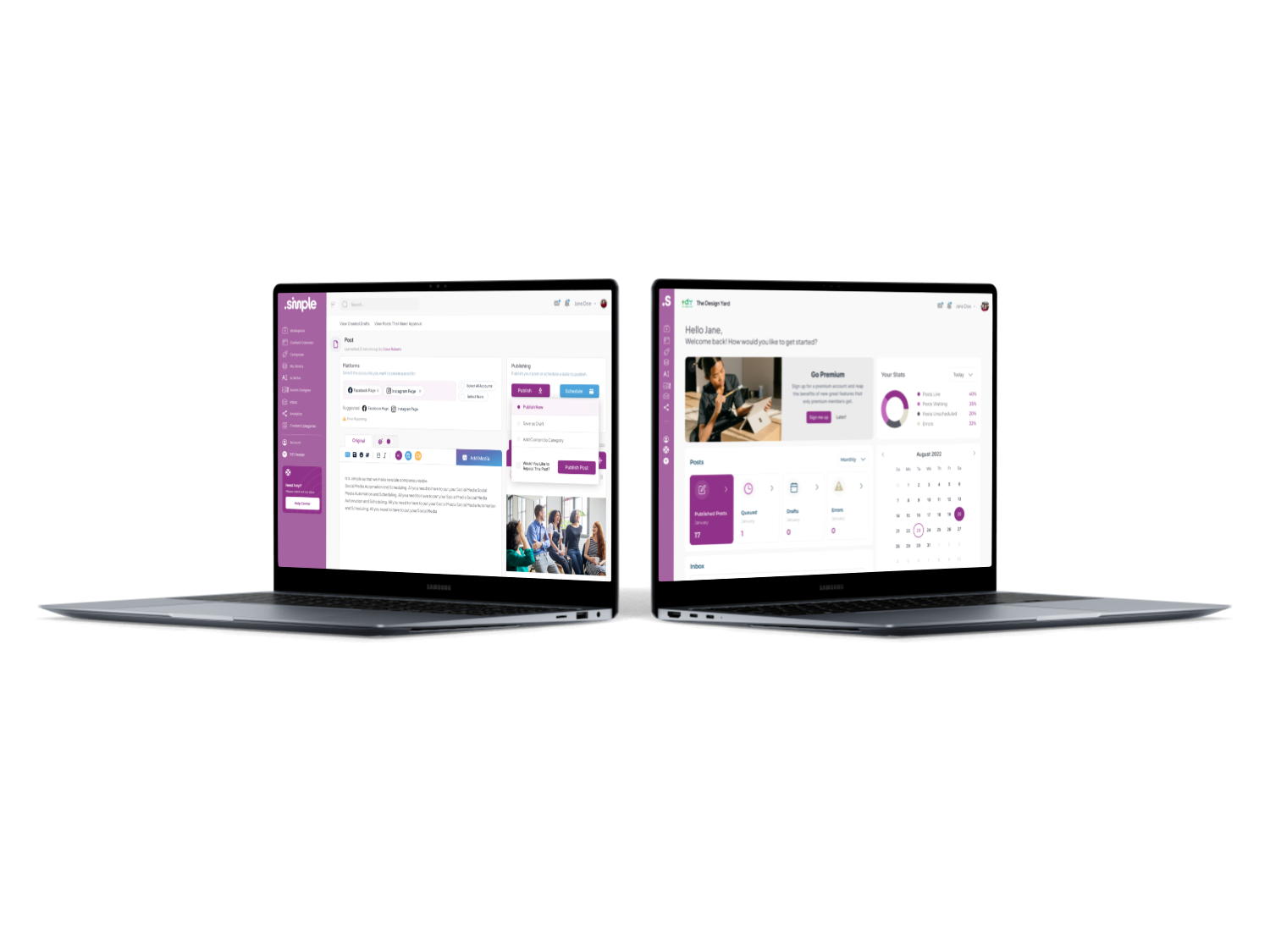
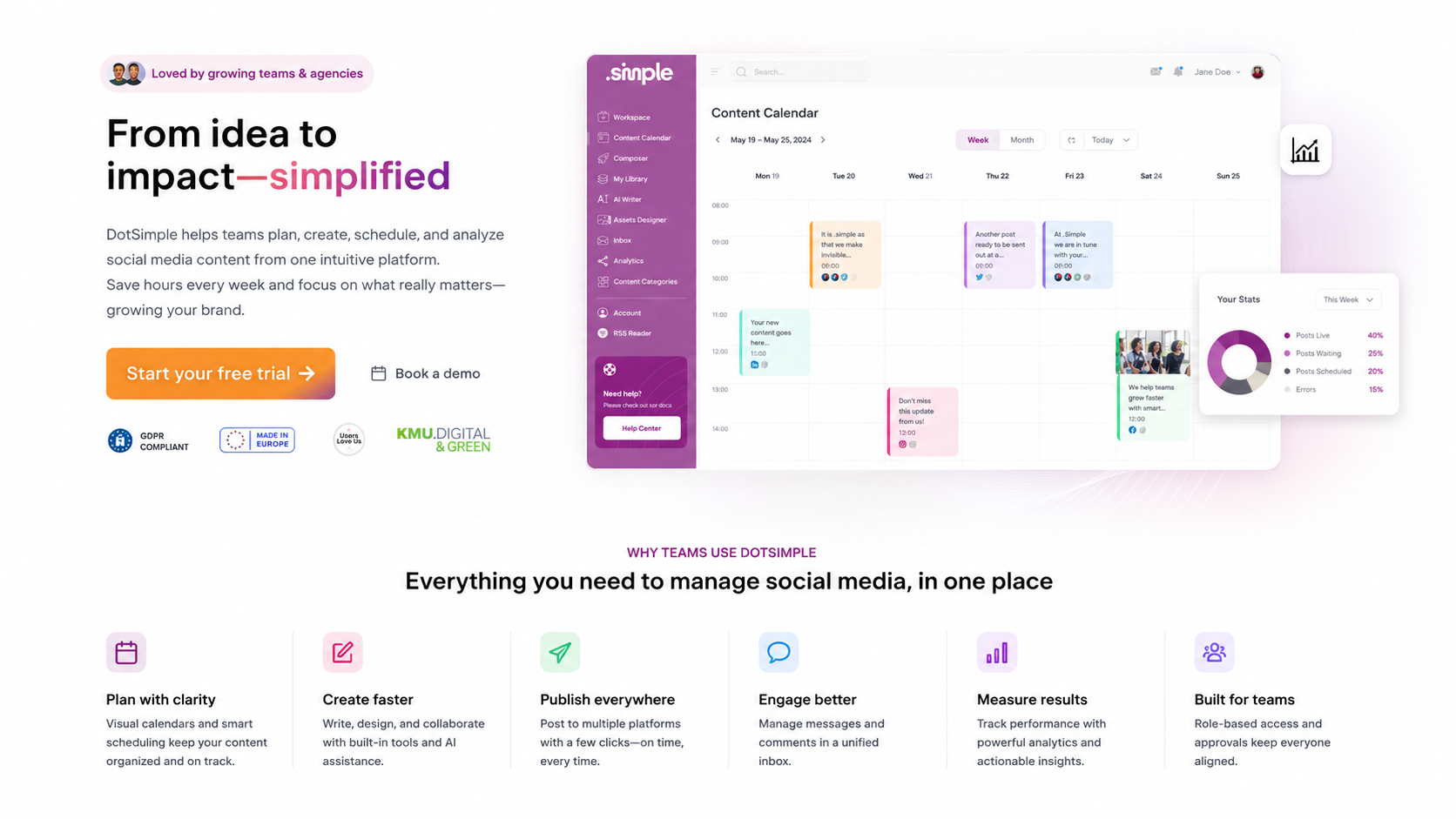
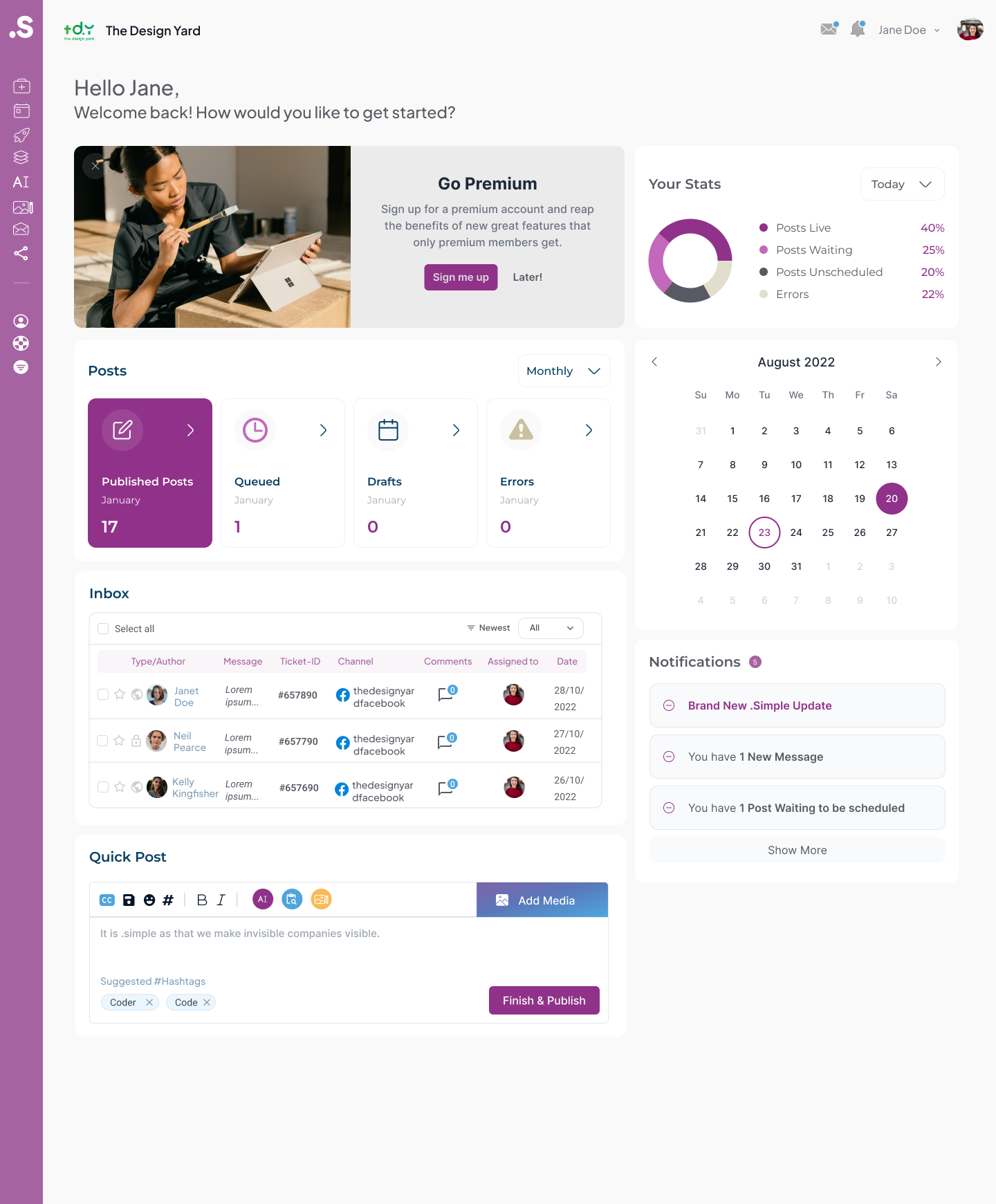
.Simple is a SaaS product concept aimed at small teams that need to manage work, clients and information without adopting a large enterprise platform. The product combines lightweight planning, records and collaboration in one workspace.
The brief was to create an interface that felt immediately understandable while retaining enough flexibility for different businesses. New users needed to start quickly, and experienced teams needed room to build more structured workflows over time.I led the UX audit, usability testing, and competitor analysis for DotSimple, a SaaS social media management platform, to address inefficient workflows and limited content creation capabilities.
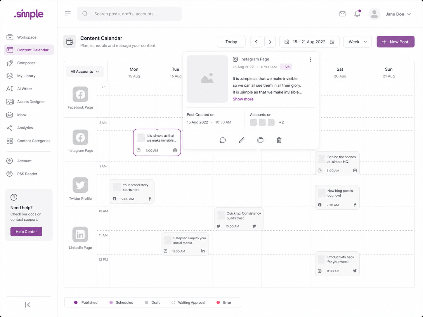
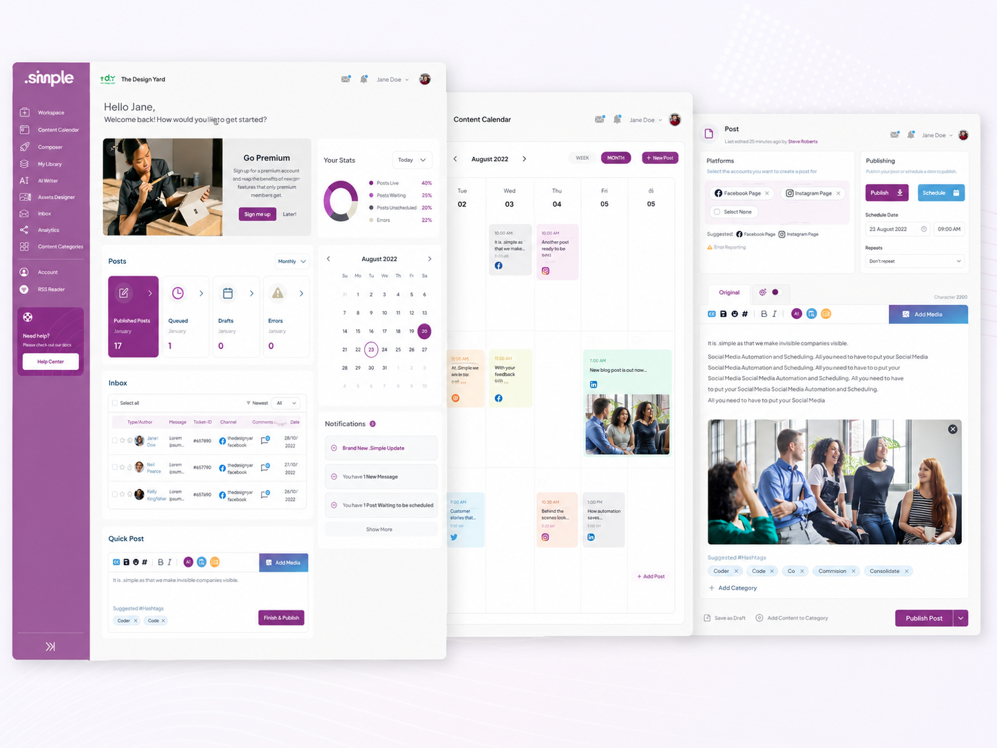
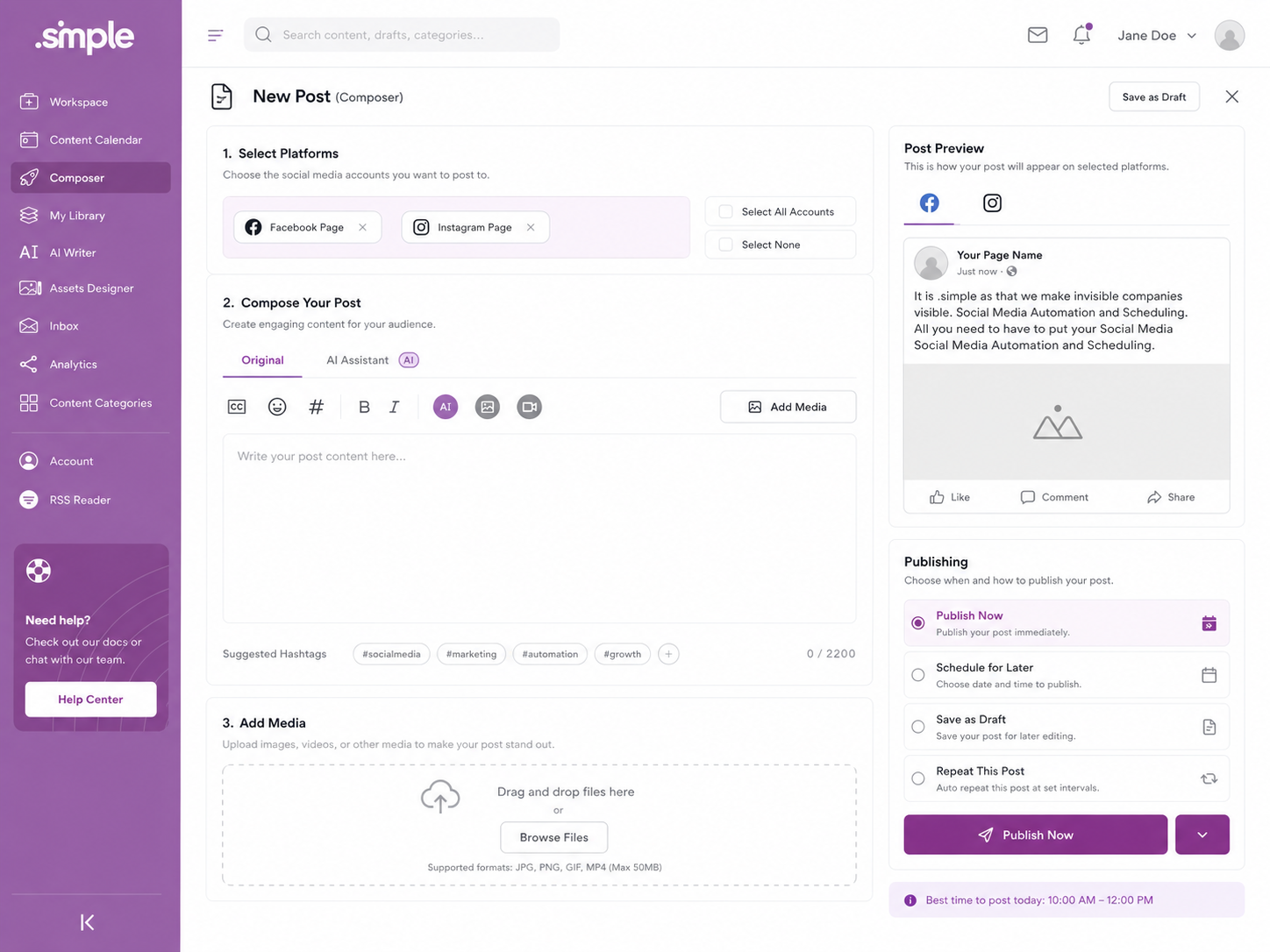
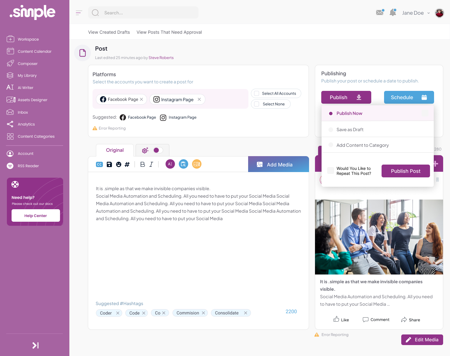
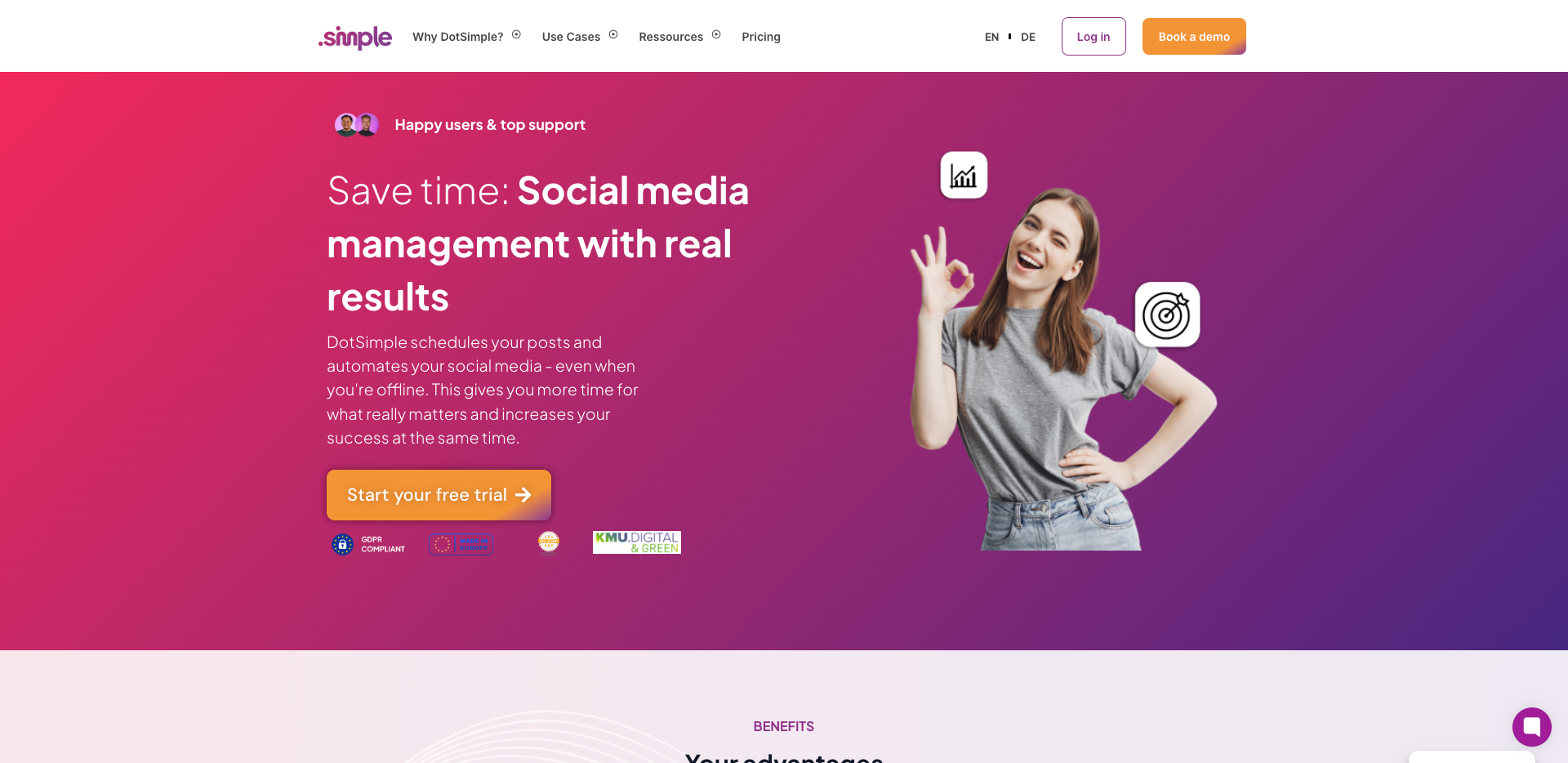
By analysing user behaviour and competitor offerings, I redesigned key experiences to streamline navigation, improve planning, and accelerate content creation. The solution introduced AI-powered content generation, a flexible template system, and a simplified scheduling calendar, significantly improving productivity, consistency, and overall user satisfaction.
DESIGN PRINCIPLE
“Simple does not mean fewer capabilities; it means fewer decisions at one time.”
The Challenge
The early product concept exposed configuration, navigation and data structure before users had completed a useful task. This made the tool feel more powerful but less approachable.
Features also used different interaction patterns, creating the impression of several small applications rather than one connected workspace.
The Diagnosis
The diagnosis showed that users needed a stronger default experience. Flexibility was valuable only after the product had demonstrated a clear starting workflow.
The information architecture also separated projects, clients and tasks too strictly, making it difficult to move naturally between related information.
The Strategy
The strategy established a guided workspace with useful defaults, example content and progressive configuration. Teams could begin with a simple workflow and introduce custom fields, views or automation later.
A shared record pattern connected projects, clients, tasks and notes. Navigation focused on recent work, priorities and saved views rather than a long list of product modules.
User Flow & Structure
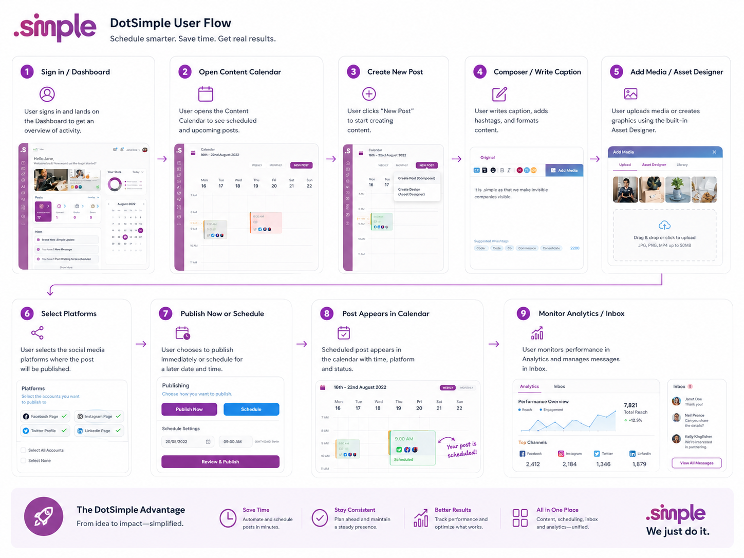
The core flow moved from workspace creation to an example project, first task and client record. Contextual prompts introduced additional capability only when it supported the current activity.
Universal search, quick creation and linked records reduced navigation. Empty states offered a practical action and an example rather than generic instructions.
Wireframes
Visual Direction
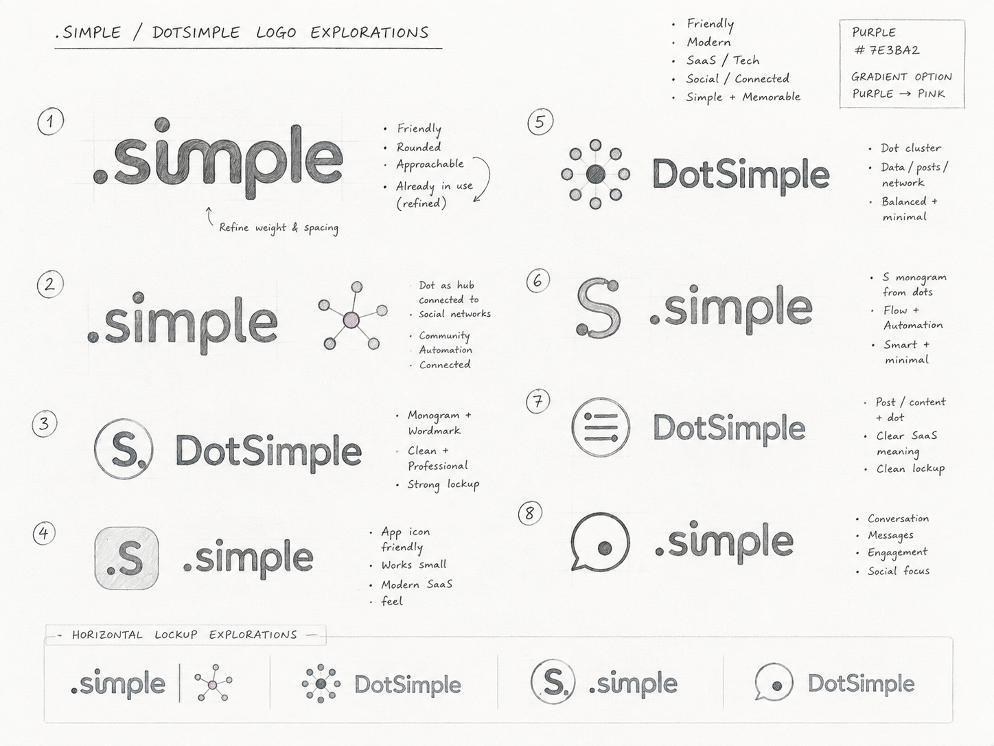
The visual direction used a minimal, quiet interface with strong spacing, clear typography and limited colour. Visual complexity increased only where the amount or status of information required it.
Consistent panels, tables and cards allowed users to switch views without feeling that the product had changed.
Implementation
The prototype included onboarding, workspace navigation, linked records, task views, search, quick creation and configurable fields. Responsive layouts supported focused work outside the desktop environment.
Component documentation defined how new features should reuse the same interaction patterns, protecting the simple experience as the product expanded.
Impact
Illustrative portfolio statistics — replace with verified project data before publishing.
−40%
time required to create a first project
+29%
increase in weekly active users
−24%
fewer support questions during onboarding
Key Takeaways
01
Provide a useful default
Flexibility becomes valuable after users have completed a real task.
02
Reveal power gradually
Advanced options should appear when they support the current goal.
03
Reuse interaction patterns
Consistency makes a growing product continue to feel simple.
START WITH THE PROBLEM
Have a product, store or digital experience that needs clearer thinking?
I help SaaS founders, Shopify brands and agencies diagnose friction, design better journeys and deliver interfaces that can actually be built.


UX · PRODUCT · SHOPIFY · DEVELOPMENT
I solve usability problems before they become business problems — connecting UX, product thinking and build-ready delivery.

Available for selected remote projects


© 2026 Steve Roberts / ME&CO. All rights reserved.



MENU

CASE STUDIES
Portfolio
UX Design & Research
UI Design
Graphic Design
Just Branding
Alt Graphics
Development
Key Areas
UX Audit & Usability TestingCompetitor AnalysisSaaS Product UX DesignWorkflow OptimisationInformation ArchitectureAI Feature Integration (UX Strategy)
Content Creation & Publishing UXTemplate System DesignInteraction DesignCalendar & Scheduling UXUI Design & Visual ConsistencyUser-Centred Product Strategy
Overview
.Simple is a SaaS product concept aimed at small teams that need to manage work, clients and information without adopting a large enterprise platform. The product combines lightweight planning, records and collaboration in one workspace.
The brief was to create an interface that felt immediately understandable while retaining enough flexibility for different businesses. New users needed to start quickly, and experienced teams needed room to build more structured workflows over time.I led the UX audit, usability testing, and competitor analysis for DotSimple, a SaaS social media management platform, to address inefficient workflows and limited content creation capabilities.
By analysing user behaviour and competitor offerings, I redesigned key experiences to streamline navigation, improve planning, and accelerate content creation. The solution introduced AI-powered content generation, a flexible template system, and a simplified scheduling calendar, significantly improving productivity, consistency, and overall user satisfaction.
DESIGN PRINCIPLE
“Simple does not mean fewer capabilities; it means fewer decisions at one time.”
The Challenge
The early product concept exposed configuration, navigation and data structure before users had completed a useful task. This made the tool feel more powerful but less approachable.
Features also used different interaction patterns, creating the impression of several small applications rather than one connected workspace.
The Diagnosis
The diagnosis showed that users needed a stronger default experience. Flexibility was valuable only after the product had demonstrated a clear starting workflow.
The information architecture also separated projects, clients and tasks too strictly, making it difficult to move naturally between related information.
The Strategy
The strategy established a guided workspace with useful defaults, example content and progressive configuration. Teams could begin with a simple workflow and introduce custom fields, views or automation later.
A shared record pattern connected projects, clients, tasks and notes. Navigation focused on recent work, priorities and saved views rather than a long list of product modules.
User Flow & Structure
The core flow moved from workspace creation to an example project, first task and client record. Contextual prompts introduced additional capability only when it supported the current activity.
Universal search, quick creation and linked records reduced navigation. Empty states offered a practical action and an example rather than generic instructions.
Wireframes
Visual Direction
The visual direction used a minimal, quiet interface with strong spacing, clear typography and limited colour. Visual complexity increased only where the amount or status of information required it.
Consistent panels, tables and cards allowed users to switch views without feeling that the product had changed.
Implementation
The prototype included onboarding, workspace navigation, linked records, task views, search, quick creation and configurable fields. Responsive layouts supported focused work outside the desktop environment.
Component documentation defined how new features should reuse the same interaction patterns, protecting the simple experience as the product expanded.
Impact
Illustrative portfolio statistics — replace with verified project data before publishing.
−40%
time required to create a first project
+29%
increase in weekly active users
−24%
fewer support questions during onboarding
Key Takeaways
01
Provide a useful default
Flexibility becomes valuable after users have completed a real task.
02
Reveal power gradually
Advanced options should appear when they support the current goal.
03
Reuse interaction patterns
Consistency makes a growing product continue to feel simple.









START WITH THE PROBLEM
Have a product, store or digital experience that needs clearer thinking?
I help SaaS founders, Shopify brands and agencies diagnose friction, design better journeys and deliver interfaces that can actually be built.


UX · PRODUCT · SHOPIFY · DEVELOPMENT
I solve usability problems before they become business problems — connecting UX, product thinking and build-ready delivery.
Available for selected remote projects


© 2026 Steve Roberts / ME&CO. All rights reserved.

ABOUT
UX CONSULTANT
UX RESEARCH
UI & GRAPHICS
SOFTWARE
PORTFOLIO
RESOURCES
BOOKS
BLOG
