
CASE STUDIES
Portfolio

UX Design & Research
UI Design
Graphic Design
Just Branding
Alt Graphics
Development



Key Areas
Brand Identity Design
App UX & UI Design
Website Design & UX
Visual Design Systems
Marketing & Print Design
Business Cards & Leaflet Design
Cross-Channel Brand Consistency
User-Centred Design
Art Direction
End-to-End Creative Delivery
Overview
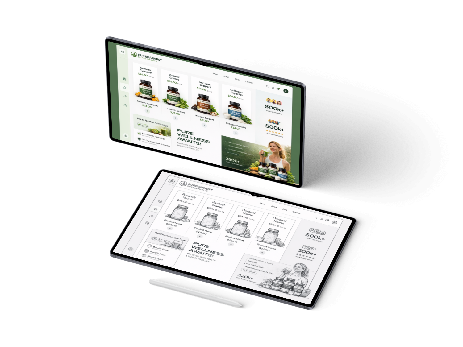
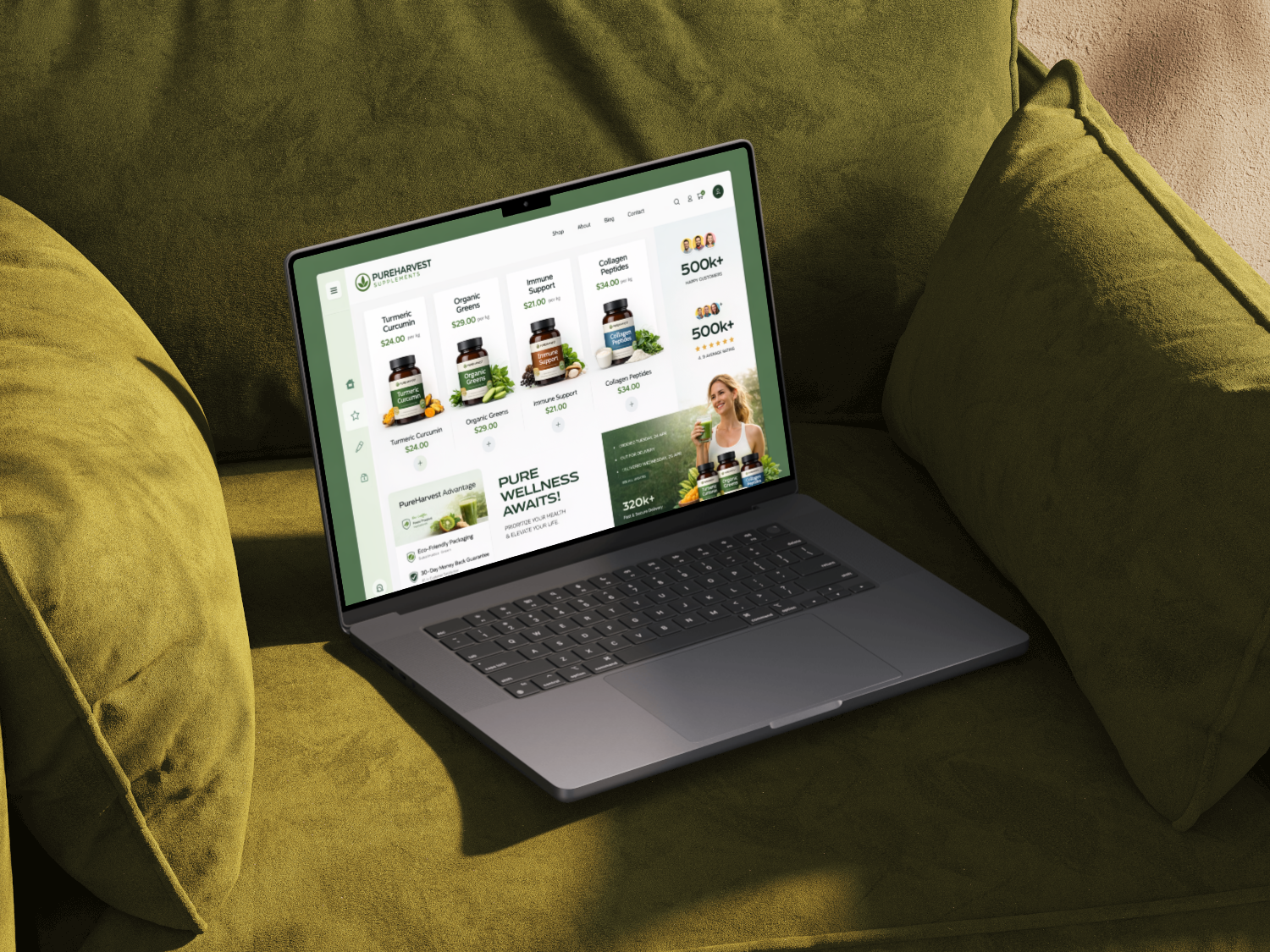
PureHarvest Supplements is a direct-to-consumer nutrition concept offering vitamins, minerals and targeted wellness products. The store needed to communicate quality and make product selection easier in a crowded category.
The brief was to organise the range around customer needs, explain ingredients clearly and support repeat purchase without depending on exaggerated claims or discount-heavy messaging.Delivered the full digital design and e-commerce build for PureHarvest, a supplements brand focused on health, trust, and product clarity. Established the visual design direction and translated the brand into a clean, structured UI that communicates credibility and supports confident purchasing. Designed the complete website interface with strong emphasis on product presentation, user trust signals, and conversion-focused journeys. Built and launched the site in Shopify, creating a fully responsive and scalable online store.
Key contributions
Developed the PureHarvest brand look and digital design direction
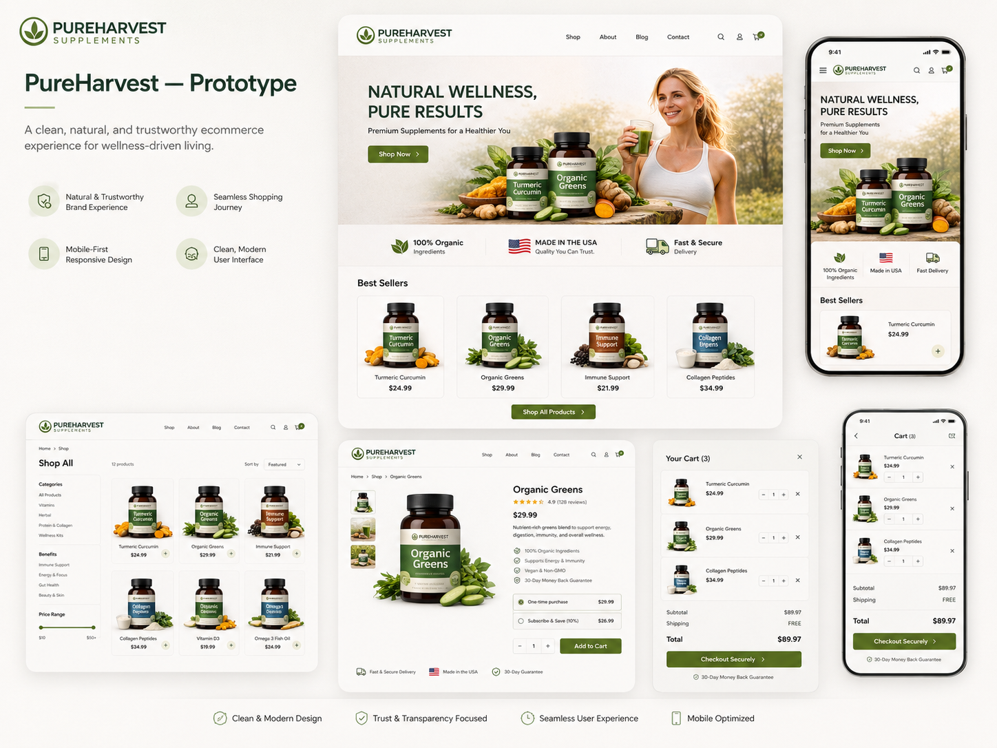
Designed the full website UI, including product pages, layouts, and user flows
Built and deployed the e-commerce site in Shopify
Optimised the experience for clarity, trust, and conversion
Ensured responsive performance across desktop and mobile devices
DESIGN PRINCIPLE
“In a complex category, transparency is the strongest conversion tool.”
The Challenge
Customers faced similar products with unfamiliar ingredient names, strengths and usage instructions. Comparison required too much prior knowledge.
Subscription and bundle options added value but also introduced decisions about frequency, quantity and suitability before users fully understood the product.
The Diagnosis
The audit showed that product pages led with branding and benefits but delayed dosage, ingredient evidence, suitability and warnings.
Navigation also separated products by internal range names rather than health goals, making discovery dependent on existing knowledge.
The Strategy
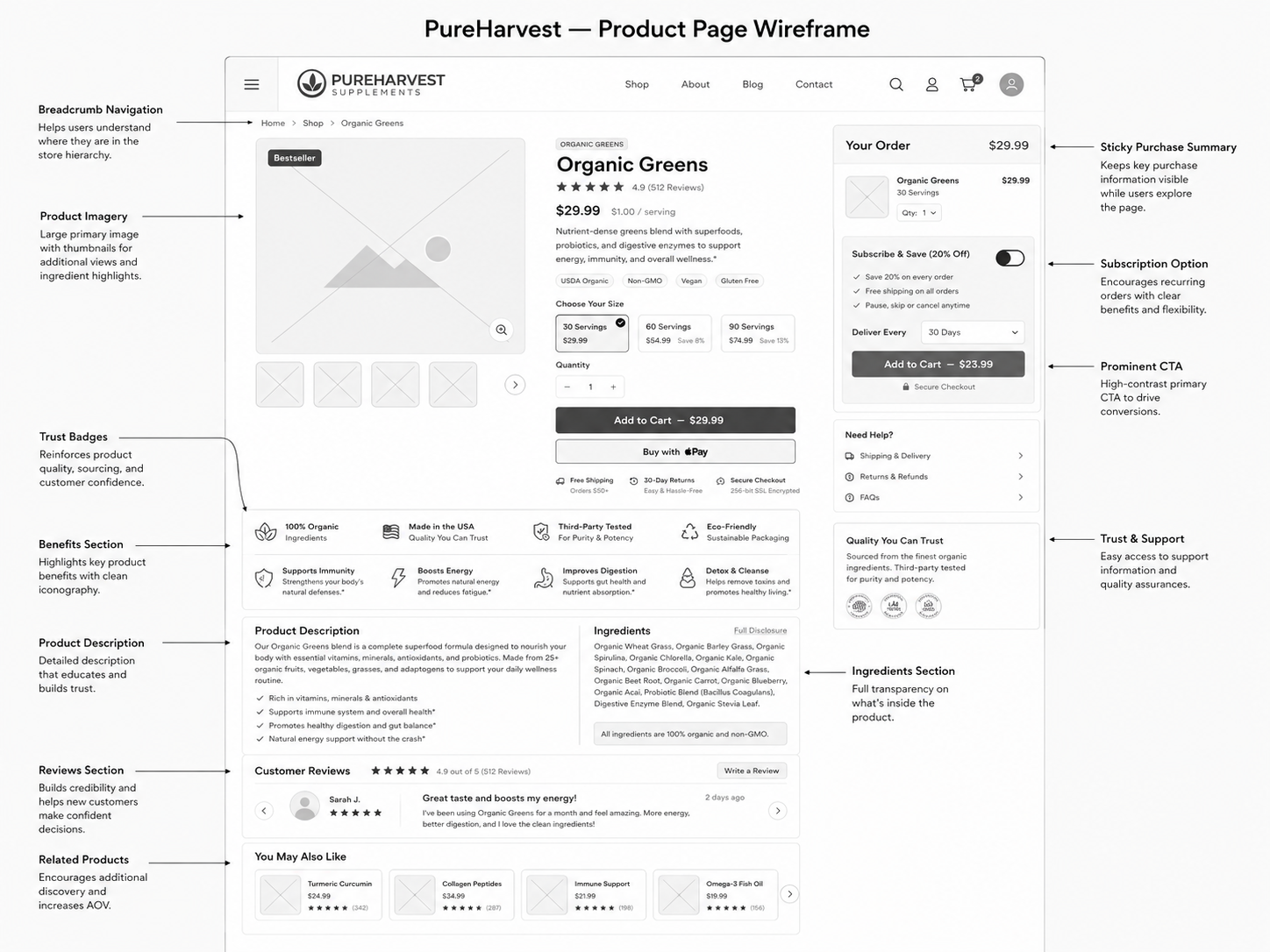
The strategy created goal-led categories and consistent comparison information for every product: purpose, key ingredients, dose, duration, suitability and cautions.
Subscription was presented after product understanding, with clear savings, frequency and cancellation information rather than being the default purchase mode.
User Flow & Structure
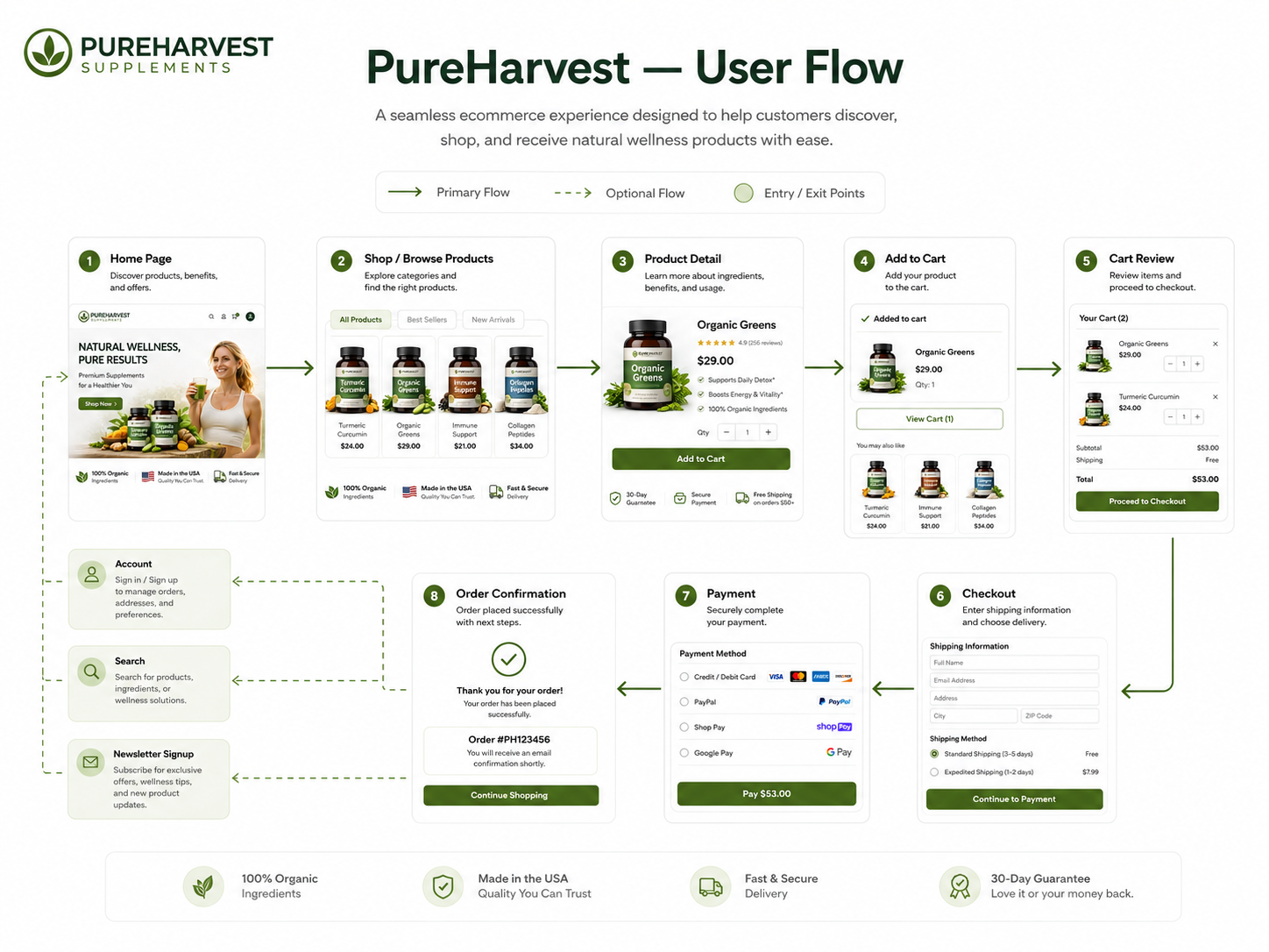
The main flow moved from health goal or ingredient search into comparison, product detail and purchase type. A repeat-order route allowed returning customers to bypass educational content.
Bundles were built around compatible routines, while warnings and suitability checks appeared before checkout when relevant.
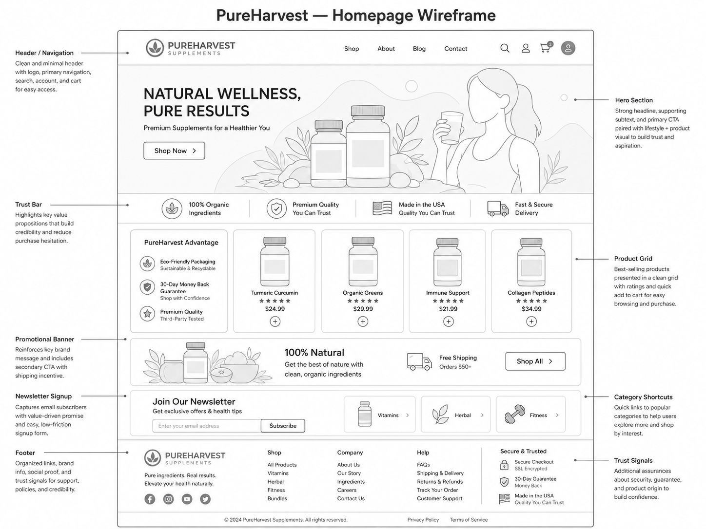
Wireframes
Visual Direction
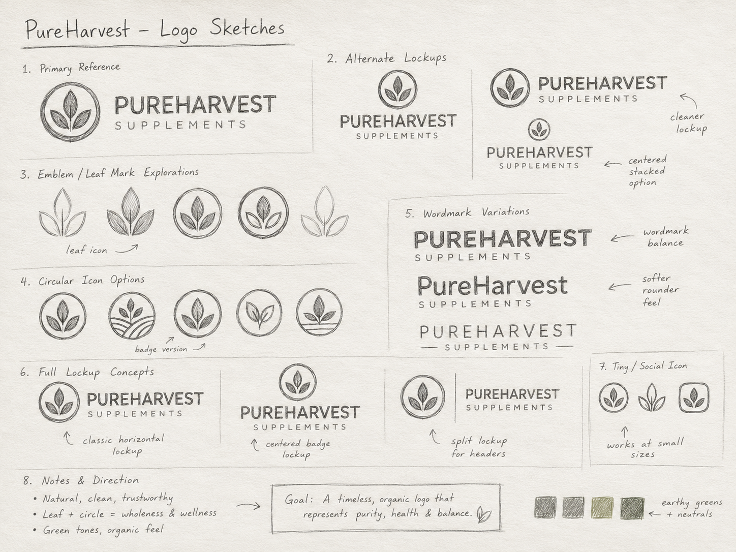
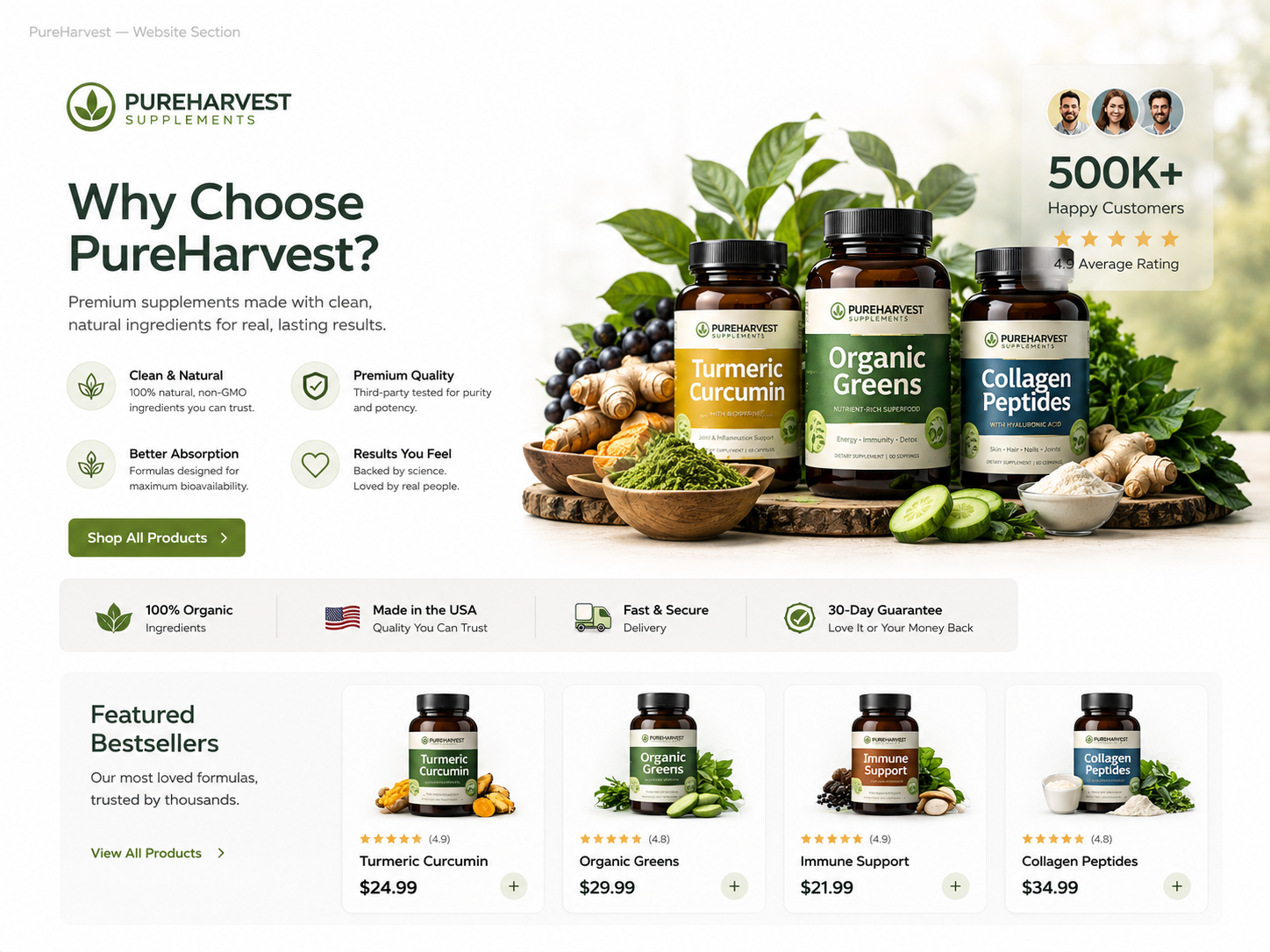
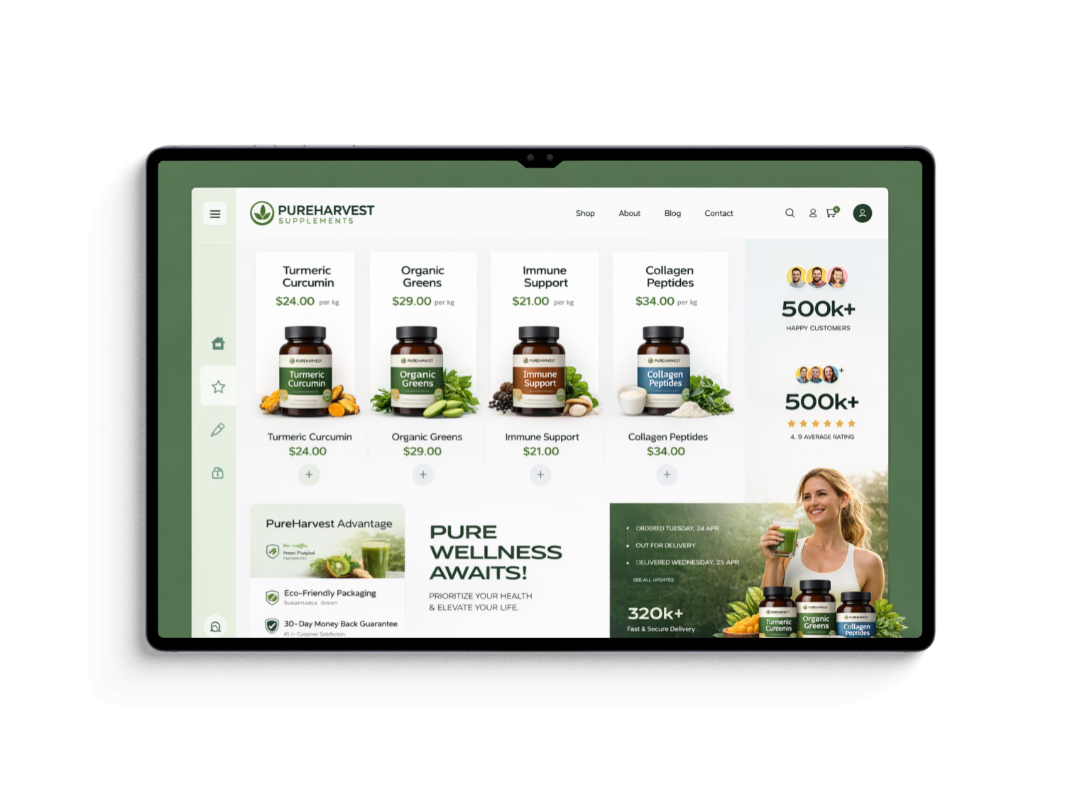
The visual direction combined clean clinical structure with natural product photography. Colour identified product families but never replaced labels or written information.
Evidence, ingredient and usage sections used a repeatable layout so customers could compare products confidently.
Implementation
The designs included goal-led navigation, comparison, product details, subscription selection, bundles, account reordering and key compliance states.
A component and content framework ensured new supplements could be added without creating inconsistent benefit claims or information structures.
Impact
Illustrative portfolio statistics — replace with verified project data before publishing.
+30%
increase in product comparison use
+19%
growth in repeat-order conversion
−28%
fewer questions about dosage and suitability
Key Takeaways
01
Make comparison consistent
Repeated information structures reduce the knowledge needed to choose.
02
Earn subscription trust
Frequency and cancellation should be as clear as the saving.
03
Put evidence near claims
Customers need supporting information at the point of persuasion.
START WITH THE PROBLEM
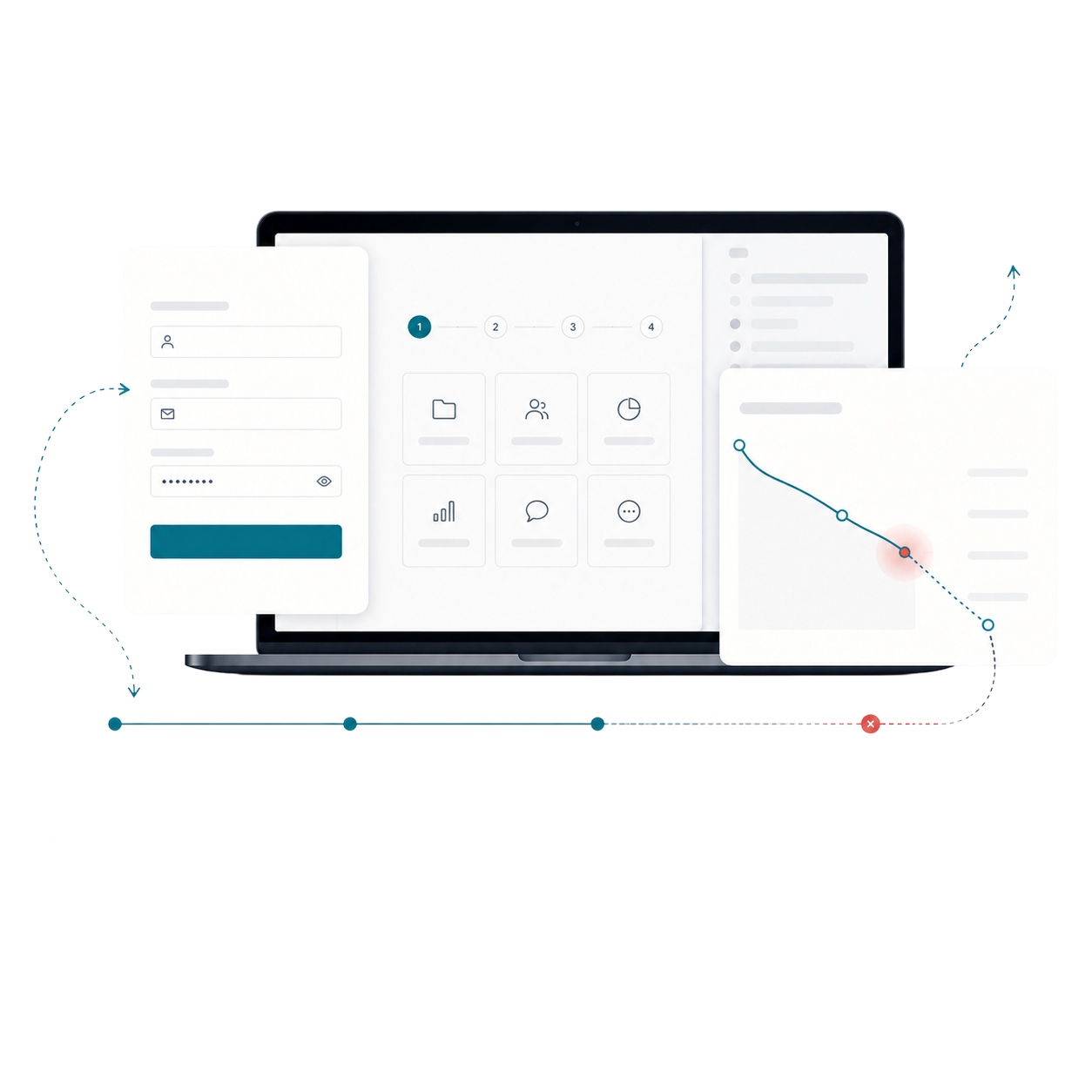
Have a product, store or digital experience that needs clearer thinking?
I help SaaS founders, Shopify brands and agencies diagnose friction, design better journeys and deliver interfaces that can actually be built.


UX · PRODUCT · SHOPIFY · DEVELOPMENT
I solve usability problems before they become business problems — connecting UX, product thinking and build-ready delivery.

Available for selected remote projects


© 2026 Steve Roberts / ME&CO. All rights reserved.



MENU

CASE STUDIES
Portfolio
UX Design & Research
UI Design
Graphic Design
Just Branding
Alt Graphics
Development
Key Areas
Brand Identity Design
App UX & UI Design
Website Design & UX
Visual Design Systems
Marketing & Print Design
Business Cards & Leaflet Design
Cross-Channel Brand Consistency
User-Centred Design
Art Direction
End-to-End Creative Delivery
Overview
PureHarvest Supplements is a direct-to-consumer nutrition concept offering vitamins, minerals and targeted wellness products. The store needed to communicate quality and make product selection easier in a crowded category.
The brief was to organise the range around customer needs, explain ingredients clearly and support repeat purchase without depending on exaggerated claims or discount-heavy messaging.Delivered the full digital design and e-commerce build for PureHarvest, a supplements brand focused on health, trust, and product clarity. Established the visual design direction and translated the brand into a clean, structured UI that communicates credibility and supports confident purchasing. Designed the complete website interface with strong emphasis on product presentation, user trust signals, and conversion-focused journeys. Built and launched the site in Shopify, creating a fully responsive and scalable online store.
Key contributions
Developed the PureHarvest brand look and digital design direction
Designed the full website UI, including product pages, layouts, and user flows
Built and deployed the e-commerce site in Shopify
Optimised the experience for clarity, trust, and conversion
Ensured responsive performance across desktop and mobile devices
DESIGN PRINCIPLE
“In a complex category, transparency is the strongest conversion tool.”
The Challenge
Customers faced similar products with unfamiliar ingredient names, strengths and usage instructions. Comparison required too much prior knowledge.
Subscription and bundle options added value but also introduced decisions about frequency, quantity and suitability before users fully understood the product.
The Diagnosis
The audit showed that product pages led with branding and benefits but delayed dosage, ingredient evidence, suitability and warnings.
Navigation also separated products by internal range names rather than health goals, making discovery dependent on existing knowledge.
The Strategy
The strategy created goal-led categories and consistent comparison information for every product: purpose, key ingredients, dose, duration, suitability and cautions.
Subscription was presented after product understanding, with clear savings, frequency and cancellation information rather than being the default purchase mode.
User Flow & Structure
The main flow moved from health goal or ingredient search into comparison, product detail and purchase type. A repeat-order route allowed returning customers to bypass educational content.
Bundles were built around compatible routines, while warnings and suitability checks appeared before checkout when relevant.
Wireframes
Visual Direction
The visual direction combined clean clinical structure with natural product photography. Colour identified product families but never replaced labels or written information.
Evidence, ingredient and usage sections used a repeatable layout so customers could compare products confidently.
Implementation
The designs included goal-led navigation, comparison, product details, subscription selection, bundles, account reordering and key compliance states.
A component and content framework ensured new supplements could be added without creating inconsistent benefit claims or information structures.
Impact
Illustrative portfolio statistics — replace with verified project data before publishing.
+30%
increase in product comparison use
+19%
growth in repeat-order conversion
−28%
fewer questions about dosage and suitability
Key Takeaways
01
Make comparison consistent
Repeated information structures reduce the knowledge needed to choose.
02
Earn subscription trust
Frequency and cancellation should be as clear as the saving.
03
Put evidence near claims
Customers need supporting information at the point of persuasion.









START WITH THE PROBLEM
Have a product, store or digital experience that needs clearer thinking?
I help SaaS founders, Shopify brands and agencies diagnose friction, design better journeys and deliver interfaces that can actually be built.


UX · PRODUCT · SHOPIFY · DEVELOPMENT
I solve usability problems before they become business problems — connecting UX, product thinking and build-ready delivery.
Available for selected remote projects


© 2026 Steve Roberts / ME&CO. All rights reserved.

ABOUT
UX CONSULTANT
UX RESEARCH
UI & GRAPHICS
SOFTWARE
PORTFOLIO
RESOURCES
BOOKS
BLOG
