
CASE STUDIES
Portfolio

UX Design & Research
UI Design
Graphic Design
Just Branding
Alt Graphics
Development


Key Areas
UX Audit & Usability AnalysisUser Journey MappingCompetitor AnalysisUser Research (Interviews & Surveys)Conversion-Focused UX DesignInformation ArchitectureForm Design & OptimisationTrust & Credibility DesignUI Design & Visual ClarityAccessibility (WCAG Compliance)Responsive & Mobile-First DesignStakeholder & Business Alignment
Overview
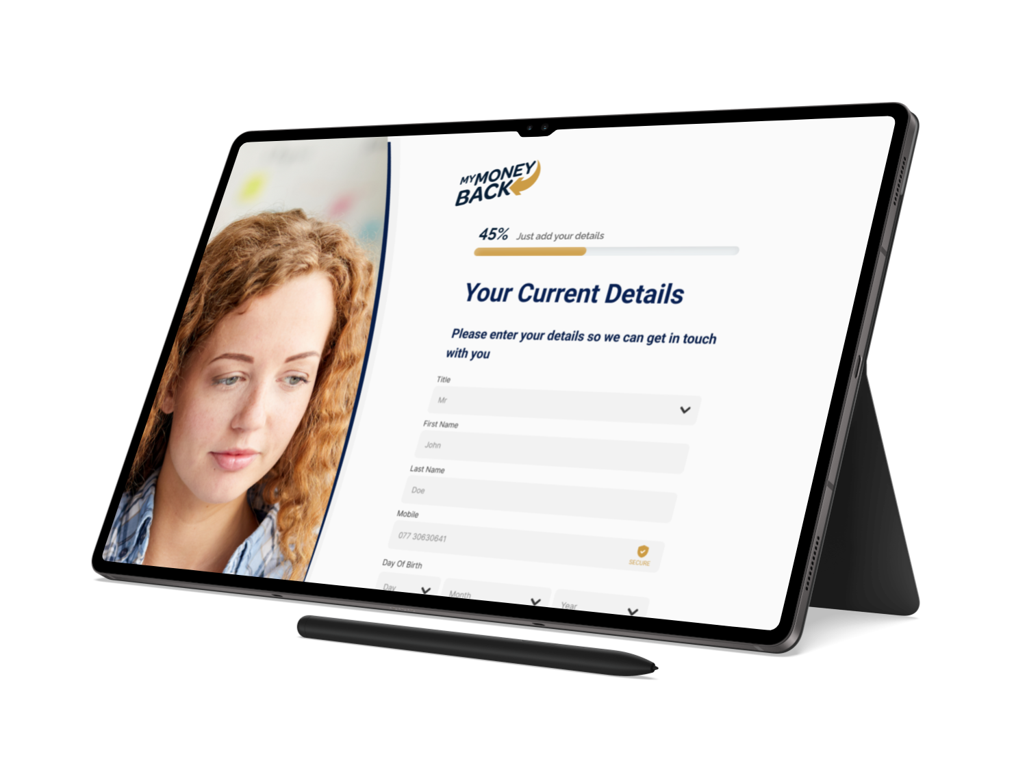
MyMoneyBack is a financial claims service helping people understand whether they may be eligible to reclaim money from unsuitable financial products. The audience includes users with very different levels of financial knowledge and confidence.
The brief was to redesign the claims journey so it felt transparent, credible and manageable. Users needed enough context to make informed decisions without being overwhelmed by legal terminology, lender information or long forms.I delivered a UX audit, competitor analysis, and end-to-end redesign focused on simplifying workflows, improving navigation, and introducing role-based, mobile-optimised experiences.
I led a UX audit and competitor analysis of a medical management application, identifying issues with cluttered navigation, complex workflows, and a lack of role-specific views. Using competitor insights and user personas, I redesigned key flows to simplify access to stock, team, and patient data. The solution introduced clearer navigation, role-based dashboards, task prioritisation, and mobile optimisation to improve efficiency and usability.
DESIGN PRINCIPLE
“Trust is built when every question explains why it matters.”
The Challenge
The application asked users to make complex decisions before they understood the overall process. Long forms, inconsistent terminology and uncertainty around lenders created avoidable hesitation and drop-off.
Users were also providing sensitive financial and personal information. Any unclear question or unexpected request risked damaging trust at the exact moment the journey needed reassurance.
The Diagnosis
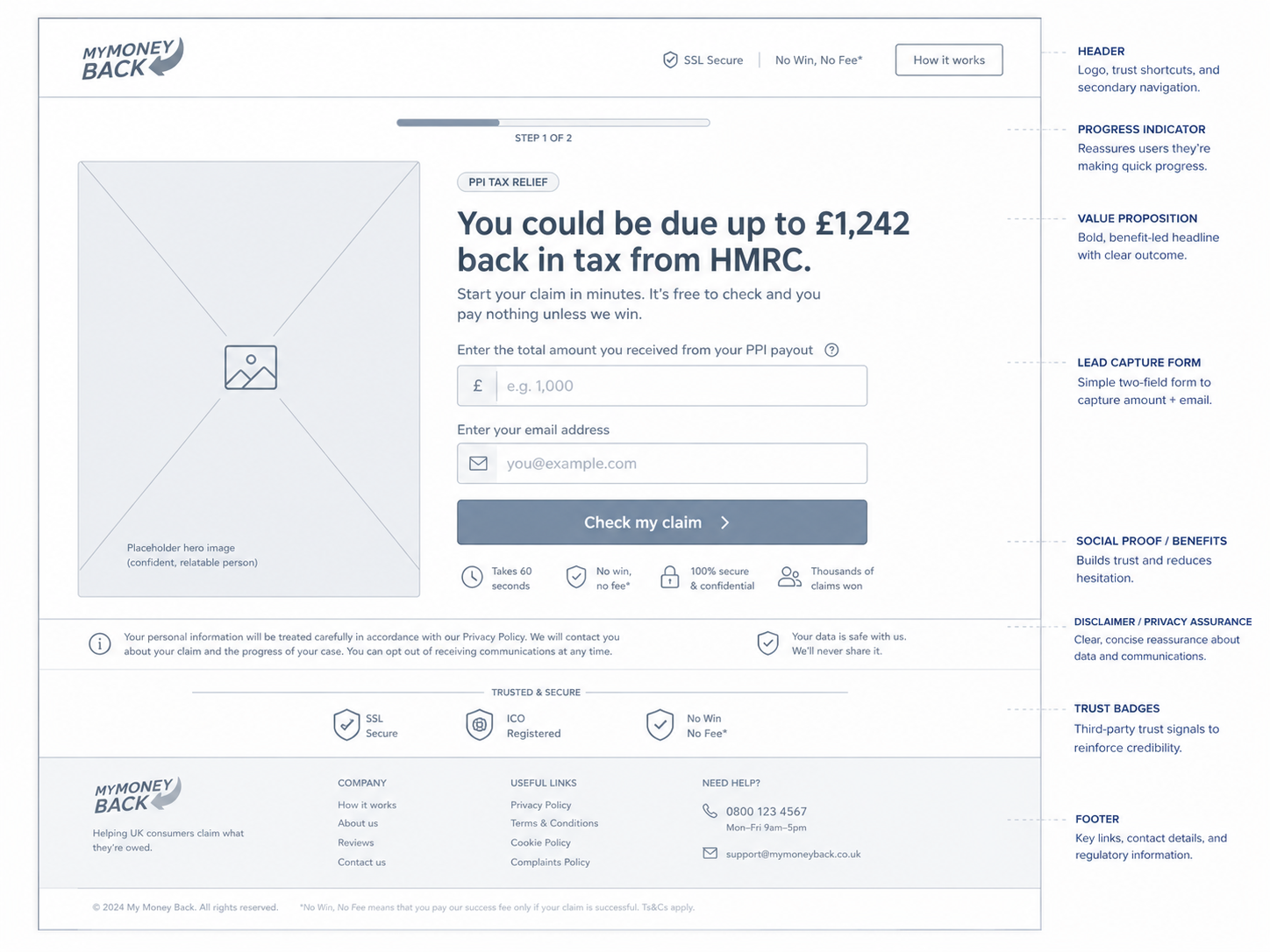
The audit showed that the form was being treated as a single transaction rather than a sequence of confidence-building decisions. Progress was not visible enough, and users could not easily predict how much effort remained.
The content also focused on what the business needed to collect rather than what the user needed to understand. Explanations, consent and support were therefore redesigned as part of the interaction, not as secondary copy.
The Strategy
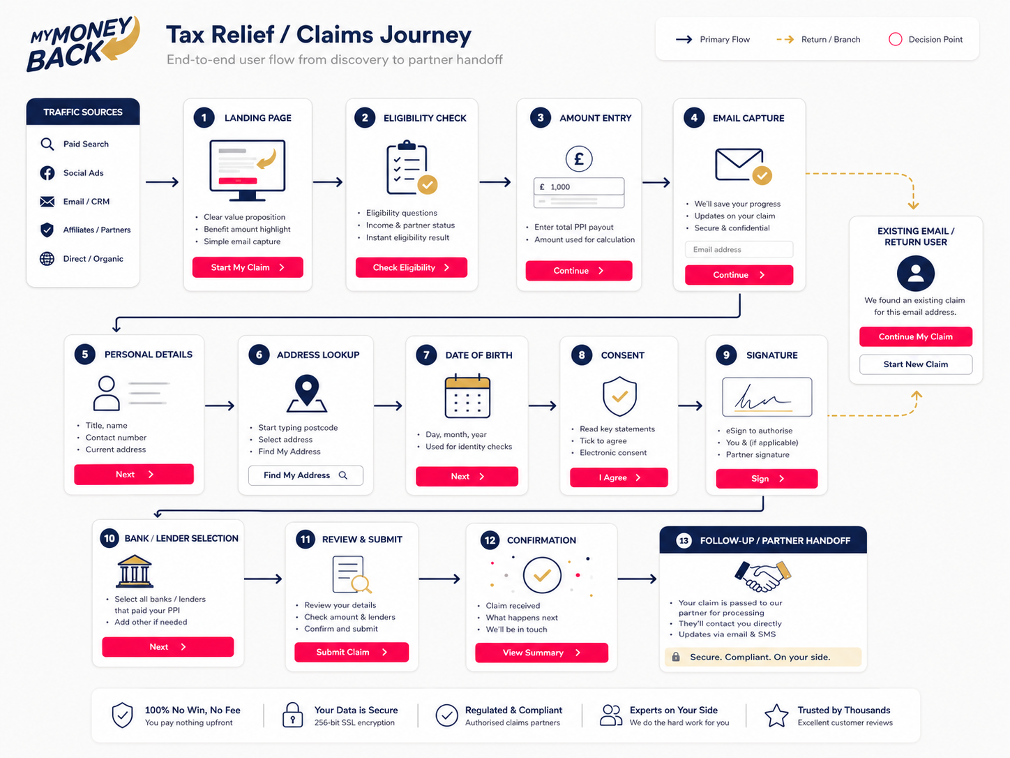
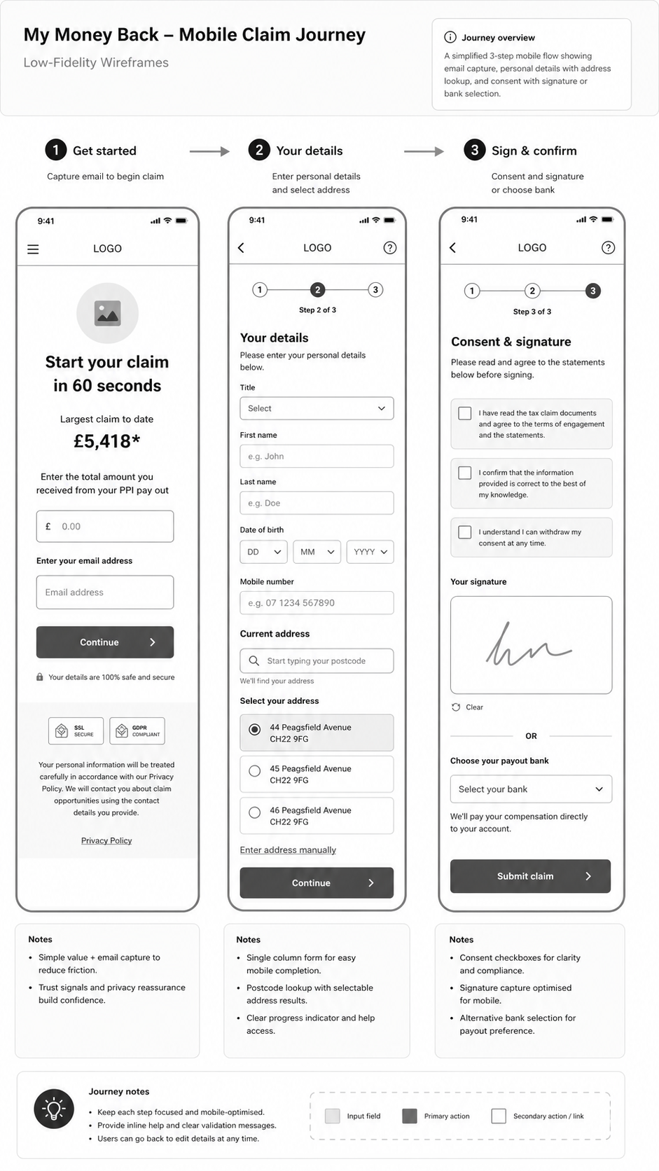
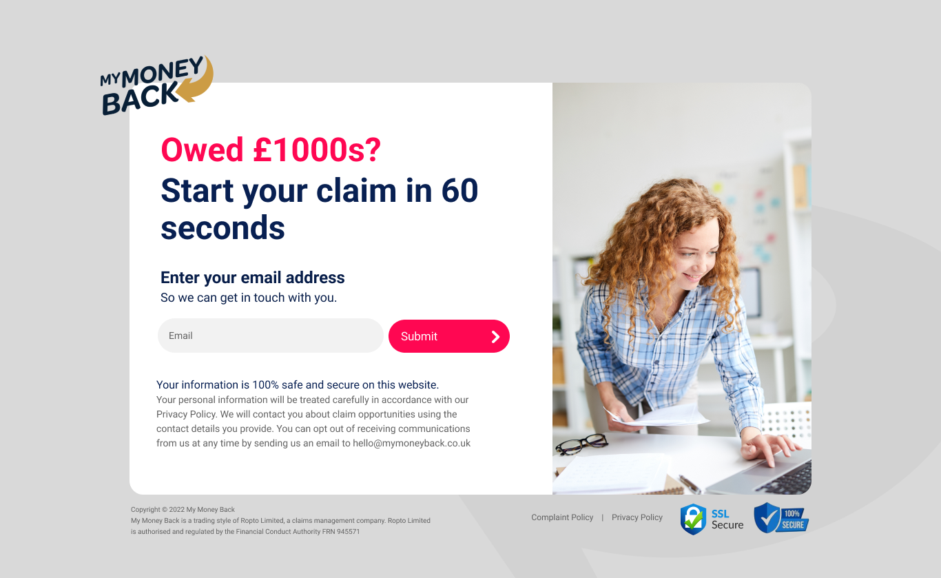
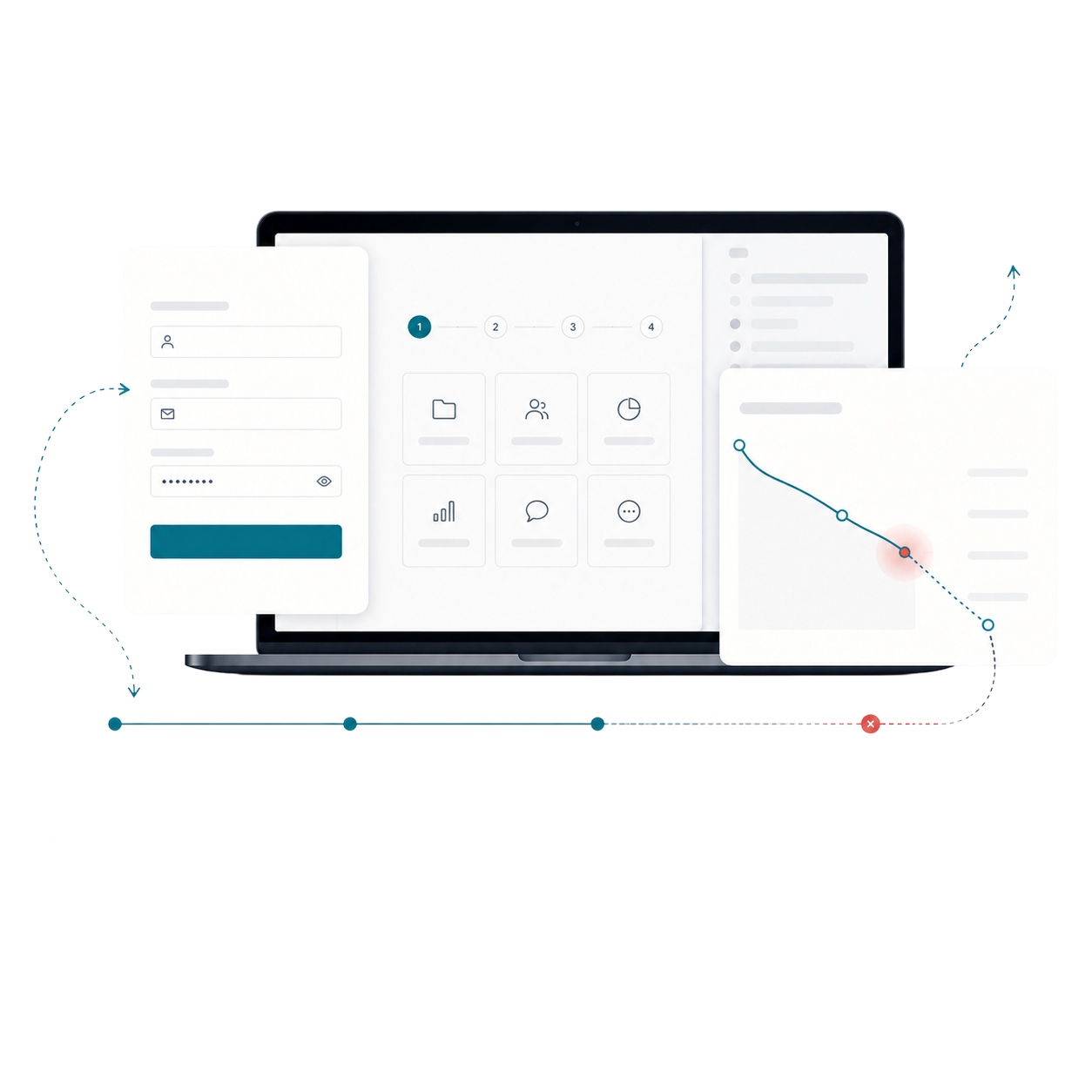
The strategy divided the claim into short stages with a clear purpose, visible progress and a concise explanation of why each group of questions was required.
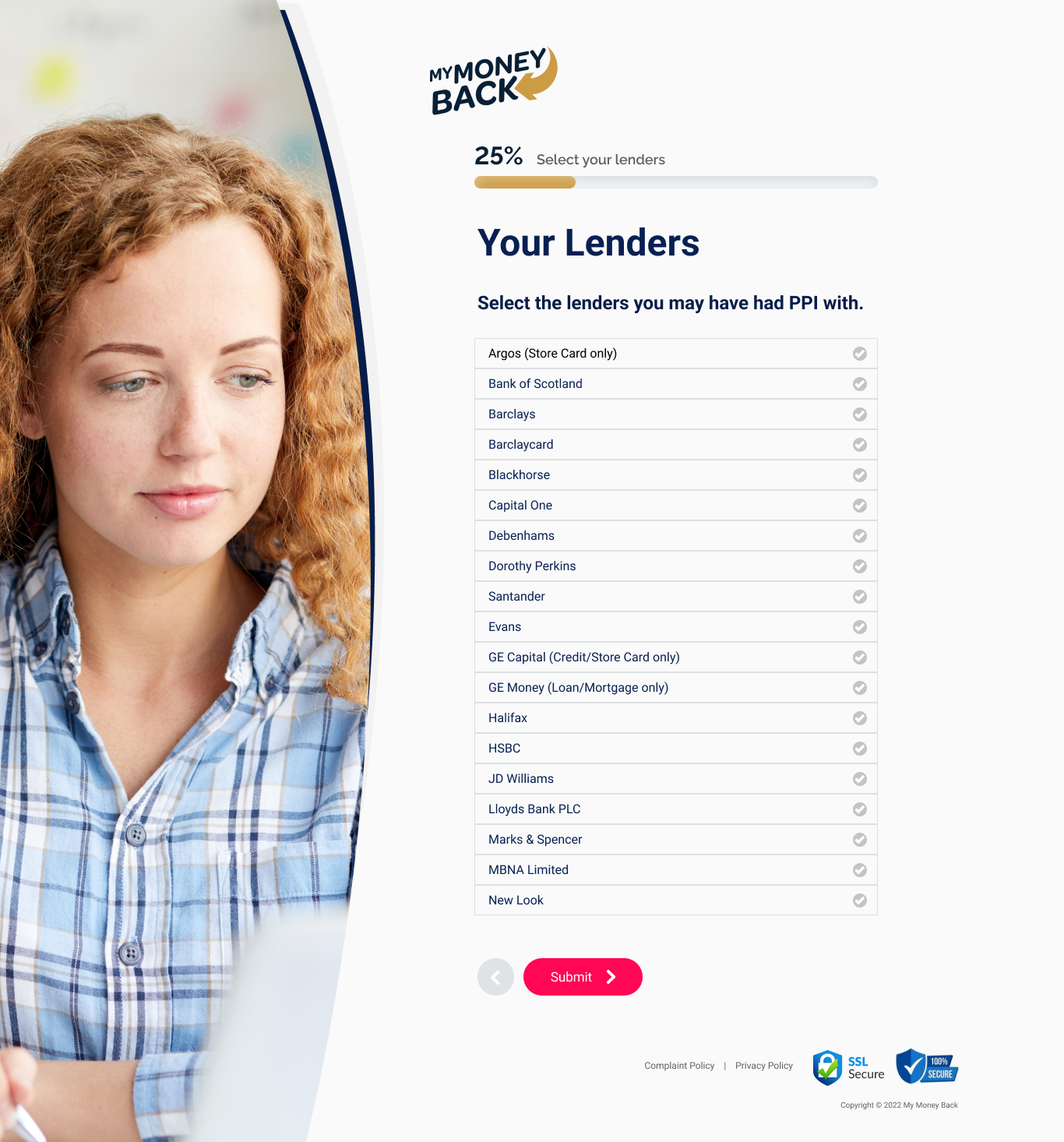
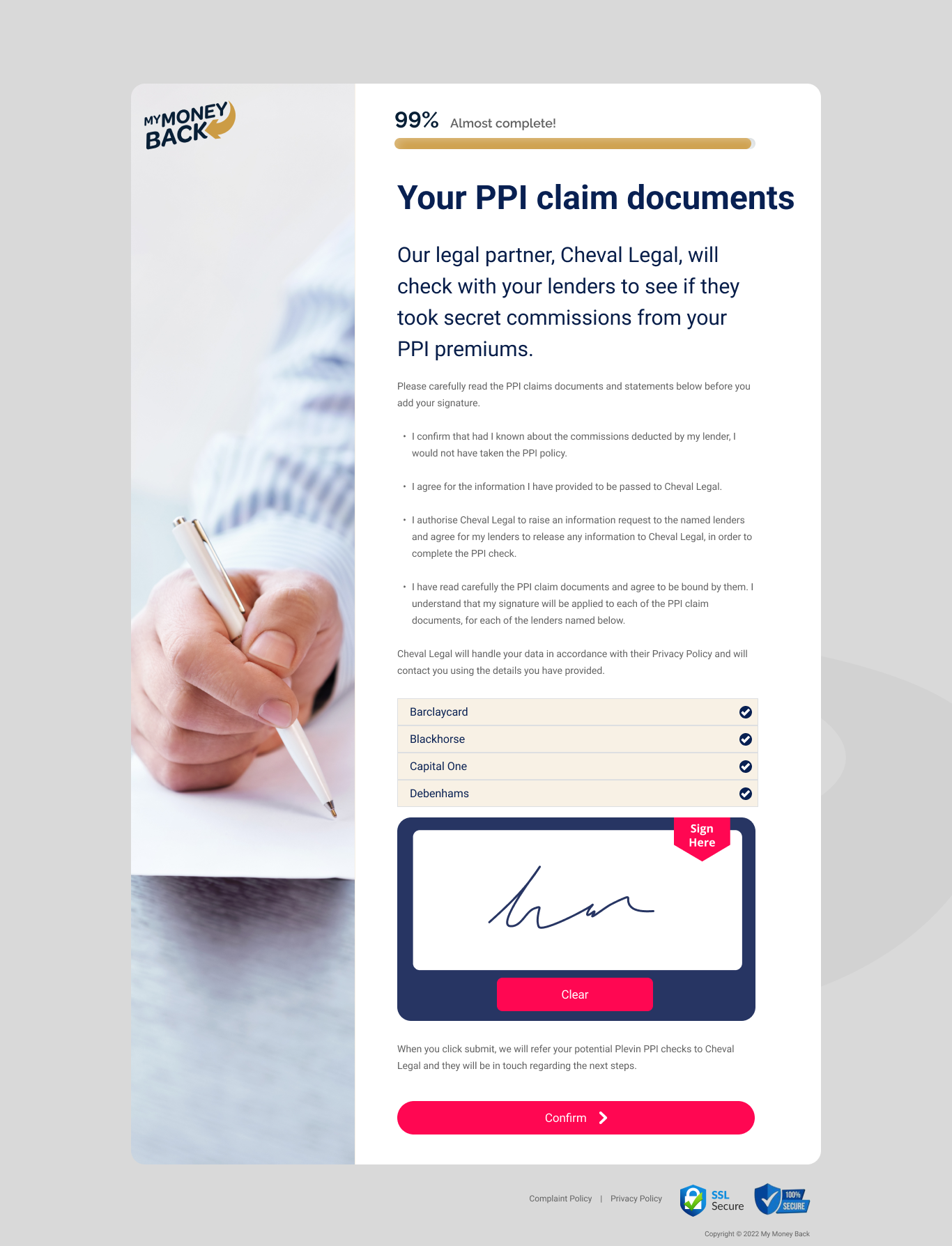
Reusable patterns were created for lender selection, personal details, eligibility, evidence, consent and confirmation. This gave the product a consistent structure that could support several claim types.
User Flow & Structure
The core journey moved from eligibility and lender selection through account details, evidence and submission. Search, recent lenders and an “I am not sure” route reduced the pressure to remember exact financial information.
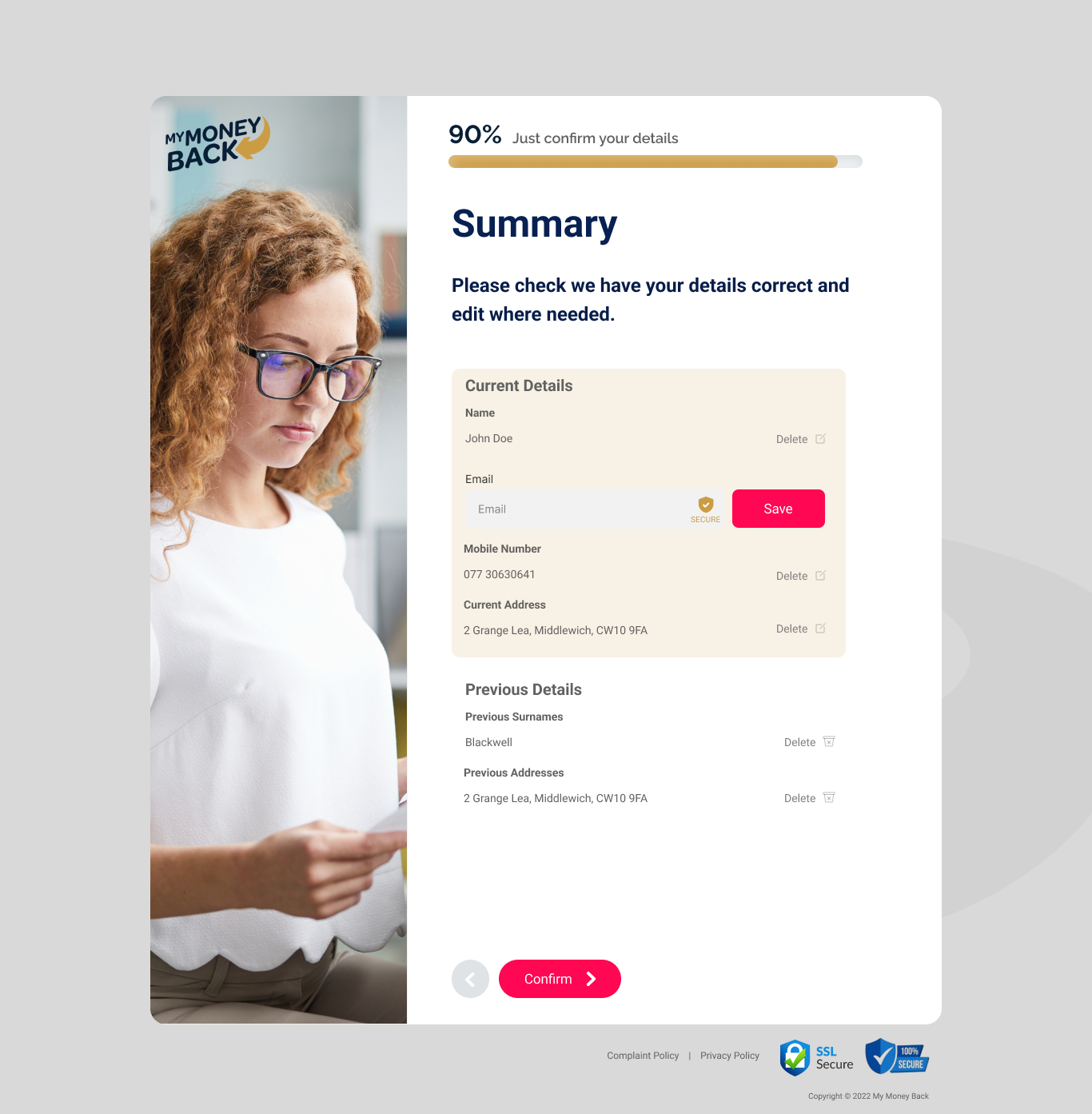
Alternative flows supported missing documents, uncertain answers, validation problems and users returning later. A summary step allowed people to review sensitive information before final submission.
Wireframes
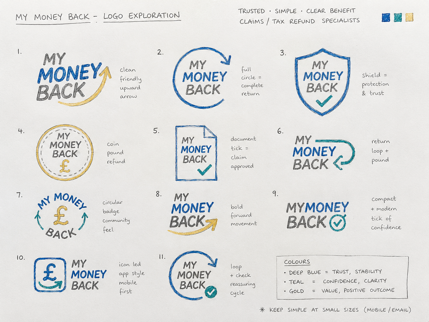
Visual Direction
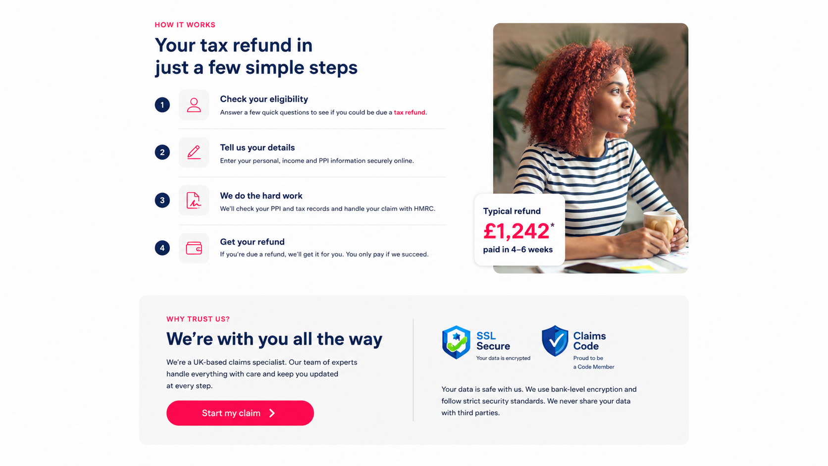
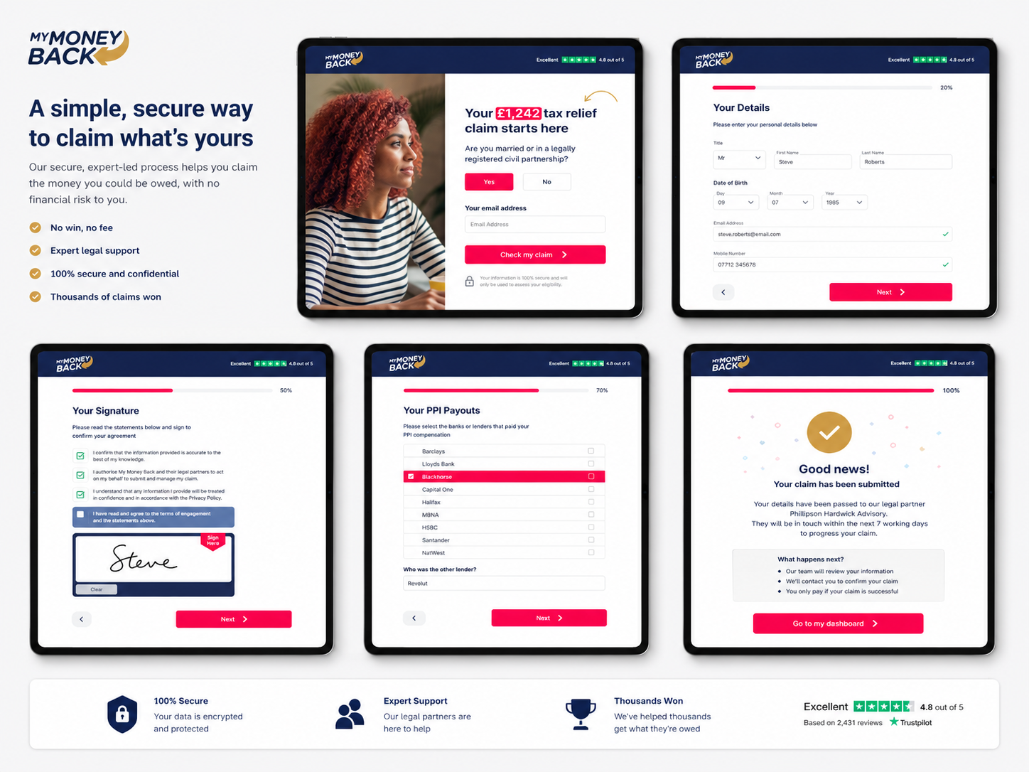
The visual direction balanced financial credibility with a more human, supportive tone. Strong hierarchy, restrained colour and generous spacing helped complex forms feel shorter and easier to scan.
Progress indicators, contextual help and confirmation panels created reassurance without using aggressive sales language. Buttons and form states were standardised across desktop and mobile.
Implementation
The responsive prototype covered the full application, including searchable lender lists, validation, save-and-return behaviour, consent and confirmation states. Components were documented for consistent engineering handoff.
The structure also allowed new claim products to reuse the same foundation while changing the eligibility questions and evidence required for each financial service.

Impact
Illustrative portfolio statistics — replace with verified project data before publishing.
+28%
increase in completed claim journeys
−32%
fewer users abandoning lender selection
+21%
improvement in perceived process clarity
Key Takeaways
01
Explain sensitive questions
Users are more comfortable sharing information when the reason is clear.
02
Show the remaining effort
Visible progress makes a long regulated process feel manageable.
03
Design for uncertainty
Useful alternatives prevent users getting trapped by incomplete knowledge.
START WITH THE PROBLEM
Have a product, store or digital experience that needs clearer thinking?
I help SaaS founders, Shopify brands and agencies diagnose friction, design better journeys and deliver interfaces that can actually be built.


UX · PRODUCT · SHOPIFY · DEVELOPMENT
I solve usability problems before they become business problems — connecting UX, product thinking and build-ready delivery.

Available for selected remote projects


© 2026 Steve Roberts / ME&CO. All rights reserved.



MENU

CASE STUDIES
Portfolio
UX Design & Research
UI Design
Graphic Design
Just Branding
Alt Graphics
Development
Key Areas
UX Audit & Usability AnalysisUser Journey MappingCompetitor AnalysisUser Research (Interviews & Surveys)Conversion-Focused UX DesignInformation ArchitectureForm Design & OptimisationTrust & Credibility DesignUI Design & Visual ClarityAccessibility (WCAG Compliance)Responsive & Mobile-First DesignStakeholder & Business Alignment
Overview
MyMoneyBack is a financial claims service helping people understand whether they may be eligible to reclaim money from unsuitable financial products. The audience includes users with very different levels of financial knowledge and confidence.
The brief was to redesign the claims journey so it felt transparent, credible and manageable. Users needed enough context to make informed decisions without being overwhelmed by legal terminology, lender information or long forms.I delivered a UX audit, competitor analysis, and end-to-end redesign focused on simplifying workflows, improving navigation, and introducing role-based, mobile-optimised experiences.
I led a UX audit and competitor analysis of a medical management application, identifying issues with cluttered navigation, complex workflows, and a lack of role-specific views. Using competitor insights and user personas, I redesigned key flows to simplify access to stock, team, and patient data. The solution introduced clearer navigation, role-based dashboards, task prioritisation, and mobile optimisation to improve efficiency and usability.
DESIGN PRINCIPLE
“Trust is built when every question explains why it matters.”
The Challenge
The application asked users to make complex decisions before they understood the overall process. Long forms, inconsistent terminology and uncertainty around lenders created avoidable hesitation and drop-off.
Users were also providing sensitive financial and personal information. Any unclear question or unexpected request risked damaging trust at the exact moment the journey needed reassurance.
The Diagnosis
The audit showed that the form was being treated as a single transaction rather than a sequence of confidence-building decisions. Progress was not visible enough, and users could not easily predict how much effort remained.
The content also focused on what the business needed to collect rather than what the user needed to understand. Explanations, consent and support were therefore redesigned as part of the interaction, not as secondary copy.
The Strategy
The strategy divided the claim into short stages with a clear purpose, visible progress and a concise explanation of why each group of questions was required.
Reusable patterns were created for lender selection, personal details, eligibility, evidence, consent and confirmation. This gave the product a consistent structure that could support several claim types.
User Flow & Structure
The core journey moved from eligibility and lender selection through account details, evidence and submission. Search, recent lenders and an “I am not sure” route reduced the pressure to remember exact financial information.
Alternative flows supported missing documents, uncertain answers, validation problems and users returning later. A summary step allowed people to review sensitive information before final submission.
Wireframes
Visual Direction
The visual direction balanced financial credibility with a more human, supportive tone. Strong hierarchy, restrained colour and generous spacing helped complex forms feel shorter and easier to scan.
Progress indicators, contextual help and confirmation panels created reassurance without using aggressive sales language. Buttons and form states were standardised across desktop and mobile.
Implementation
The responsive prototype covered the full application, including searchable lender lists, validation, save-and-return behaviour, consent and confirmation states. Components were documented for consistent engineering handoff.
The structure also allowed new claim products to reuse the same foundation while changing the eligibility questions and evidence required for each financial service.
Impact
Illustrative portfolio statistics — replace with verified project data before publishing.
+28%
increase in completed claim journeys
−32%
fewer users abandoning lender selection
+21%
improvement in perceived process clarity
Key Takeaways
01
Explain sensitive questions
Users are more comfortable sharing information when the reason is clear.
02
Show the remaining effort
Visible progress makes a long regulated process feel manageable.
03
Design for uncertainty
Useful alternatives prevent users getting trapped by incomplete knowledge.









START WITH THE PROBLEM
Have a product, store or digital experience that needs clearer thinking?
I help SaaS founders, Shopify brands and agencies diagnose friction, design better journeys and deliver interfaces that can actually be built.


UX · PRODUCT · SHOPIFY · DEVELOPMENT
I solve usability problems before they become business problems — connecting UX, product thinking and build-ready delivery.
Available for selected remote projects


© 2026 Steve Roberts / ME&CO. All rights reserved.

ABOUT
UX CONSULTANT
UX RESEARCH
UI & GRAPHICS
SOFTWARE
PORTFOLIO
RESOURCES
BOOKS
BLOG
