
CASE STUDIES
Portfolio

UX Design & Research
UI Design
Graphic Design
Just Branding
Alt Graphics
Development


Key Areas
App UX & UI Design
VR UI / Spatial Interface Design
User Flow & Journey Design
Interaction Design (2D & Immersive)
Wireframing & Prototyping
Design Systems & Component Design
Cross-Platform UX Strategy
Accessibility & Usability Design
Visual Design & Interface Consistency
Iterative Design & Feedback Cycles
Overview
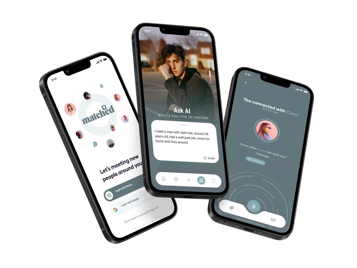
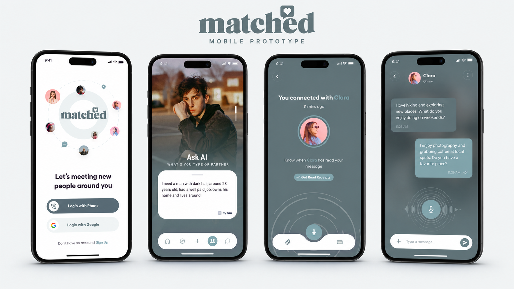
Matched is a mobile-first platform concept that connects people with relevant opportunities, services or professional relationships through guided profiles and recommendations. The product needed to feel personal without becoming intrusive.
The brief was to simplify onboarding, improve the quality of profile information and help users understand why a recommendation was relevant. The experience also needed to support trust, privacy and clear next steps after a match was made.
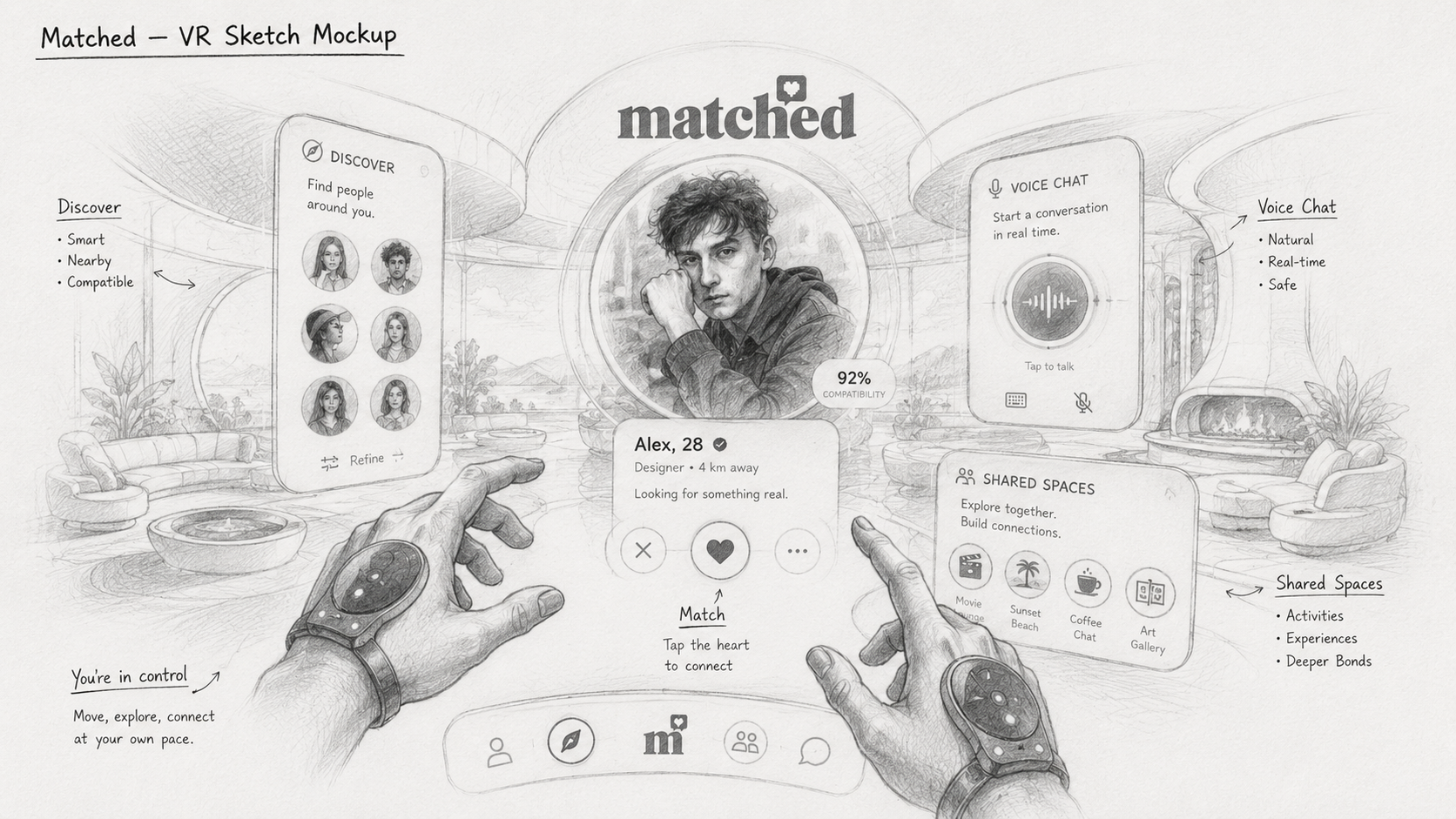
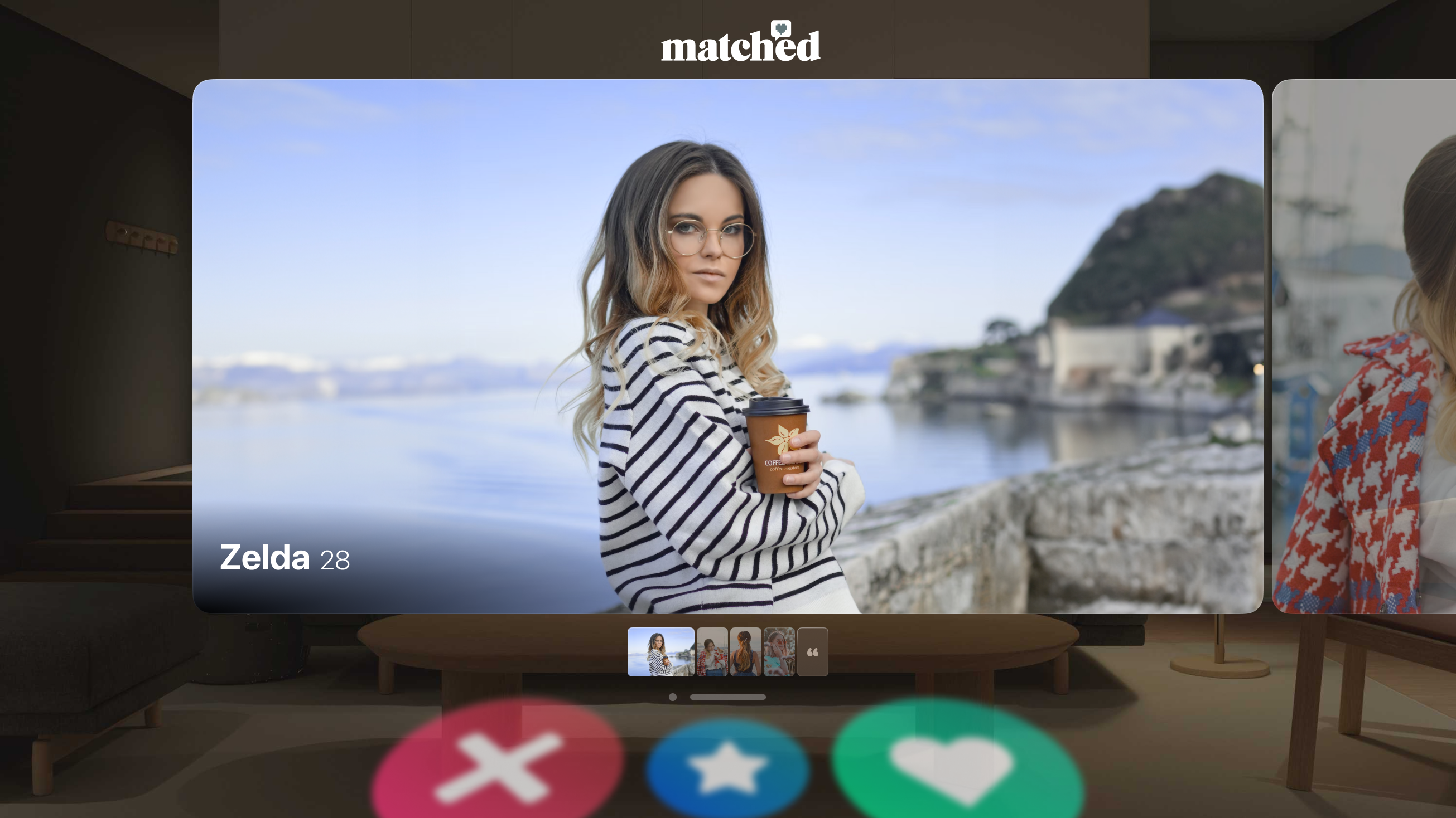
I designed the user experience and interface for Matched, a digital application focused on creating clear, intuitive interactions across both standard app and VR environments. The work involved defining user flows, designing UI systems, and adapting interaction patterns for immersive VR use while maintaining consistency, usability, and accessibility. The final designs delivered a cohesive experience across platforms, balancing visual clarity with intuitive interaction in both 2D and spatial interfaces.
DESIGN PRINCIPLE
“A good match feels personal, but the experience behind it must be predictable.”
The Challenge
Matching platforms often ask for too much information before users receive any value. Long onboarding, unclear profile requirements and generic recommendations can make the process feel mechanical rather than useful.
Users also needed control over visibility and communication. The challenge was to gather enough information for meaningful recommendations while keeping the journey lightweight and transparent.
The Diagnosis
The main issue was a weak connection between profile questions and the recommendations users later received. People could not see how their answers improved the match, so the form felt like administration.
The match screen also focused heavily on visual presentation but did not provide enough evidence, shared interests or practical context to support a confident decision.
The Strategy
The strategy introduced progressive profiling: only essential questions were asked initially, with optional detail added when it improved future recommendations.
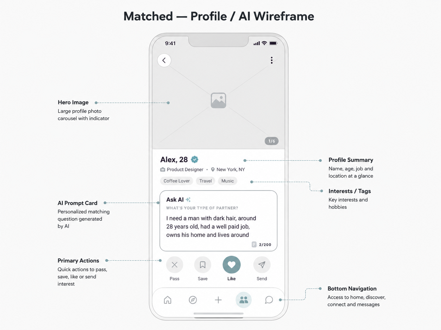
Recommendation cards explained the strongest reasons for each match and offered clear actions to save, dismiss, compare or start a conversation. Privacy controls were embedded throughout the journey.
User Flow & Structure
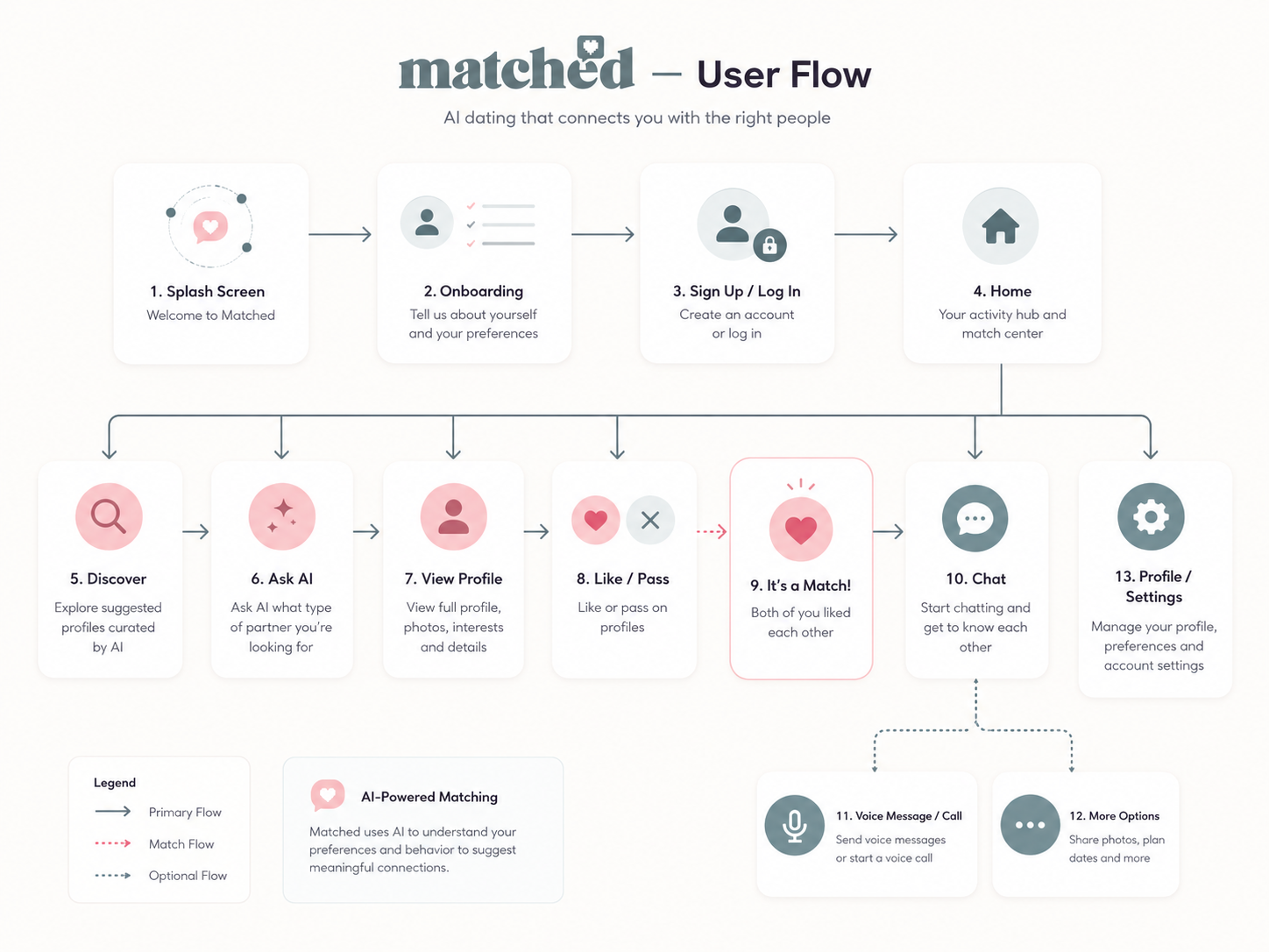
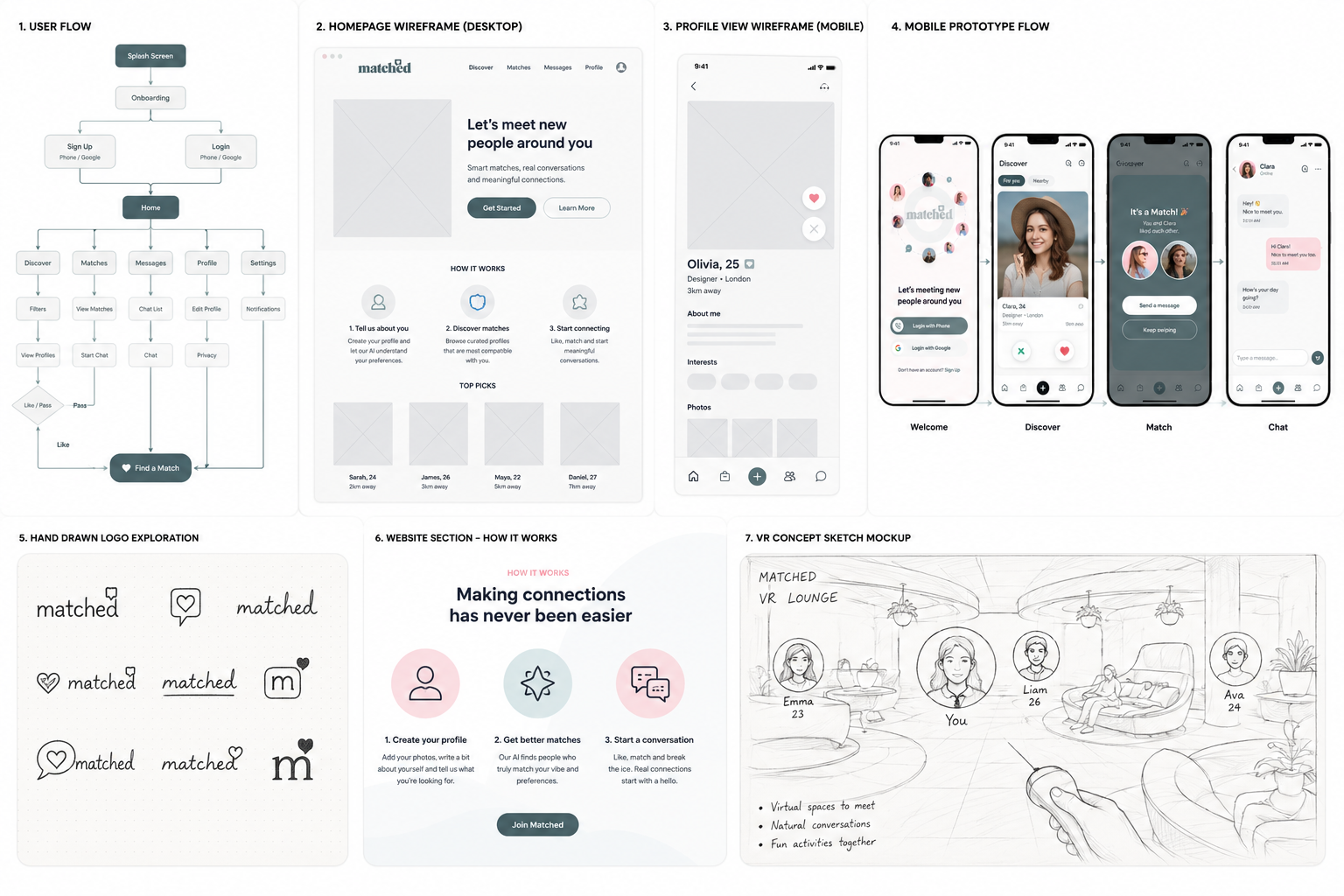
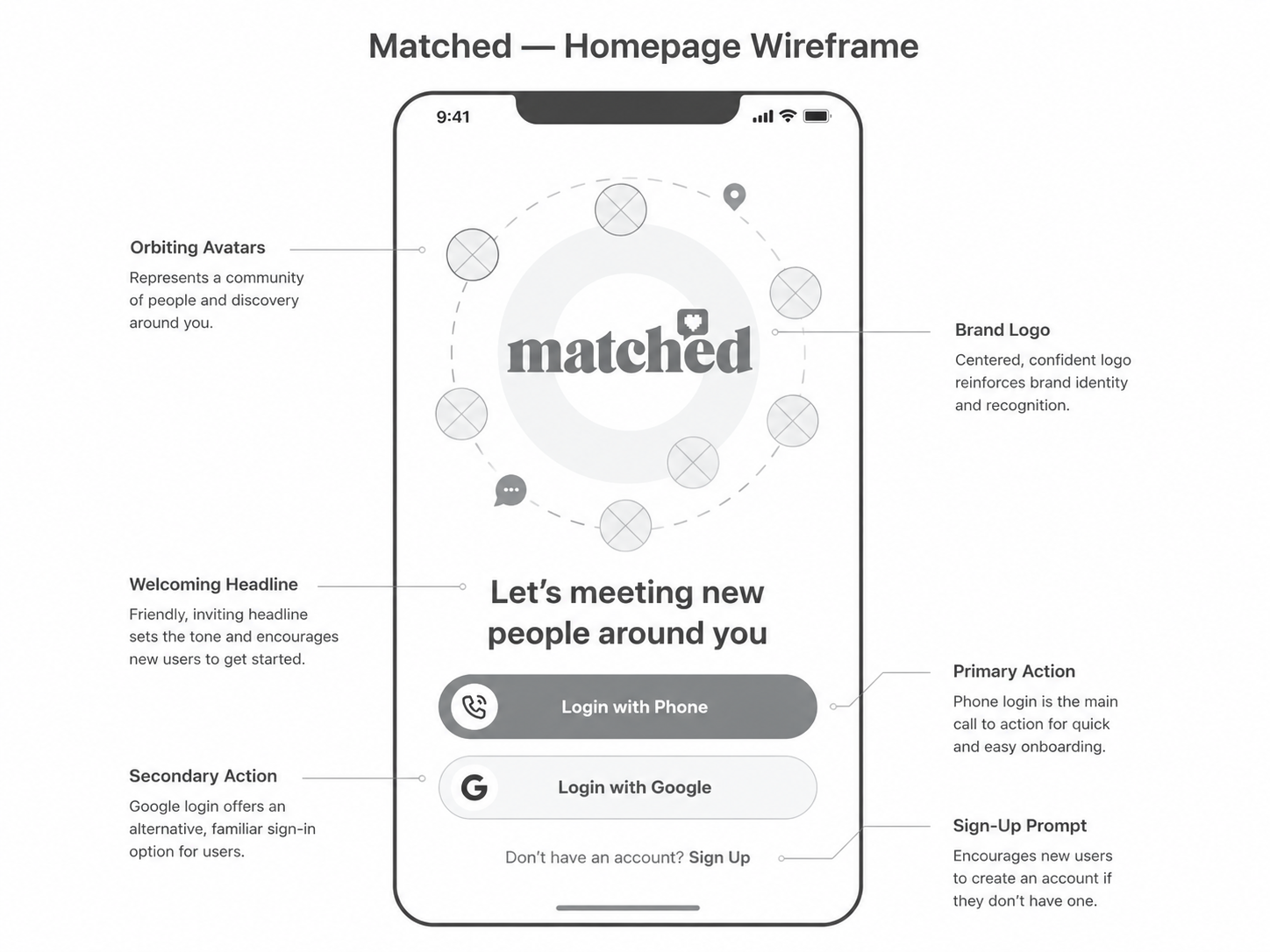
The core flow moved from lightweight account creation to profile essentials, initial recommendations and a detailed match view. Users could refine preferences after seeing value rather than completing a long form in advance.
Alternative paths supported skipped questions, incomplete profiles, paused conversations and unwanted contact. Each interaction made the consequences of visibility and communication settings clear.
Wireframes

Visual Direction
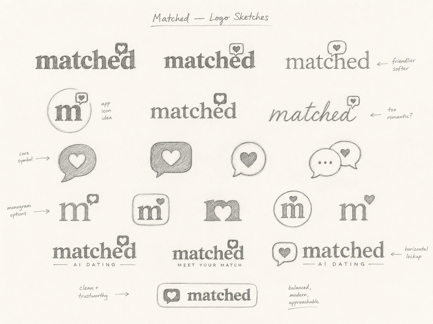
The visual direction used a friendly editorial style with strong profile imagery, clear compatibility signals and generous white space. Warm accents helped the interface feel human without becoming playful or informal.
Cards and conversation states followed consistent patterns, while privacy and safety information used calm, direct language rather than warning-heavy presentation.
Implementation
The prototype included onboarding, profile editing, recommendations, detailed matches, saved items, messaging and reporting controls across mobile and desktop views.
Reusable components were created for profile attributes, compatibility indicators, message states and privacy settings so the experience could scale into new matching categories.

AI Dating
matched

♥
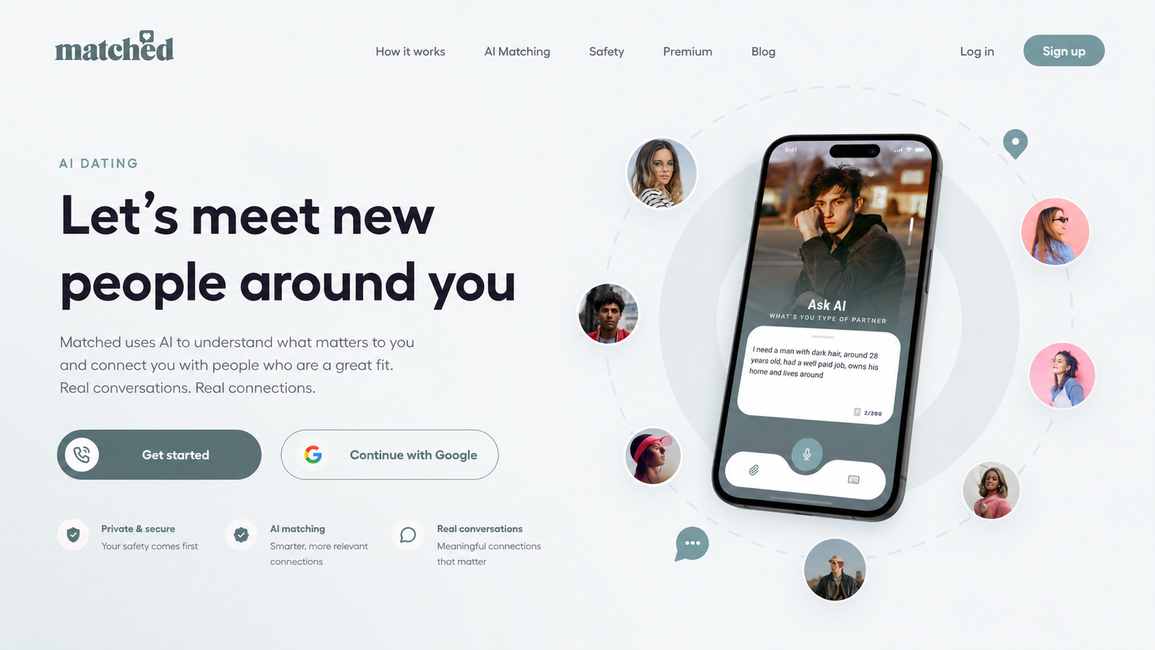
AI Implementation






matched

♥


Zelda
28

à 9 km

♥


Impact
Illustrative portfolio statistics — replace with verified project data before publishing.
+34%
increase in completed profiles
+23%
more users opening detailed matches
−29%
fewer abandoned onboarding sessions
Key Takeaways
01
Show value early
Users provide better information once they understand how it improves results.
02
Explain recommendations
A match becomes credible when the shared reasons are visible.
03
Make privacy active
Control and safety should be part of the main flow, not hidden settings.
START WITH THE PROBLEM
Have a product, store or digital experience that needs clearer thinking?
I help SaaS founders, Shopify brands and agencies diagnose friction, design better journeys and deliver interfaces that can actually be built.


UX · PRODUCT · SHOPIFY · DEVELOPMENT
I solve usability problems before they become business problems — connecting UX, product thinking and build-ready delivery.

Available for selected remote projects


© 2026 Steve Roberts / ME&CO. All rights reserved.



MENU

CASE STUDIES
Portfolio
UX Design & Research
UI Design
Graphic Design
Just Branding
Alt Graphics
Development

Key Areas
App UX & UI Design
VR UI / Spatial Interface Design
User Flow & Journey Design
Interaction Design (2D & Immersive)
Wireframing & Prototyping
Design Systems & Component Design
Cross-Platform UX Strategy
Accessibility & Usability Design
Visual Design & Interface Consistency
Iterative Design & Feedback Cycles
Overview
Matched is a mobile-first platform concept that connects people with relevant opportunities, services or professional relationships through guided profiles and recommendations. The product needed to feel personal without becoming intrusive.
The brief was to simplify onboarding, improve the quality of profile information and help users understand why a recommendation was relevant. The experience also needed to support trust, privacy and clear next steps after a match was made.
I designed the user experience and interface for Matched, a digital application focused on creating clear, intuitive interactions across both standard app and VR environments. The work involved defining user flows, designing UI systems, and adapting interaction patterns for immersive VR use while maintaining consistency, usability, and accessibility. The final designs delivered a cohesive experience across platforms, balancing visual clarity with intuitive interaction in both 2D and spatial interfaces.
DESIGN PRINCIPLE
“A good match feels personal, but the experience behind it must be predictable.”
The Challenge
Matching platforms often ask for too much information before users receive any value. Long onboarding, unclear profile requirements and generic recommendations can make the process feel mechanical rather than useful.
Users also needed control over visibility and communication. The challenge was to gather enough information for meaningful recommendations while keeping the journey lightweight and transparent.
The Diagnosis
The main issue was a weak connection between profile questions and the recommendations users later received. People could not see how their answers improved the match, so the form felt like administration.
The match screen also focused heavily on visual presentation but did not provide enough evidence, shared interests or practical context to support a confident decision.
The Strategy
The strategy introduced progressive profiling: only essential questions were asked initially, with optional detail added when it improved future recommendations.
Recommendation cards explained the strongest reasons for each match and offered clear actions to save, dismiss, compare or start a conversation. Privacy controls were embedded throughout the journey.
User Flow & Structure
The core flow moved from lightweight account creation to profile essentials, initial recommendations and a detailed match view. Users could refine preferences after seeing value rather than completing a long form in advance.
Alternative paths supported skipped questions, incomplete profiles, paused conversations and unwanted contact. Each interaction made the consequences of visibility and communication settings clear.
Wireframes
Visual Direction
The visual direction used a friendly editorial style with strong profile imagery, clear compatibility signals and generous white space. Warm accents helped the interface feel human without becoming playful or informal.
Cards and conversation states followed consistent patterns, while privacy and safety information used calm, direct language rather than warning-heavy presentation.
Implementation
The prototype included onboarding, profile editing, recommendations, detailed matches, saved items, messaging and reporting controls across mobile and desktop views.
Reusable components were created for profile attributes, compatibility indicators, message states and privacy settings so the experience could scale into new matching categories.
AI Dating
matched
♥
AI Implementation
matched
♥
Zelda
28
à 9 km
♥
Impact
Illustrative portfolio statistics — replace with verified project data before publishing.
+34%
increase in completed profiles
+23%
more users opening detailed matches
−29%
fewer abandoned onboarding sessions
Key Takeaways
01
Show value early
Users provide better information once they understand how it improves results.
02
Explain recommendations
A match becomes credible when the shared reasons are visible.
03
Make privacy active
Control and safety should be part of the main flow, not hidden settings.









START WITH THE PROBLEM
Have a product, store or digital experience that needs clearer thinking?
I help SaaS founders, Shopify brands and agencies diagnose friction, design better journeys and deliver interfaces that can actually be built.


UX · PRODUCT · SHOPIFY · DEVELOPMENT
I solve usability problems before they become business problems — connecting UX, product thinking and build-ready delivery.
Available for selected remote projects


© 2026 Steve Roberts / ME&CO. All rights reserved.

ABOUT
UX CONSULTANT
UX RESEARCH
UI & GRAPHICS
SOFTWARE
PORTFOLIO
RESOURCES
BOOKS
BLOG
