
CASE STUDIES
Portfolio

UX Design & Research
UI Design
Graphic Design
Just Branding
Alt Graphics
Development


Key Areas
UX Audit & Heuristic EvaluationStakeholder InterviewsUser Research & Analytics ReviewCompetitor & Market AnalysisInformation Architecture ReviewNavigation & UX Flow Optimisation
Mobile & Responsive UX EvaluationPerformance & Page Load AssessmentAccessibility & Inclusive Design (WCAG)UX Reporting & Prioritised RecommendationsStrategic UX Consultancy
Overview
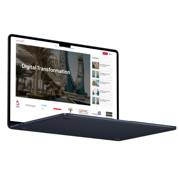
Malomatia is a digital services and technology organisation supporting large-scale transformation programmes. This concept focused on presenting services, expertise and operational tools through a more coherent digital experience.
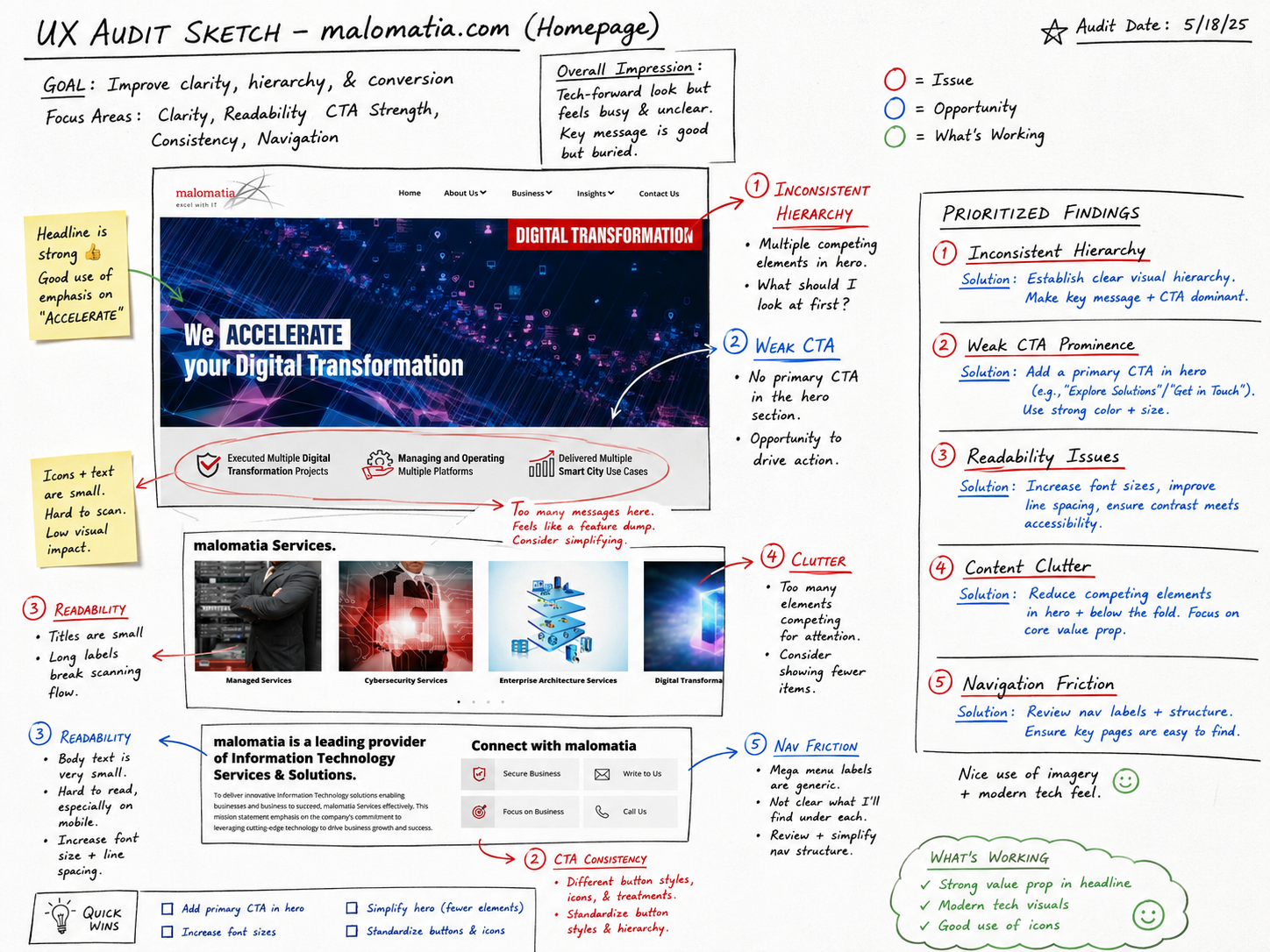
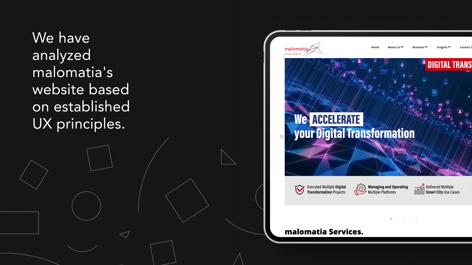
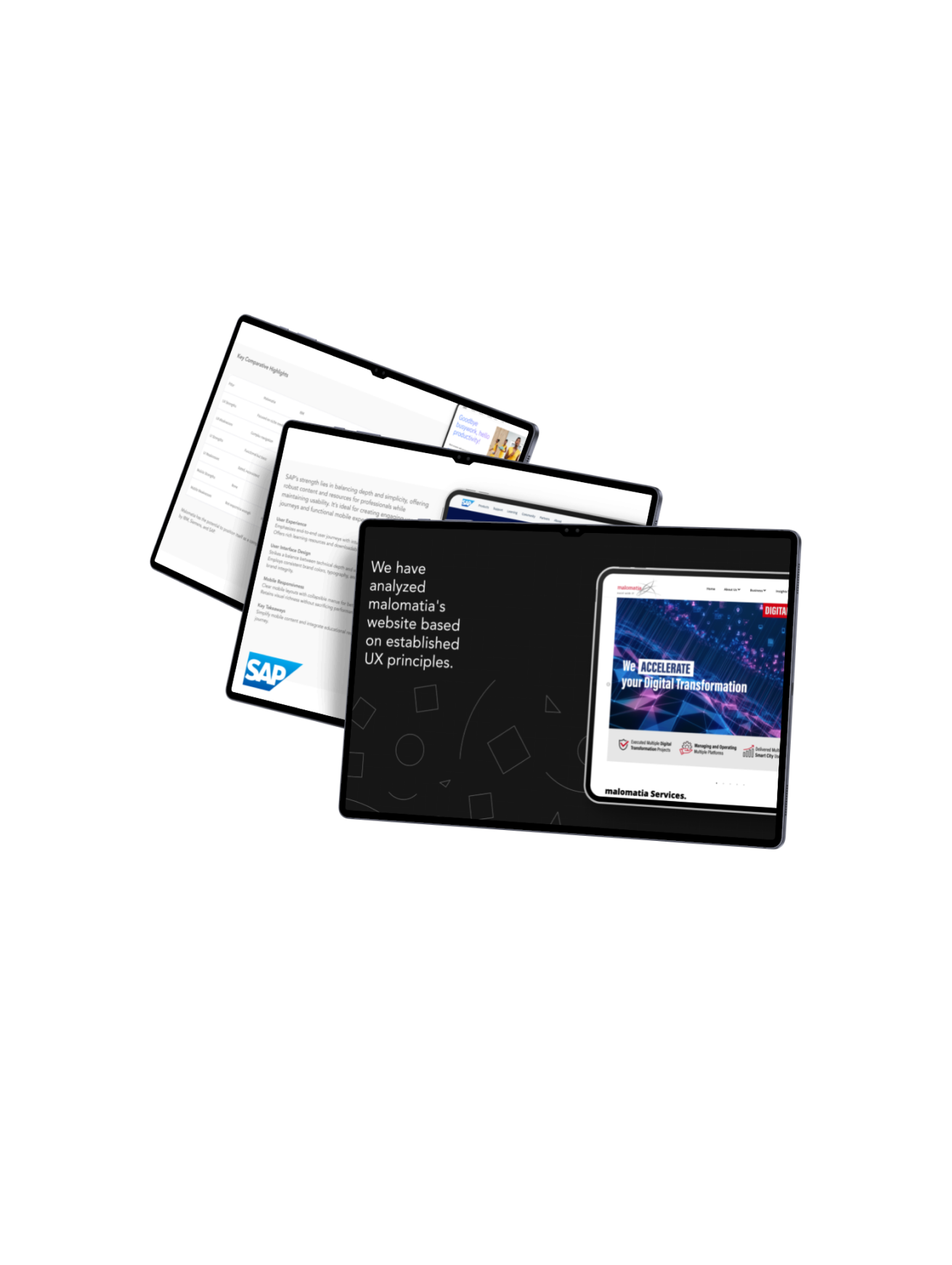
The brief was to create a structure that could speak to public-sector and enterprise audiences while also supporting detailed service information, case studies and internal product workflows.I conducted a comprehensive UX audit of malomatia.com to identify usability, performance, and accessibility issues impacting user engagement.
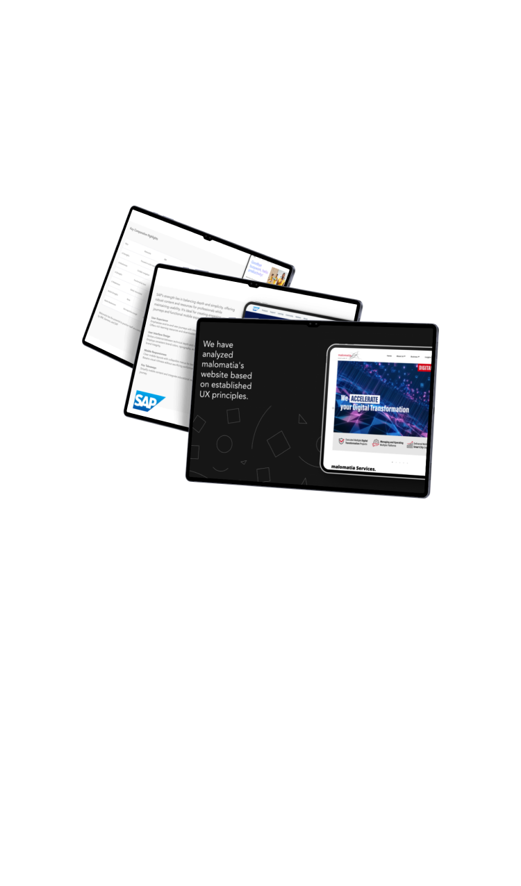
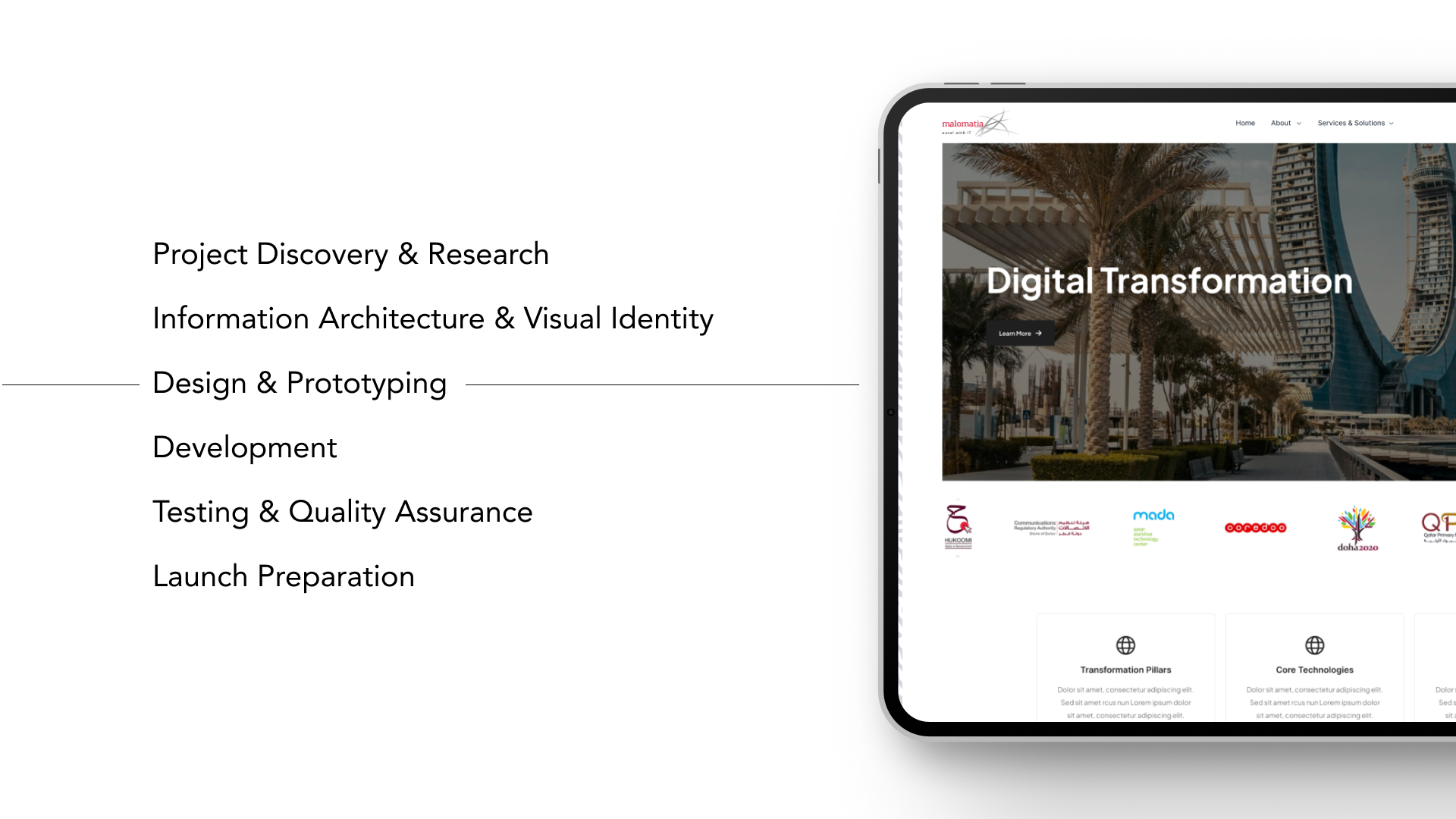
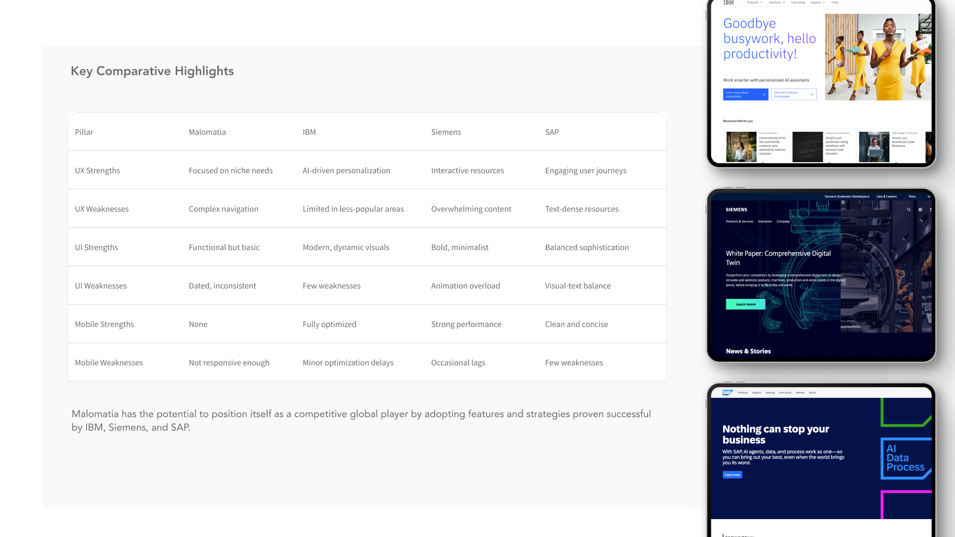
Through heuristic evaluation, stakeholder input, user research, and competitor benchmarking, I assessed navigation, mobile responsiveness, visual hierarchy, and page performance. The audit produced a set of prioritised, actionable recommendations to improve information architecture, accessibility, and overall user experience, aligning the site more closely with user needs and Malomatia’s business goals.
DESIGN PRINCIPLE
“Enterprise products become usable when complexity is organised around real responsibilities.”
The Challenge
The existing information model reflected organisational departments and technical capability. Visitors needed to understand outcomes, services and relevant experience without knowing the company structure.
Enterprise users also encountered dense terminology and similar service descriptions, making it difficult to identify the right route or contact.
The Diagnosis
The audit found that content repeated the same messages at several levels but lacked a clear decision path. Users could browse widely without becoming more certain about which service matched their need.
Case studies and credentials were separated from service information, weakening evidence at the point where users were evaluating capability.
The Strategy
The strategy reorganised content around client objectives such as digital transformation, managed services, data and citizen experience.
Each service connected outcomes, capabilities, relevant sectors and proof in one predictable structure. Clear routes supported procurement, partnership and recruitment audiences.
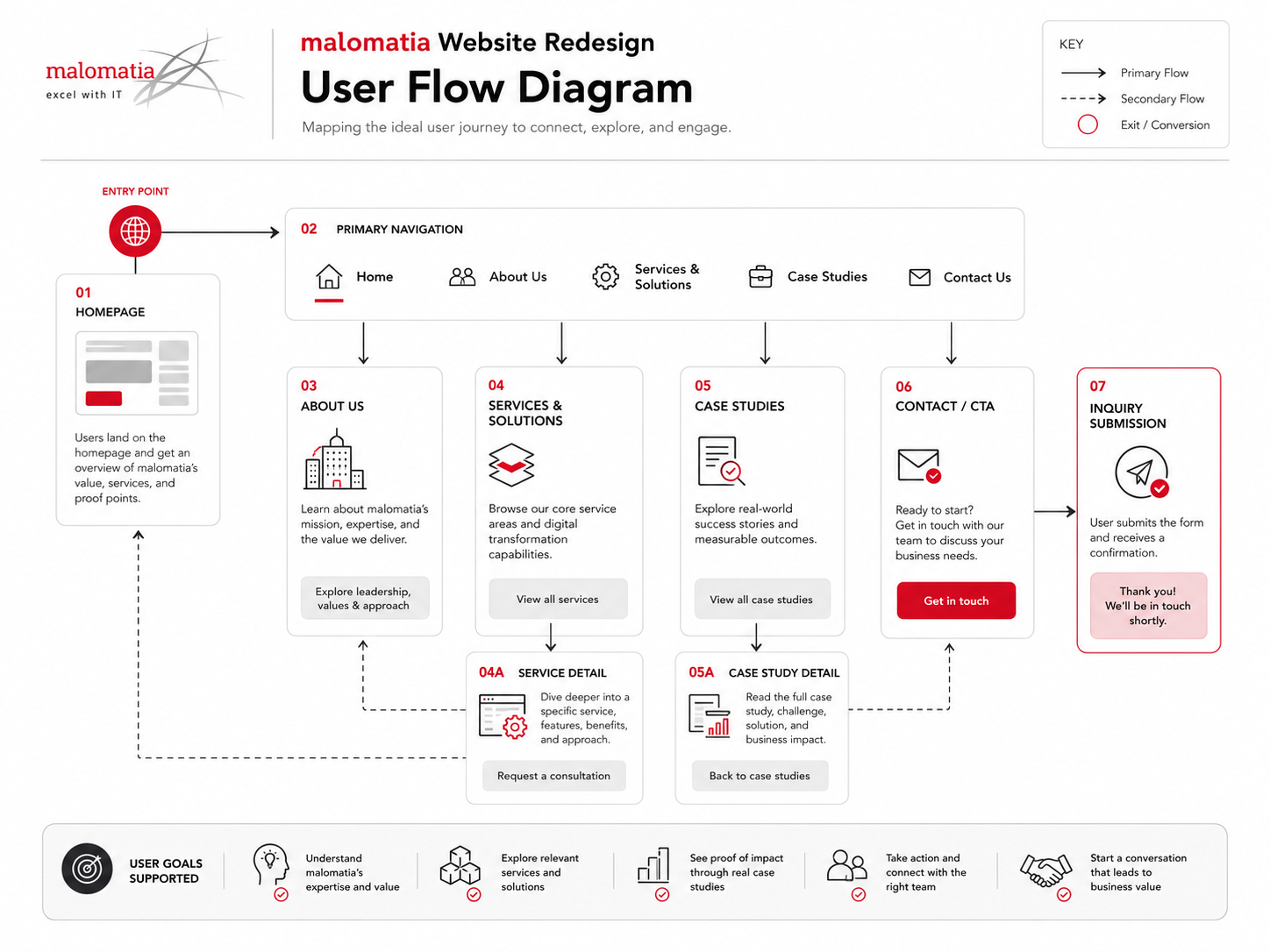
User Flow & Structure
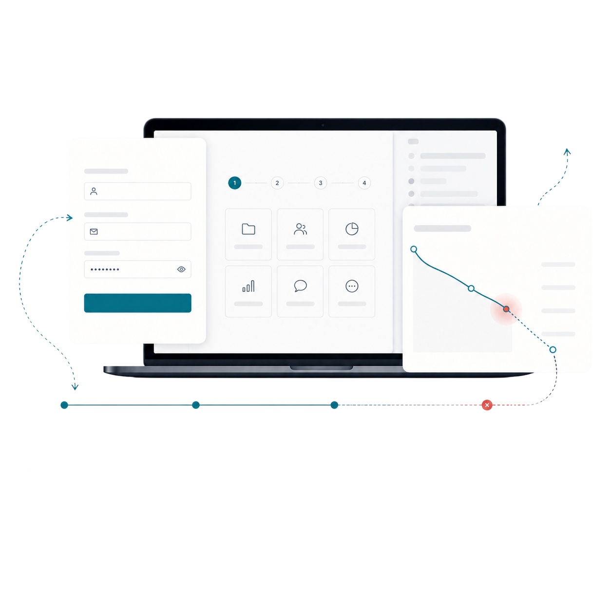
The primary journey moved from an organisational challenge into a service overview, detailed capability and relevant case study before contact.
Search and cross-linking supported users who arrived through technical terms, while persistent context helped them understand where each capability sat within the wider offer.
Wireframes
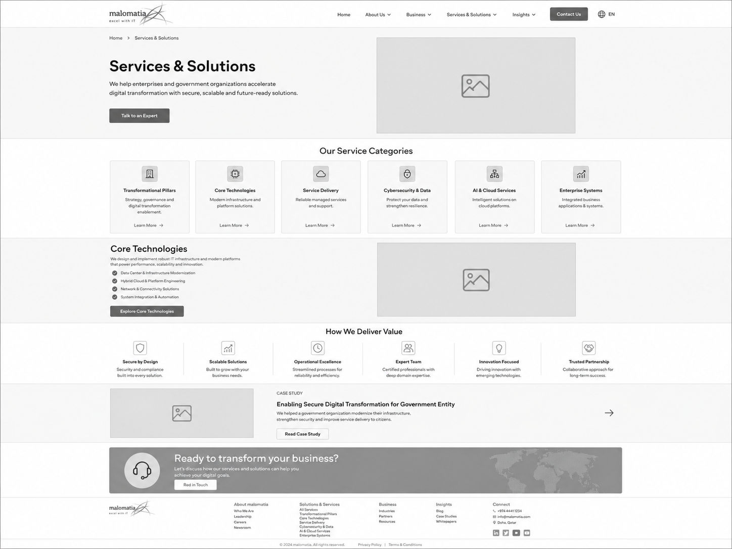
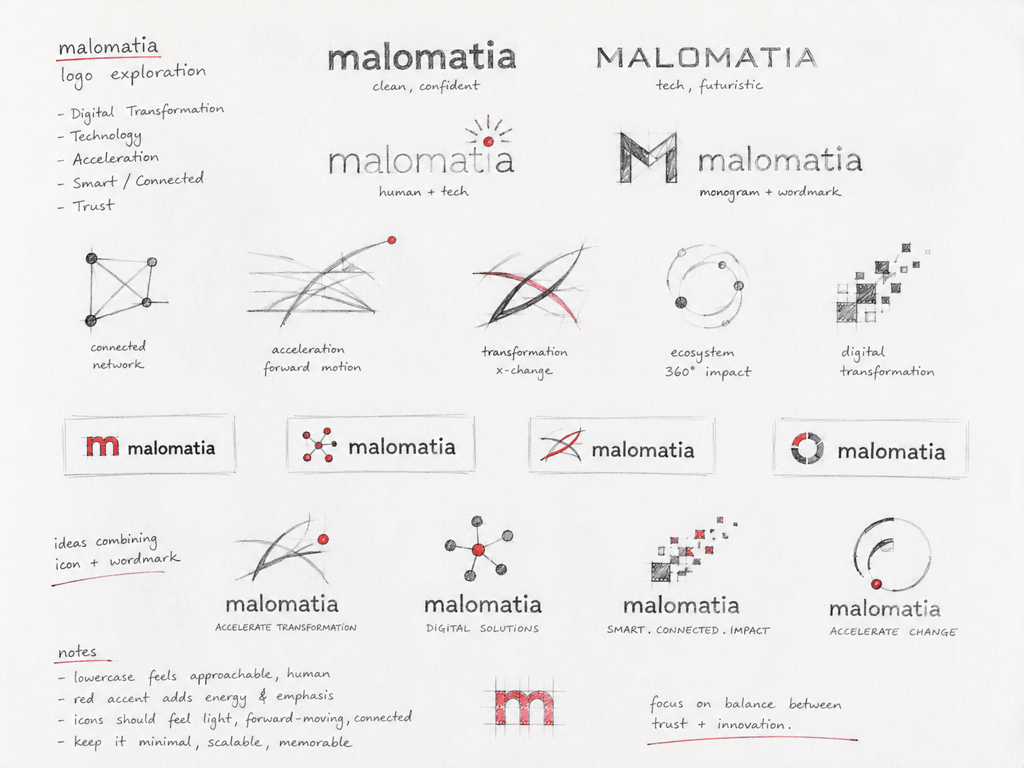
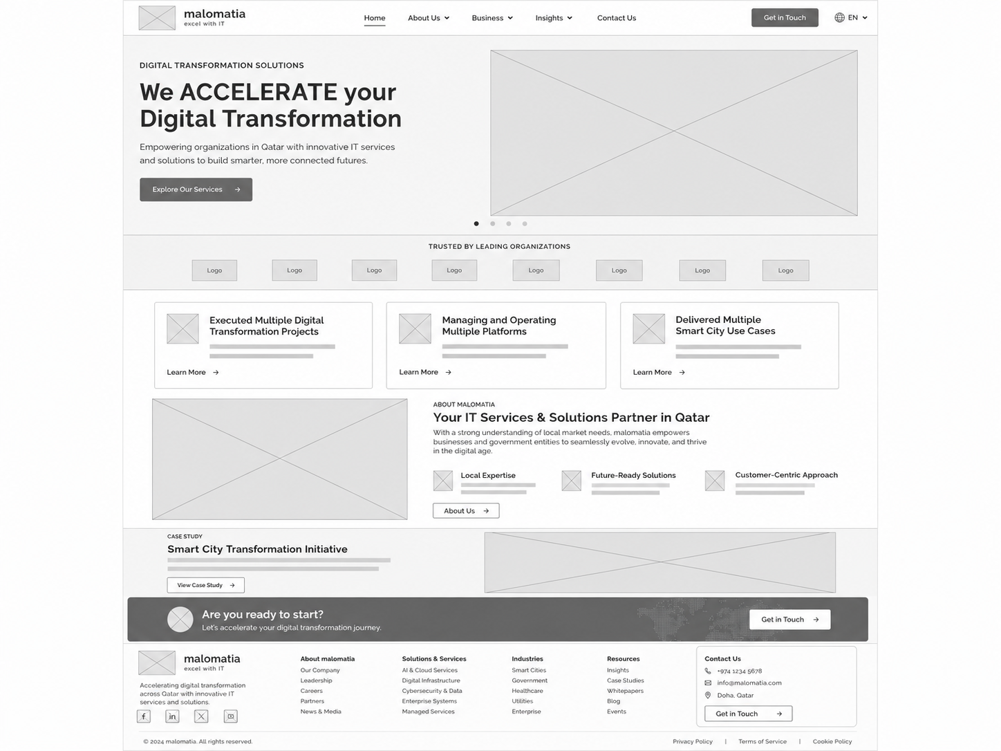
Visual Direction
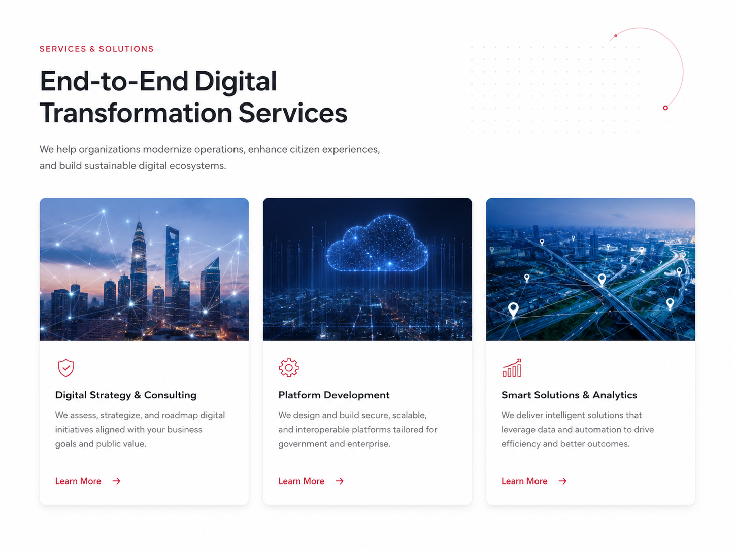
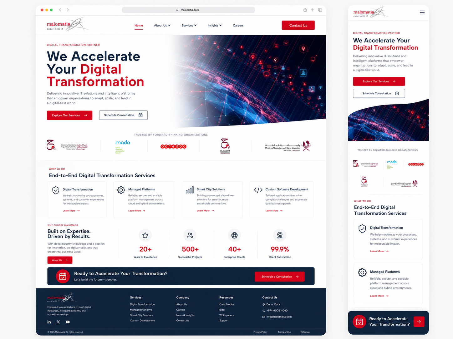
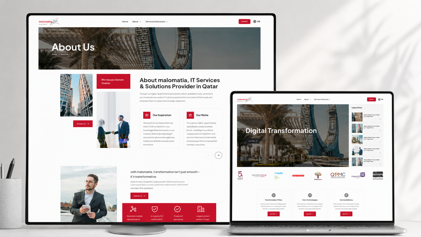
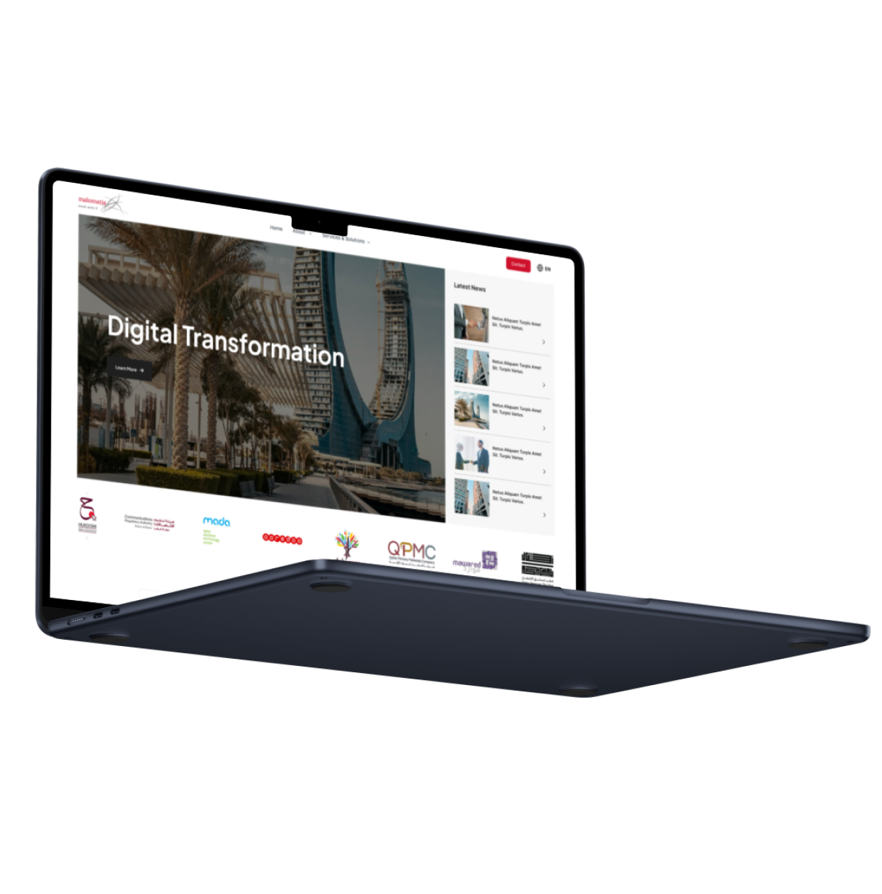
The visual direction used confident enterprise typography, structured grids and focused colour. Large-scale imagery communicated regional ambition while diagrams clarified service relationships.
Cards and evidence panels followed consistent rules so detailed information remained scannable across desktop and tablet.
Implementation
The responsive designs included service navigation, capability pages, sector content, case studies and contact routes. Reusable modules supported different content depths without changing page behaviour.
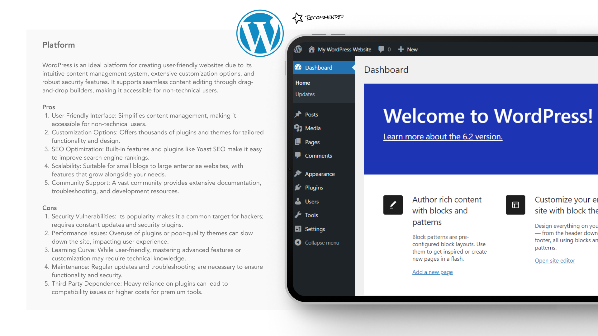
A content model and component library gave internal teams a consistent way to publish new services and transformation stories.
Impact
Illustrative portfolio statistics — replace with verified project data before publishing.
+26%
increase in service-page engagement
−31%
less time required to find a relevant capability
+18%
growth in qualified contact journeys
Key Takeaways
01
Lead with client outcomes
Enterprise audiences need to recognise their challenge before technical capability.
02
Place evidence near claims
Case studies are strongest when they support a specific service decision.
03
Create a content system
Large organisations need repeatable structures to prevent future fragmentation.
START WITH THE PROBLEM
Have a product, store or digital experience that needs clearer thinking?
I help SaaS founders, Shopify brands and agencies diagnose friction, design better journeys and deliver interfaces that can actually be built.


UX · PRODUCT · SHOPIFY · DEVELOPMENT
I solve usability problems before they become business problems — connecting UX, product thinking and build-ready delivery.

Available for selected remote projects


© 2026 Steve Roberts / ME&CO. All rights reserved.



MENU

CASE STUDIES
Portfolio
UX Design & Research
UI Design
Graphic Design
Just Branding
Alt Graphics
Development
Key Areas
UX Audit & Heuristic EvaluationStakeholder InterviewsUser Research & Analytics ReviewCompetitor & Market AnalysisInformation Architecture ReviewNavigation & UX Flow Optimisation
Mobile & Responsive UX EvaluationPerformance & Page Load AssessmentAccessibility & Inclusive Design (WCAG)UX Reporting & Prioritised RecommendationsStrategic UX Consultancy
Overview
Malomatia is a digital services and technology organisation supporting large-scale transformation programmes. This concept focused on presenting services, expertise and operational tools through a more coherent digital experience.
The brief was to create a structure that could speak to public-sector and enterprise audiences while also supporting detailed service information, case studies and internal product workflows.I conducted a comprehensive UX audit of malomatia.com to identify usability, performance, and accessibility issues impacting user engagement.
Through heuristic evaluation, stakeholder input, user research, and competitor benchmarking, I assessed navigation, mobile responsiveness, visual hierarchy, and page performance. The audit produced a set of prioritised, actionable recommendations to improve information architecture, accessibility, and overall user experience, aligning the site more closely with user needs and Malomatia’s business goals.
DESIGN PRINCIPLE
“Enterprise products become usable when complexity is organised around real responsibilities.”
The Challenge
The existing information model reflected organisational departments and technical capability. Visitors needed to understand outcomes, services and relevant experience without knowing the company structure.
Enterprise users also encountered dense terminology and similar service descriptions, making it difficult to identify the right route or contact.
The Diagnosis
The audit found that content repeated the same messages at several levels but lacked a clear decision path. Users could browse widely without becoming more certain about which service matched their need.
Case studies and credentials were separated from service information, weakening evidence at the point where users were evaluating capability.
The Strategy
The strategy reorganised content around client objectives such as digital transformation, managed services, data and citizen experience.
Each service connected outcomes, capabilities, relevant sectors and proof in one predictable structure. Clear routes supported procurement, partnership and recruitment audiences.
User Flow & Structure
The primary journey moved from an organisational challenge into a service overview, detailed capability and relevant case study before contact.
Search and cross-linking supported users who arrived through technical terms, while persistent context helped them understand where each capability sat within the wider offer.
Wireframes
Visual Direction
The visual direction used confident enterprise typography, structured grids and focused colour. Large-scale imagery communicated regional ambition while diagrams clarified service relationships.
Cards and evidence panels followed consistent rules so detailed information remained scannable across desktop and tablet.
Implementation
The responsive designs included service navigation, capability pages, sector content, case studies and contact routes. Reusable modules supported different content depths without changing page behaviour.
A content model and component library gave internal teams a consistent way to publish new services and transformation stories.
Impact
Illustrative portfolio statistics — replace with verified project data before publishing.
+26%
increase in service-page engagement
−31%
less time required to find a relevant capability
+18%
growth in qualified contact journeys
Key Takeaways
01
Lead with client outcomes
Enterprise audiences need to recognise their challenge before technical capability.
02
Place evidence near claims
Case studies are strongest when they support a specific service decision.
03
Create a content system
Large organisations need repeatable structures to prevent future fragmentation.









START WITH THE PROBLEM
Have a product, store or digital experience that needs clearer thinking?
I help SaaS founders, Shopify brands and agencies diagnose friction, design better journeys and deliver interfaces that can actually be built.


UX · PRODUCT · SHOPIFY · DEVELOPMENT
I solve usability problems before they become business problems — connecting UX, product thinking and build-ready delivery.
Available for selected remote projects


© 2026 Steve Roberts / ME&CO. All rights reserved.

ABOUT
UX CONSULTANT
UX RESEARCH
UI & GRAPHICS
SOFTWARE
PORTFOLIO
RESOURCES
BOOKS
BLOG
