
CASE STUDIES
Portfolio

UX Design & Research
UI Design
Graphic Design
Just Branding
Alt Graphics
Development


Key Areas
Brand Identity Design
App UX & UI Design
Website Design & UX
Visual Design Systems
Marketing & Print Design
Business Cards & Leaflet Design
Cross-Channel Brand Consistency
User-Centred Design
Art Direction
End-to-End Creative Delivery
Overview
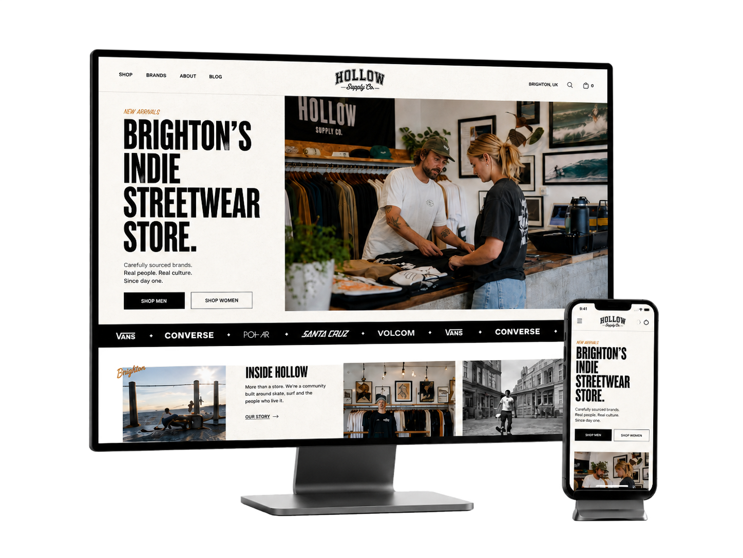
Hollow Supply Co is an independent lifestyle and apparel brand with a strong editorial identity. The ecommerce experience needed to express the brand through photography, typography and tone while remaining practical for repeat customers.
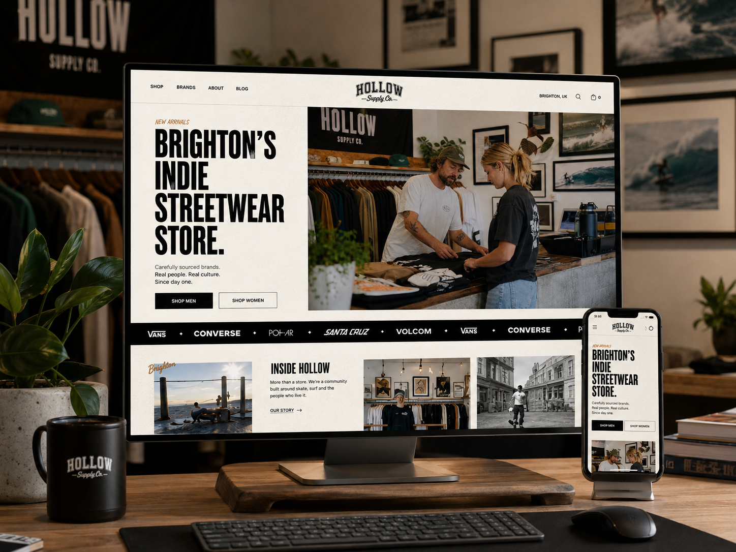
The brief was to redesign the storefront around collections, product stories and a faster purchase journey. The site needed to support seasonal campaigns, limited releases and mobile shoppers without relying on a conventional catalogue appearance.Hollow Supply Co. originally had a very standard ecommerce experience — functional, but visually generic and lacking the personality of the actual Brighton store. The original site focused heavily on products and navigation, but didn’t communicate the culture, community, or independent identity behind the brand.
The redesign transformed Hollow from a basic online clothing store into a community-led streetwear destination inspired by Brighton’s skate and surf culture. The new direction introduced a far more immersive and editorial experience, using bold typography, layered layouts, lifestyle photography, and branded storytelling to better reflect the atmosphere of the physical store.
A major part of the strategy was shifting the brand from being purely transactional to community-driven. The redesigned experience introduced areas for local culture, featured drops, store stories, Brighton-inspired content, and customer participation — helping Hollow build stronger emotional connections with its audience rather than simply selling products.
The updated design also improved the customer journey through:
stronger brand identity
more engaging product discovery
modern ecommerce UX patterns
clearer navigation
immersive campaign sections
mobile-first interactions
elevated visual storytelling
By combining ecommerce with culture and community, Hollow became more than just a reseller website — it became a digital extension of the Brighton store and the people around it.

DESIGN PRINCIPLE
“Brand character should guide the journey, not compete with it.”
The Challenge
The existing concept gave equal visual weight to campaigns, navigation and product cards. Customers could appreciate the brand but had difficulty locating sizes, understanding availability and comparing related products.
Mobile screens amplified the issue: large editorial elements created long journeys before users could reach product information or complete a purchase.
The Diagnosis
The diagnosis showed a conflict between storytelling and shopping. Editorial content was valuable, but it did not provide enough routes into products and collections.
Product detail pages also delayed essential decisions such as size, fit, delivery and stock status. These details needed to become part of the primary hierarchy.
The Strategy
The strategy connected every editorial feature to a clear collection or product path. Campaign content introduced the brand, while persistent category navigation and product recommendations maintained shopping momentum.
Product pages were reorganised around imagery, selection, availability and confidence-building details. Reusable campaign modules allowed the team to create new stories without rebuilding the storefront.
User Flow & Structure
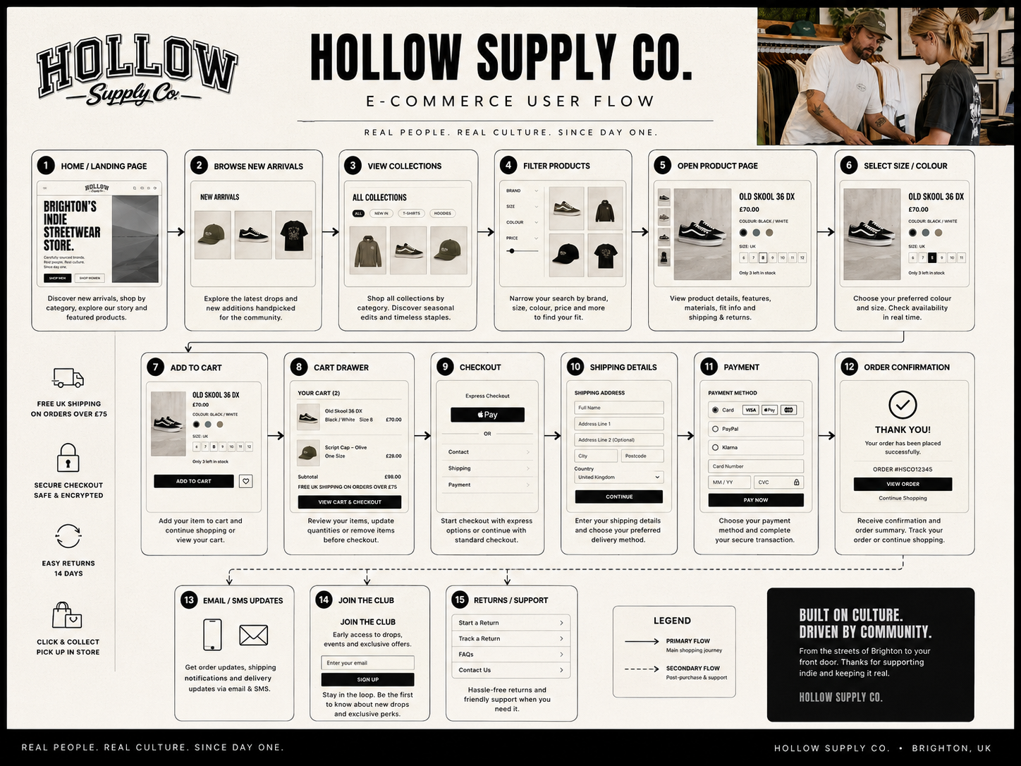
The primary journey moved from campaign or category discovery into product detail, size selection, cart and checkout. Returning customers could bypass editorial content and reach recently viewed or new products quickly.
Alternative paths supported sold-out sizes, product notifications, collection filtering and cross-selling without interrupting the main purchase flow.
Wireframes
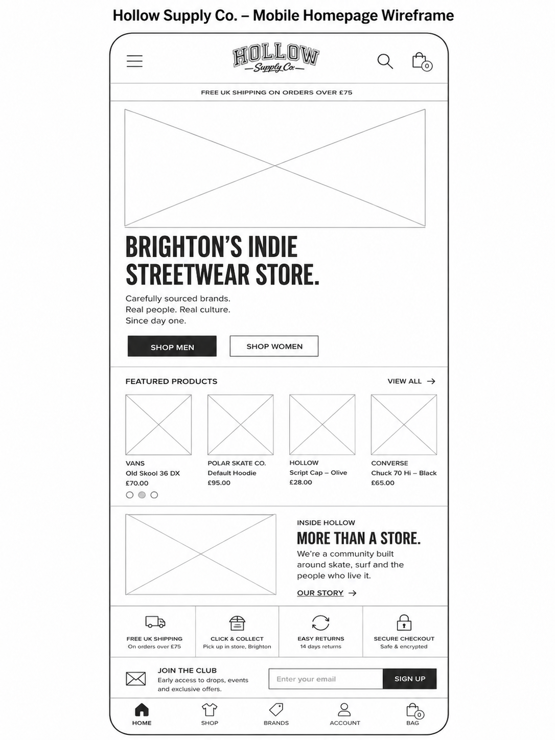
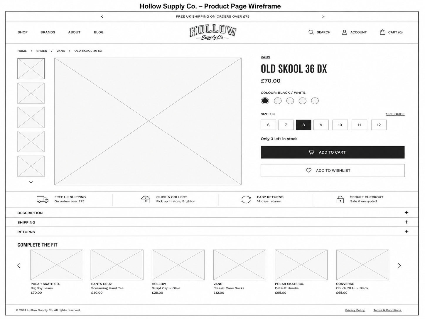
Visual Direction
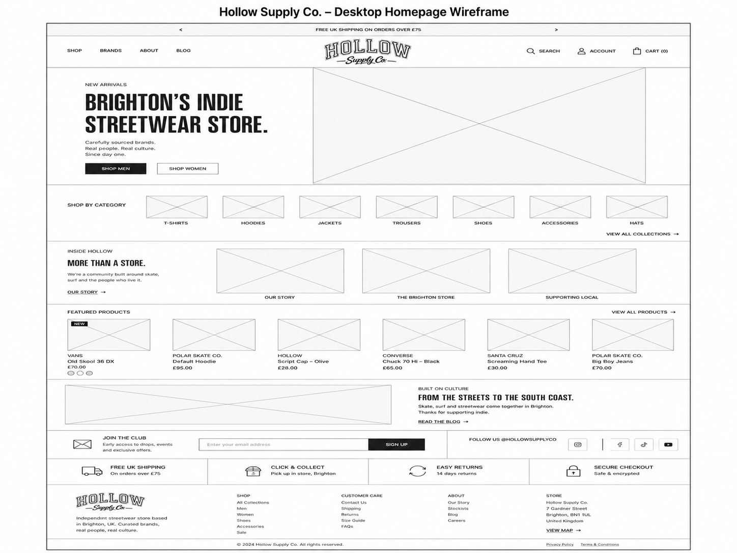
The visual direction used monochrome editorial photography, oversized type and restrained interface elements. Product and transactional information remained highly legible against the expressive brand layer.
Spacing and crop rules created consistency across campaign assets, collection cards and mobile layouts. Interaction states were deliberately simple to keep attention on the merchandise.
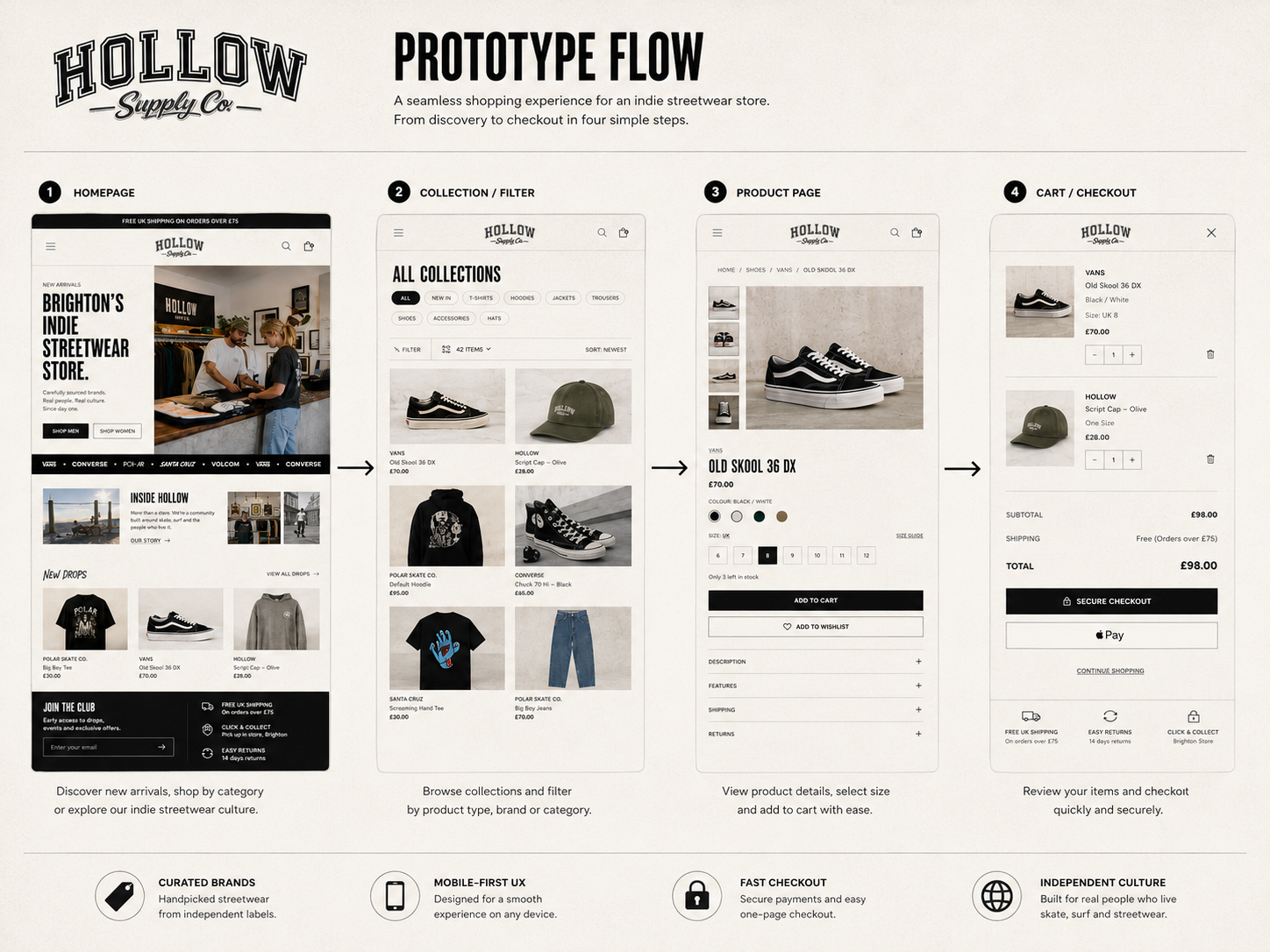
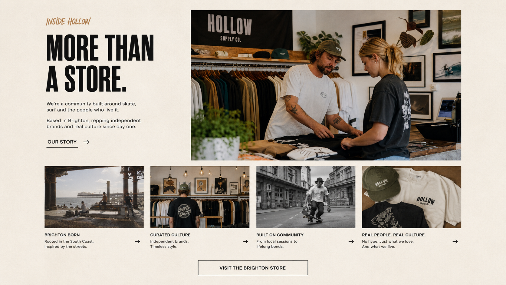
Implementation
The final responsive designs included homepage campaigns, collections, filtering, product details, cart and key checkout-support states. Modules were structured for Shopify content management and seasonal reuse.
Design specifications covered image ratios, type scaling, stock messaging and responsive behaviour so the developed store could retain its editorial quality across devices.
Impact
Illustrative portfolio statistics — replace with verified project data before publishing.
+27%
increase in product-page visits
+18%
improvement in add-to-cart rate
−20%
reduction in mobile browse time
Key Takeaways
01
Connect story to product
Editorial content should always create a useful next step.
02
Prioritise buying decisions
Size, availability and delivery belong high in the hierarchy.
03
Design modular campaigns
Reusable sections protect brand quality during frequent updates.
START WITH THE PROBLEM
Have a product, store or digital experience that needs clearer thinking?
I help SaaS founders, Shopify brands and agencies diagnose friction, design better journeys and deliver interfaces that can actually be built.


UX · PRODUCT · SHOPIFY · DEVELOPMENT
I solve usability problems before they become business problems — connecting UX, product thinking and build-ready delivery.

Available for selected remote projects


© 2026 Steve Roberts / ME&CO. All rights reserved.



MENU

CASE STUDIES
Portfolio
UX Design & Research
UI Design
Graphic Design
Just Branding
Alt Graphics
Development
Key Areas
Brand Identity Design
App UX & UI Design
Website Design & UX
Visual Design Systems
Marketing & Print Design
Business Cards & Leaflet Design
Cross-Channel Brand Consistency
User-Centred Design
Art Direction
End-to-End Creative Delivery
Overview
Hollow Supply Co is an independent lifestyle and apparel brand with a strong editorial identity. The ecommerce experience needed to express the brand through photography, typography and tone while remaining practical for repeat customers.
The brief was to redesign the storefront around collections, product stories and a faster purchase journey. The site needed to support seasonal campaigns, limited releases and mobile shoppers without relying on a conventional catalogue appearance.Hollow Supply Co. originally had a very standard ecommerce experience — functional, but visually generic and lacking the personality of the actual Brighton store. The original site focused heavily on products and navigation, but didn’t communicate the culture, community, or independent identity behind the brand.
The redesign transformed Hollow from a basic online clothing store into a community-led streetwear destination inspired by Brighton’s skate and surf culture. The new direction introduced a far more immersive and editorial experience, using bold typography, layered layouts, lifestyle photography, and branded storytelling to better reflect the atmosphere of the physical store.
A major part of the strategy was shifting the brand from being purely transactional to community-driven. The redesigned experience introduced areas for local culture, featured drops, store stories, Brighton-inspired content, and customer participation — helping Hollow build stronger emotional connections with its audience rather than simply selling products.
The updated design also improved the customer journey through:
stronger brand identity
more engaging product discovery
modern ecommerce UX patterns
clearer navigation
immersive campaign sections
mobile-first interactions
elevated visual storytelling
By combining ecommerce with culture and community, Hollow became more than just a reseller website — it became a digital extension of the Brighton store and the people around it.
DESIGN PRINCIPLE
“Brand character should guide the journey, not compete with it.”
The Challenge
The existing concept gave equal visual weight to campaigns, navigation and product cards. Customers could appreciate the brand but had difficulty locating sizes, understanding availability and comparing related products.
Mobile screens amplified the issue: large editorial elements created long journeys before users could reach product information or complete a purchase.
The Diagnosis
The diagnosis showed a conflict between storytelling and shopping. Editorial content was valuable, but it did not provide enough routes into products and collections.
Product detail pages also delayed essential decisions such as size, fit, delivery and stock status. These details needed to become part of the primary hierarchy.
The Strategy
The strategy connected every editorial feature to a clear collection or product path. Campaign content introduced the brand, while persistent category navigation and product recommendations maintained shopping momentum.
Product pages were reorganised around imagery, selection, availability and confidence-building details. Reusable campaign modules allowed the team to create new stories without rebuilding the storefront.
User Flow & Structure
The primary journey moved from campaign or category discovery into product detail, size selection, cart and checkout. Returning customers could bypass editorial content and reach recently viewed or new products quickly.
Alternative paths supported sold-out sizes, product notifications, collection filtering and cross-selling without interrupting the main purchase flow.
Wireframes
Visual Direction
The visual direction used monochrome editorial photography, oversized type and restrained interface elements. Product and transactional information remained highly legible against the expressive brand layer.
Spacing and crop rules created consistency across campaign assets, collection cards and mobile layouts. Interaction states were deliberately simple to keep attention on the merchandise.
Implementation
The final responsive designs included homepage campaigns, collections, filtering, product details, cart and key checkout-support states. Modules were structured for Shopify content management and seasonal reuse.
Design specifications covered image ratios, type scaling, stock messaging and responsive behaviour so the developed store could retain its editorial quality across devices.
Impact
Illustrative portfolio statistics — replace with verified project data before publishing.
+27%
increase in product-page visits
+18%
improvement in add-to-cart rate
−20%
reduction in mobile browse time
Key Takeaways
01
Connect story to product
Editorial content should always create a useful next step.
02
Prioritise buying decisions
Size, availability and delivery belong high in the hierarchy.
03
Design modular campaigns
Reusable sections protect brand quality during frequent updates.









START WITH THE PROBLEM
Have a product, store or digital experience that needs clearer thinking?
I help SaaS founders, Shopify brands and agencies diagnose friction, design better journeys and deliver interfaces that can actually be built.


UX · PRODUCT · SHOPIFY · DEVELOPMENT
I solve usability problems before they become business problems — connecting UX, product thinking and build-ready delivery.
Available for selected remote projects


© 2026 Steve Roberts / ME&CO. All rights reserved.

ABOUT
UX CONSULTANT
UX RESEARCH
UI & GRAPHICS
SOFTWARE
PORTFOLIO
RESOURCES
BOOKS
BLOG
