
CASE STUDIES
Portfolio

UX Design & Research
UI Design
Graphic Design
Just Branding
Alt Graphics
Development
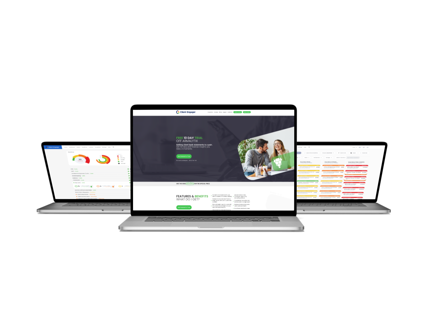



Key Areas
UX Audit & Usability AnalysisCompetitor & Market AnalysisUser Persona DefinitionWorkflow Mapping & OptimisationInformation Architecture & Navigation Design
Role-Based Dashboard Design
Interaction Design
Task Prioritisation UX
Mobile & Responsive UX Design
Prototyping & Iterative Design
Stakeholder Collaboration
Overview
Client Engager is a relationship-management concept for teams that need to track prospects, clients, conversations and opportunities in one place. The product needed to support both individual follow-up and shared team visibility.
The brief was to simplify a feature-heavy CRM experience and make daily priorities easier to understand. The design had to accommodate contact records, pipelines, tasks, notes and reporting without turning every screen into a dense administration tool.I led a UX audit and competitor analysis of a medical management application to identify usability issues across navigation, workflow complexity, and role clarity.
Using competitor insights and user personas, I redesigned key experiences to simplify access to stock, team, and patient data for busy medical staff. The solution introduced clearer navigation, streamlined workflows, and role-specific dashboards, improving efficiency, usability, and overall productivity.
DESIGN PRINCIPLE
“A useful CRM should tell people what to do next, not only what happened before.”
The Challenge
Traditional CRMs often collect a large amount of data but make the next useful action difficult to identify. Users spend time maintaining records yet still rely on memory, spreadsheets or external notes to decide who needs attention.
The existing concept also separated contacts, conversations and opportunities too rigidly. This made it harder to understand the full relationship or see how recent activity affected the next sales step.
The Diagnosis
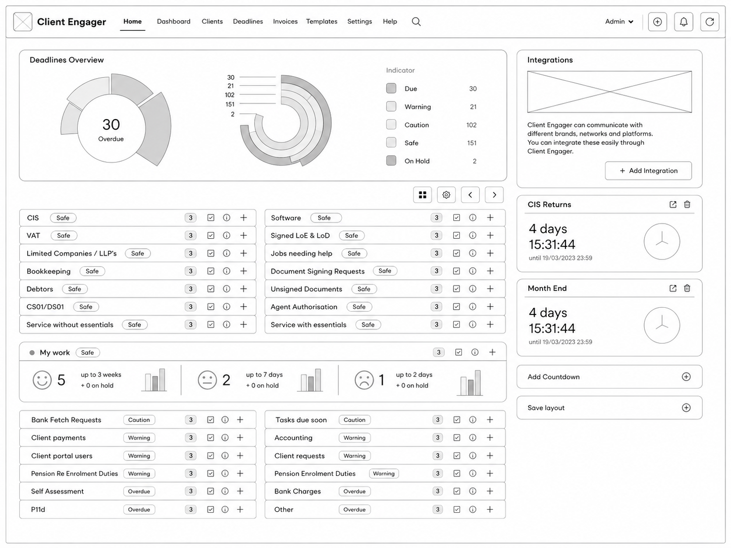
The analysis showed that the core problem was weak prioritisation rather than missing features. The dashboard displayed information, but it did not translate that information into an actionable daily workload.
Record pages also repeated details across several tabs. The structure needed a stronger timeline, clearer ownership and a consistent relationship between people, organisations, opportunities and tasks.
The Strategy
The strategy centred the product around “next best action”. Dashboards highlighted overdue follow-ups, inactive opportunities, recent replies and tasks requiring attention.
A unified relationship timeline connected emails, notes, meetings and status changes. Reusable side panels allowed users to complete common actions without losing their place in the wider workflow.
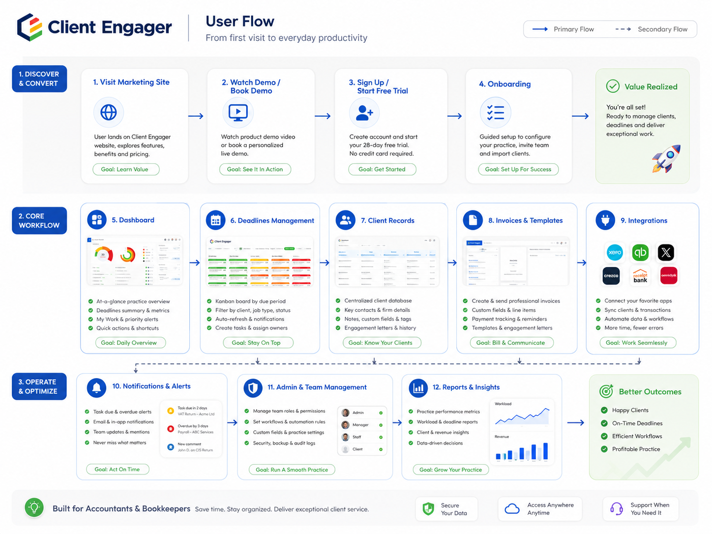
User Flow & Structure
The main flow moved from a prioritised dashboard to a contact or opportunity record, then into a focused action such as logging a call, creating a task or changing pipeline stage.
Search, filters and saved views supported different team roles. Empty states and onboarding guidance helped newer users build useful habits without requiring formal CRM training.
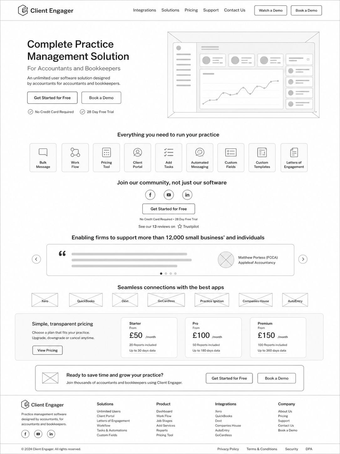
Wireframes
Visual Direction
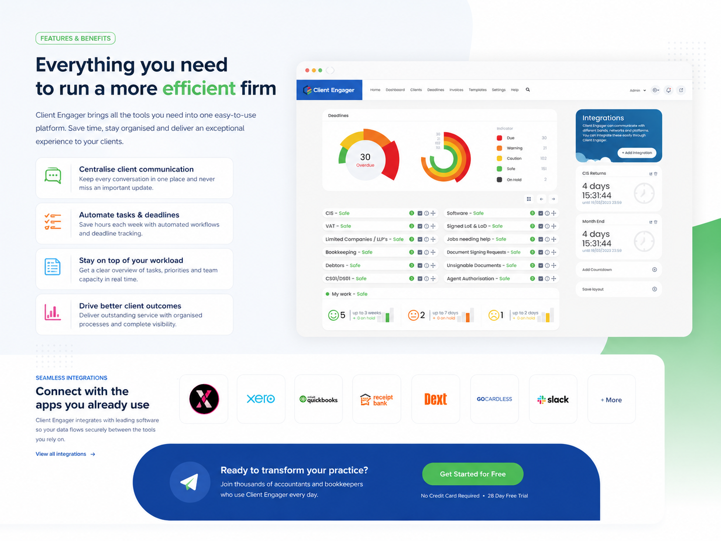
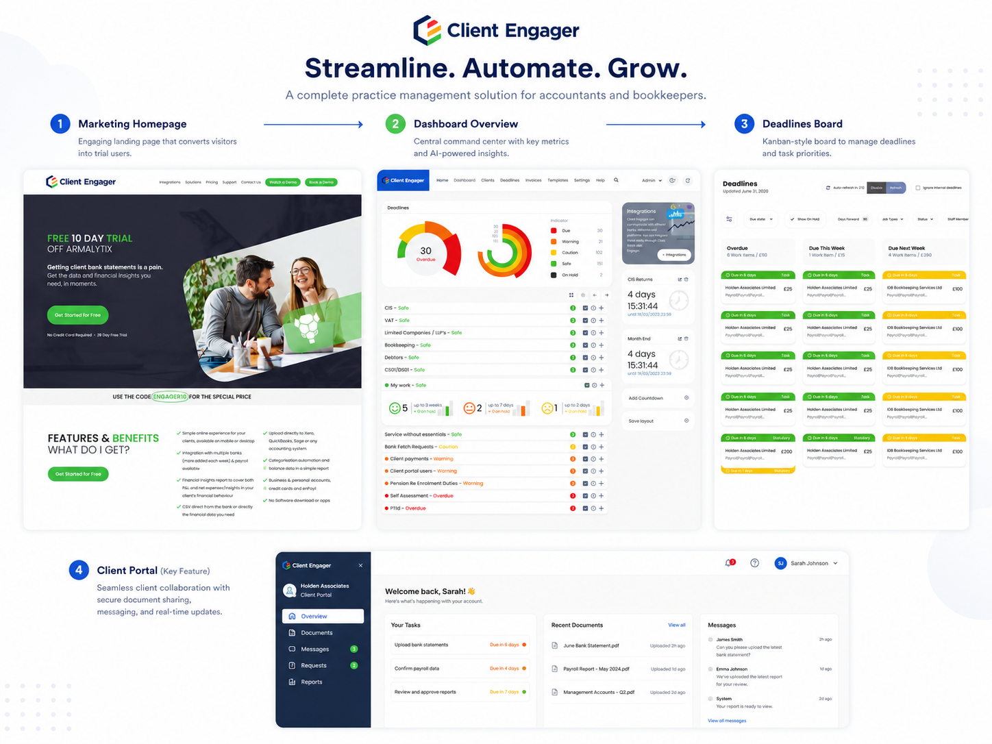
The visual direction used a restrained SaaS aesthetic with clear type scale, neutral surfaces and focused colour for stage and priority. Dense information was grouped into scannable cards and timelines.
Interactive panels, filters and tables followed a shared component system so users could predict how actions worked across contacts, companies and opportunities.
Implementation
The responsive prototype included dashboard priorities, contact and company records, opportunity pipelines, activity timelines, tasks and reporting summaries. Detailed states covered permissions, empty data and overdue work.
The final structure was designed for incremental product development, allowing communication integrations and automation rules to be introduced without changing the core experience.
Impact
Illustrative portfolio statistics — replace with verified project data before publishing.
+30%
increase in completed follow-up tasks
−25%
less time spent updating records
+19%
improvement in pipeline visibility
Key Takeaways
01
Turn data into action
A CRM becomes valuable when information leads directly to the next task.
02
Keep relationship context together
Conversations, tasks and opportunities should tell one connected story.
03
Design for daily habits
Repeated workflows need to be quick, predictable and easy to maintain.
START WITH THE PROBLEM
Have a product, store or digital experience that needs clearer thinking?
I help SaaS founders, Shopify brands and agencies diagnose friction, design better journeys and deliver interfaces that can actually be built.


UX · PRODUCT · SHOPIFY · DEVELOPMENT
I solve usability problems before they become business problems — connecting UX, product thinking and build-ready delivery.

Available for selected remote projects


© 2026 Steve Roberts / ME&CO. All rights reserved.



MENU

CASE STUDIES
Portfolio
UX Design & Research
UI Design
Graphic Design
Just Branding
Alt Graphics
Development
Key Areas
UX Audit & Usability AnalysisCompetitor & Market AnalysisUser Persona DefinitionWorkflow Mapping & OptimisationInformation Architecture & Navigation Design
Role-Based Dashboard Design
Interaction Design
Task Prioritisation UX
Mobile & Responsive UX Design
Prototyping & Iterative Design
Stakeholder Collaboration
Overview
Client Engager is a relationship-management concept for teams that need to track prospects, clients, conversations and opportunities in one place. The product needed to support both individual follow-up and shared team visibility.
The brief was to simplify a feature-heavy CRM experience and make daily priorities easier to understand. The design had to accommodate contact records, pipelines, tasks, notes and reporting without turning every screen into a dense administration tool.I led a UX audit and competitor analysis of a medical management application to identify usability issues across navigation, workflow complexity, and role clarity.
Using competitor insights and user personas, I redesigned key experiences to simplify access to stock, team, and patient data for busy medical staff. The solution introduced clearer navigation, streamlined workflows, and role-specific dashboards, improving efficiency, usability, and overall productivity.
DESIGN PRINCIPLE
“A useful CRM should tell people what to do next, not only what happened before.”
The Challenge
Traditional CRMs often collect a large amount of data but make the next useful action difficult to identify. Users spend time maintaining records yet still rely on memory, spreadsheets or external notes to decide who needs attention.
The existing concept also separated contacts, conversations and opportunities too rigidly. This made it harder to understand the full relationship or see how recent activity affected the next sales step.
The Diagnosis
The analysis showed that the core problem was weak prioritisation rather than missing features. The dashboard displayed information, but it did not translate that information into an actionable daily workload.
Record pages also repeated details across several tabs. The structure needed a stronger timeline, clearer ownership and a consistent relationship between people, organisations, opportunities and tasks.
The Strategy
The strategy centred the product around “next best action”. Dashboards highlighted overdue follow-ups, inactive opportunities, recent replies and tasks requiring attention.
A unified relationship timeline connected emails, notes, meetings and status changes. Reusable side panels allowed users to complete common actions without losing their place in the wider workflow.
User Flow & Structure
The main flow moved from a prioritised dashboard to a contact or opportunity record, then into a focused action such as logging a call, creating a task or changing pipeline stage.
Search, filters and saved views supported different team roles. Empty states and onboarding guidance helped newer users build useful habits without requiring formal CRM training.
Wireframes
Visual Direction
The visual direction used a restrained SaaS aesthetic with clear type scale, neutral surfaces and focused colour for stage and priority. Dense information was grouped into scannable cards and timelines.
Interactive panels, filters and tables followed a shared component system so users could predict how actions worked across contacts, companies and opportunities.
Implementation
The responsive prototype included dashboard priorities, contact and company records, opportunity pipelines, activity timelines, tasks and reporting summaries. Detailed states covered permissions, empty data and overdue work.
The final structure was designed for incremental product development, allowing communication integrations and automation rules to be introduced without changing the core experience.
Impact
Illustrative portfolio statistics — replace with verified project data before publishing.
+30%
increase in completed follow-up tasks
−25%
less time spent updating records
+19%
improvement in pipeline visibility
Key Takeaways
01
Turn data into action
A CRM becomes valuable when information leads directly to the next task.
02
Keep relationship context together
Conversations, tasks and opportunities should tell one connected story.
03
Design for daily habits
Repeated workflows need to be quick, predictable and easy to maintain.









START WITH THE PROBLEM
Have a product, store or digital experience that needs clearer thinking?
I help SaaS founders, Shopify brands and agencies diagnose friction, design better journeys and deliver interfaces that can actually be built.


UX · PRODUCT · SHOPIFY · DEVELOPMENT
I solve usability problems before they become business problems — connecting UX, product thinking and build-ready delivery.
Available for selected remote projects


© 2026 Steve Roberts / ME&CO. All rights reserved.

ABOUT
UX CONSULTANT
UX RESEARCH
UI & GRAPHICS
SOFTWARE
PORTFOLIO
RESOURCES
BOOKS
BLOG
