
CASE STUDIES
Portfolio

UX Design & Research
UI Design
Graphic Design
Just Branding
Alt Graphics
Development
→
Back to Portfolio
PORTFOLIO CASE STUDY · ECOMMERCE · BRAND DESIGN
Roughline
Skate Co.
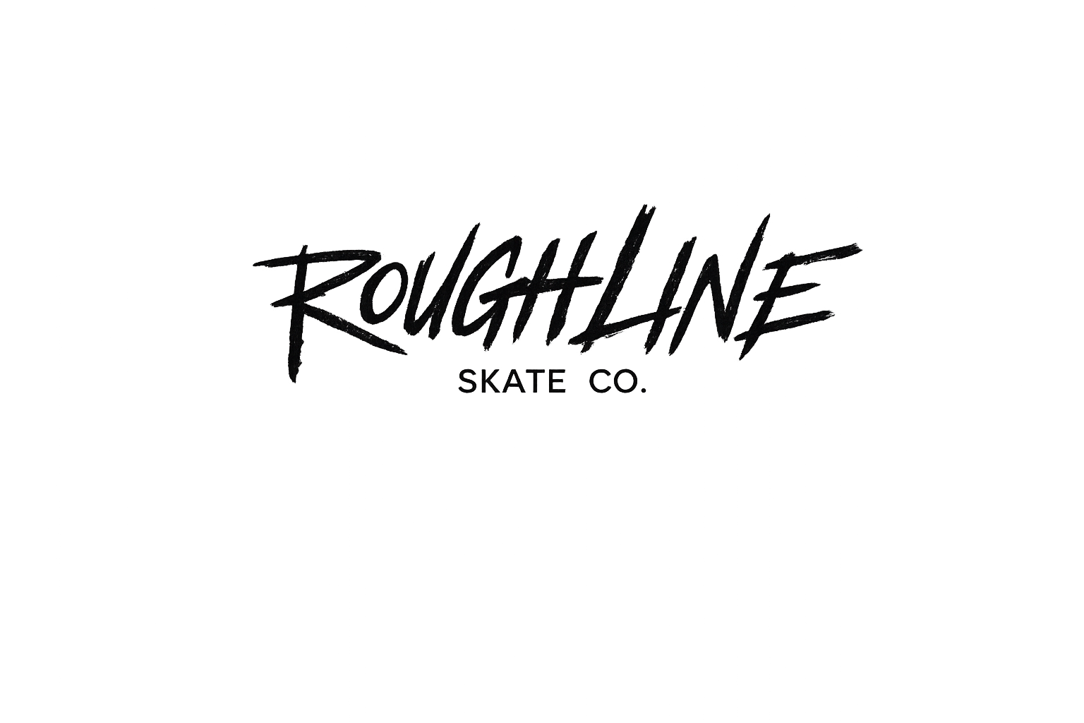
A gritty direct-to-consumer skate brand and ecommerce experience designed around clarity, culture and conversion.


Key Areas
Brand Identity Design
Ecommerce UX & UI
Shopify Storefront Design
Homepage & Campaigns
Collection & Filtering
Product Detail Design
Responsive Design
Visual Design System
Art Direction
End-to-End Creative Delivery
OVERVIEW
Building a credible skate brand from the ground up.
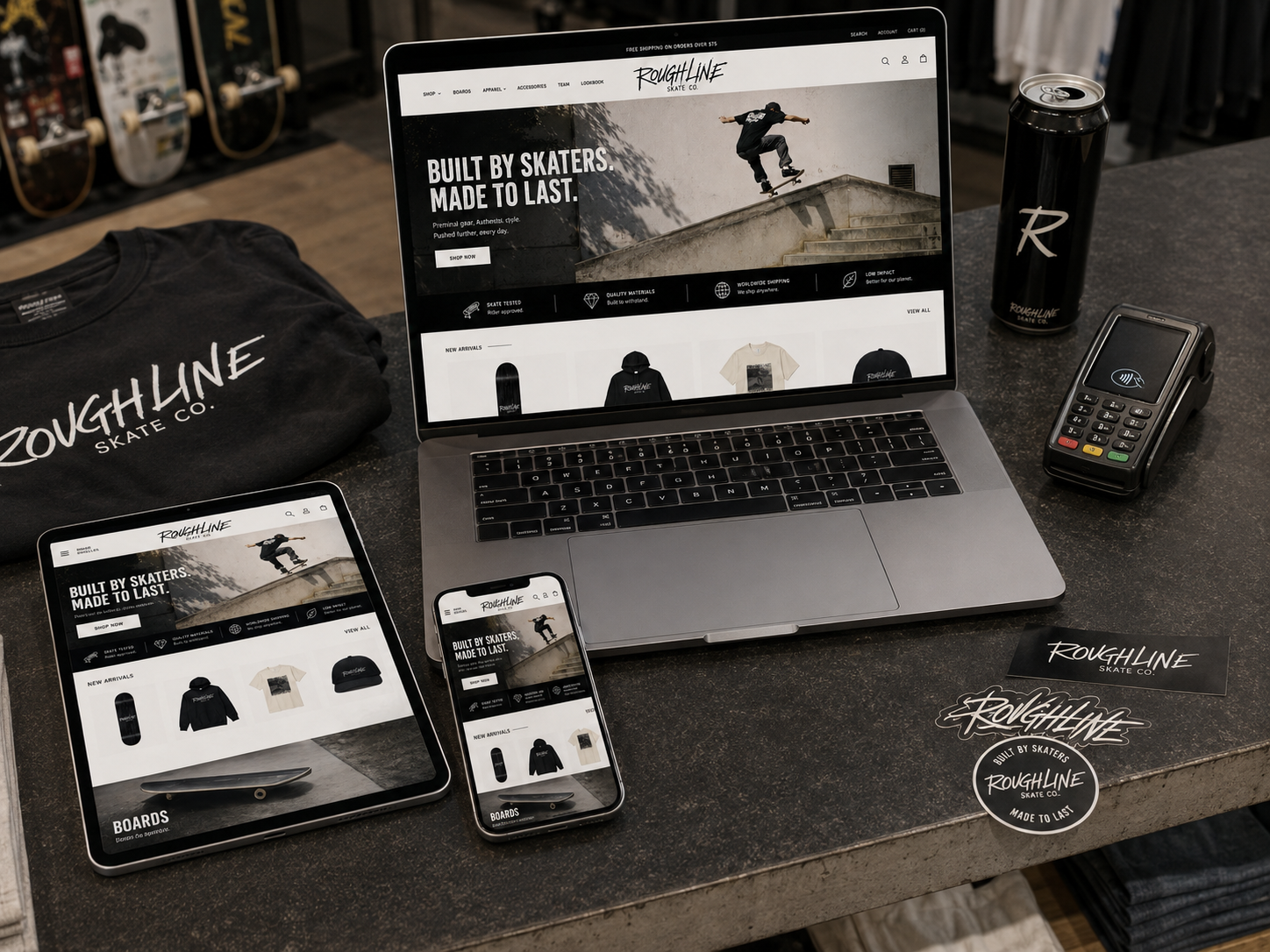
Roughline is a design for an independent skate company that needed to feel authentic without sacrificing usability. The work spans a distinctive visual identity and a complete storefront designed to make browsing, comparing and buying products effortless.
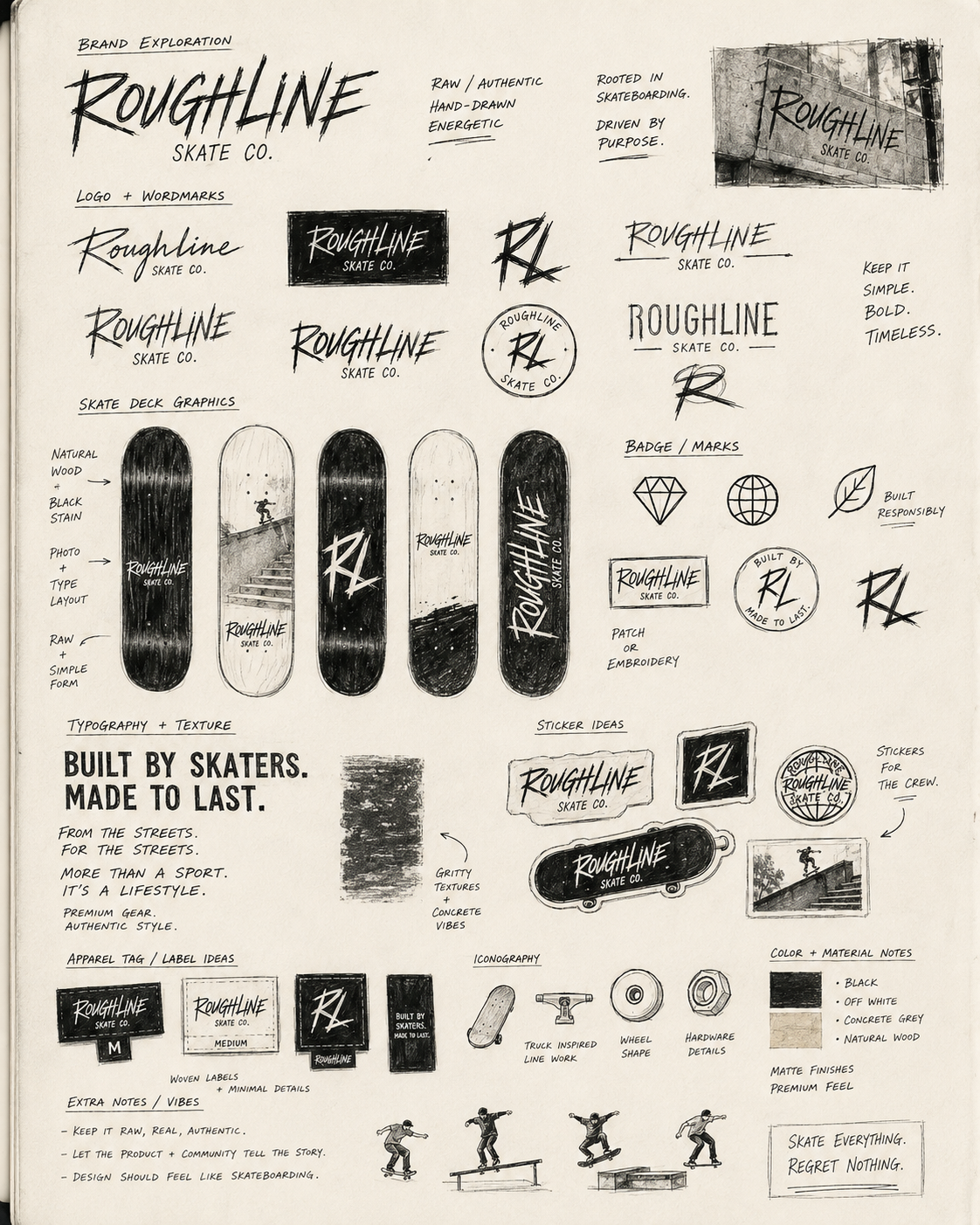
The identity uses a scratched handwritten wordmark, condensed editorial typography and a warm monochrome palette. Large photography creates energy, while restrained components keep navigation, filtering and purchasing clear.
The result is a specialist ecommerce concept where brand culture and conversion reinforce each other across every page.
ROLE
Brand designer · UX/UI designer · Ecommerce designer
DELIVERABLES
Identity · Art direction · Homepage · Collection · Product · About
TOOLS
Figma · Adobe Creative Suite · AI-assisted art direction
THE CHALLENGE
Make it feel raw.
Keep it easy to use.
Skate culture often leans on visual noise, but ecommerce depends on hierarchy and confidence. The challenge was to combine those two needs: a storefront with enough grit to feel credible, and enough restraint to remain fast to scan and simple to shop.
01
Create a recognisable identity
02
Give products room to lead
03
Support fast category browsing
04
Tell a credible brand story
BRAND DIRECTION
A rough edge with a disciplined system.
The identity uses a scratched handwritten wordmark, condensed editorial typography and a near-monochrome palette. Warm off-white backgrounds stop the experience feeling clinical, while large photography and direct language keep the brand rooted in real skate culture.
CORE PALETTE
#090909
#F6F3ED
#7A786E
#C4BDB0
DISPLAY VOICE
BUILT TO SHRED.
SUPPORTING VOICE
Direct, useful and confident. Product information remains practical while the larger messages carry the attitude.
The Strategy
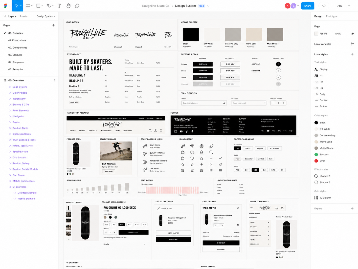
The strategy used a disciplined editorial system: scratched display lettering for attitude, condensed typography for impact, a warm monochrome palette and familiar ecommerce patterns for confidence.
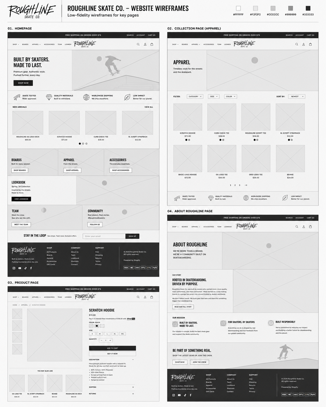
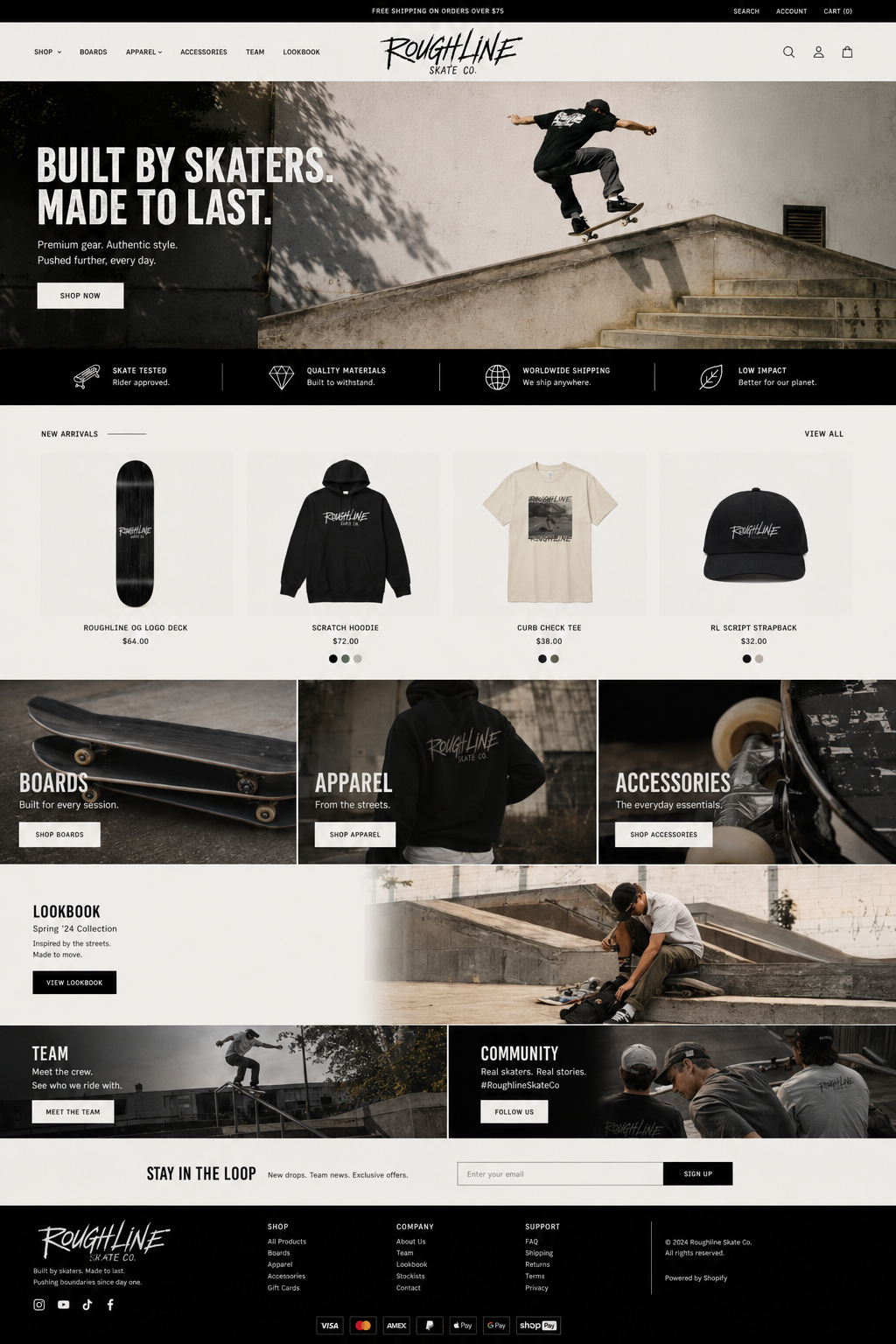
The homepage creates desire through campaign imagery; collection pages prioritise filters and scanning; product pages group decisions around the primary purchase action; and the About page turns mission, crew and culture into trust.
User Flow & Structure
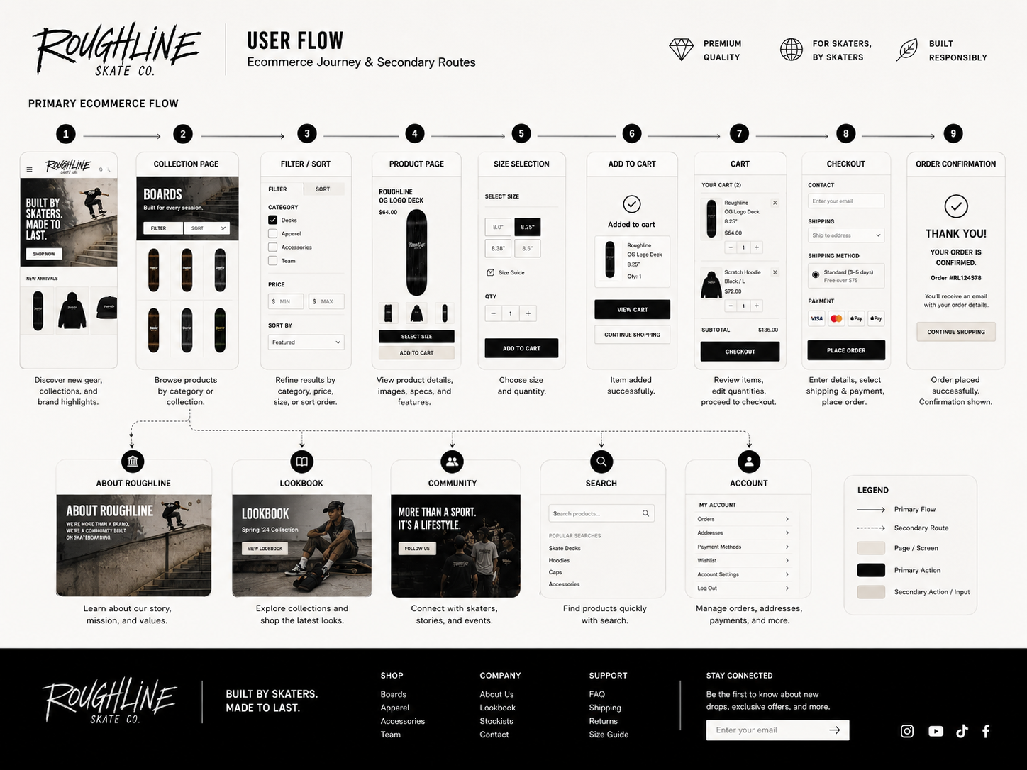
The primary journey moves from campaign or category discovery into product detail, variant selection, cart and checkout. Clear navigation allows returning customers to reach decks, apparel or accessories directly.
Alternative paths support filtering, related products, sold-out options and brand storytelling without interrupting the central purchase flow.
The wireframes
One system across every stage of the journey.
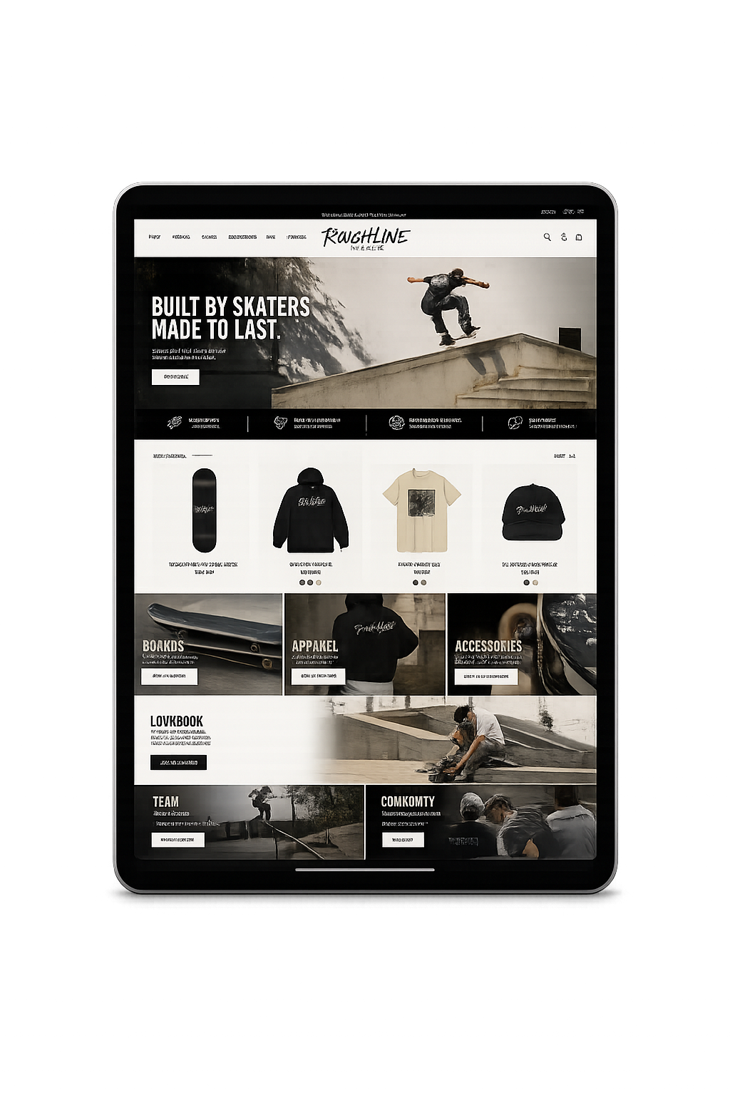
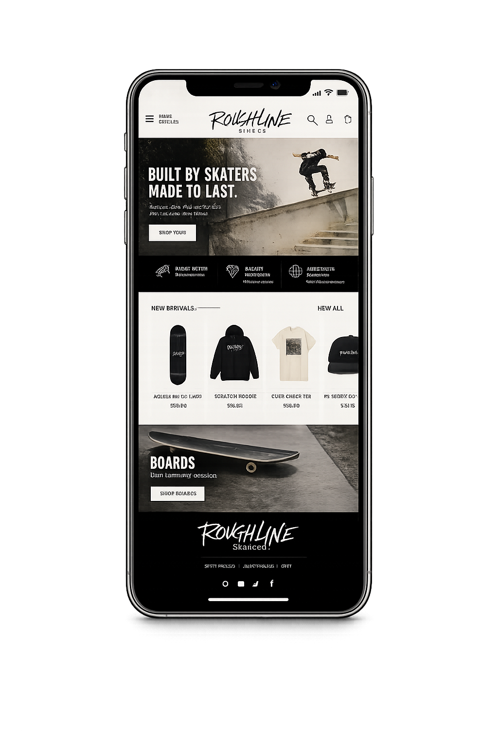
The interface maintains a consistent rhythm from first impression through category discovery and product evaluation. Strong imagery creates desire; restrained components make the shopping tasks obvious.
THE ECOMMERCE EXPERIENCE
One system across every stage of the journey.
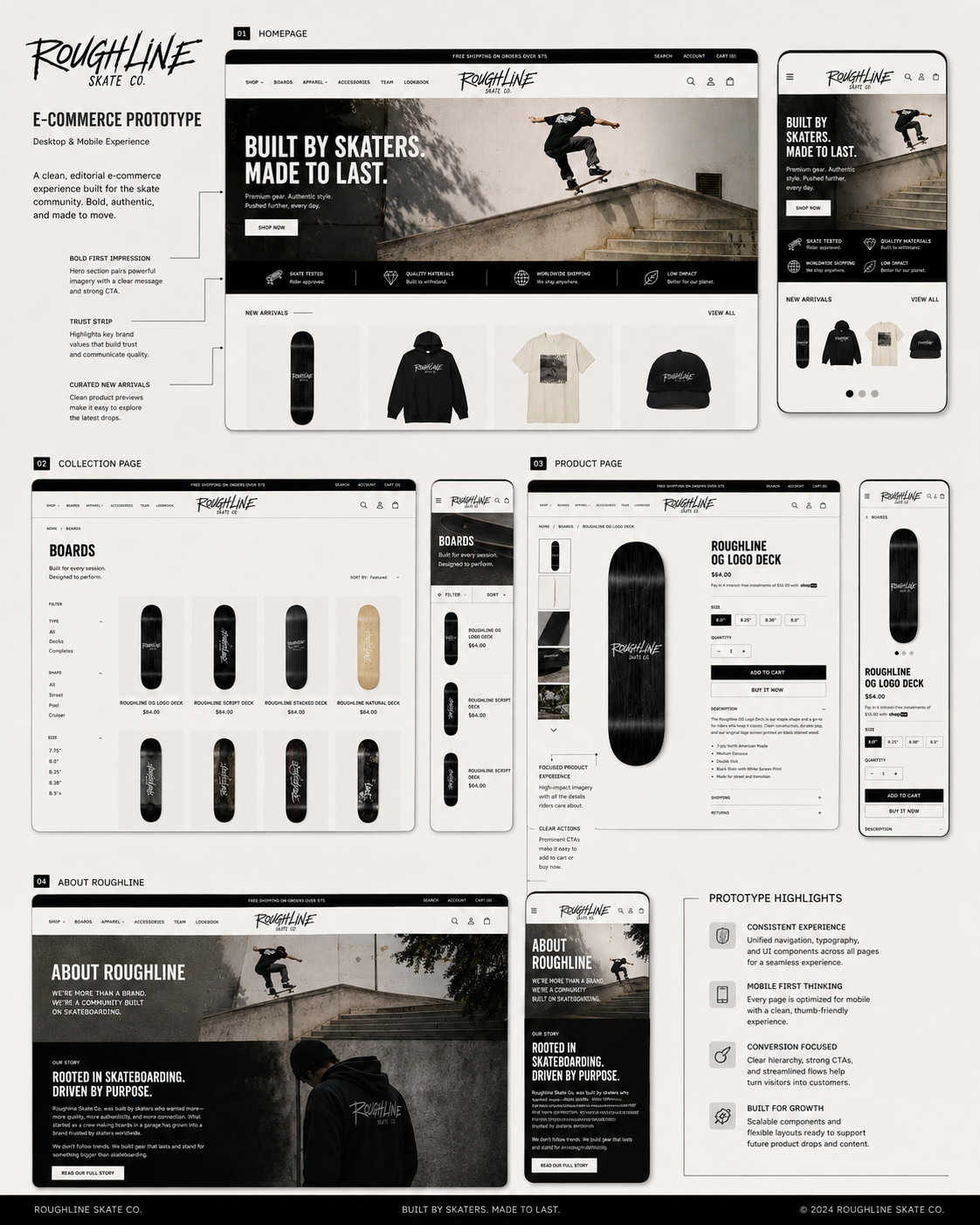
The interface maintains a consistent rhythm from first impression through category discovery and product evaluation. Strong imagery creates desire; restrained components make the shopping tasks obvious.
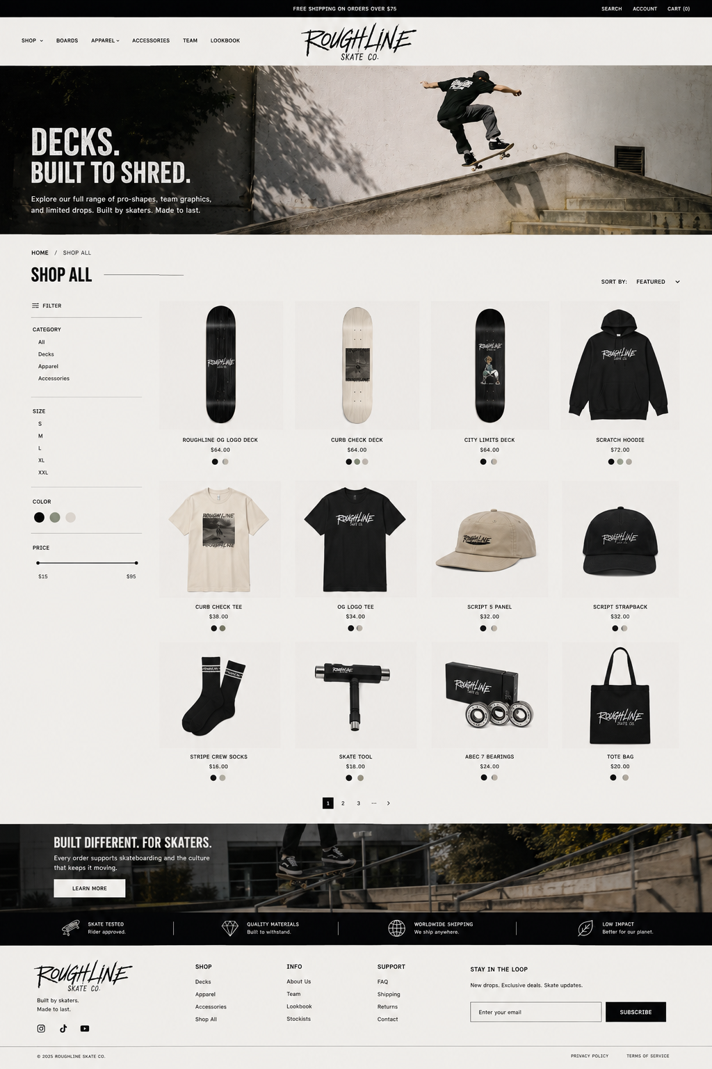
COLLECTION PAGE · FILTERING AND PRODUCT DISCOVERY
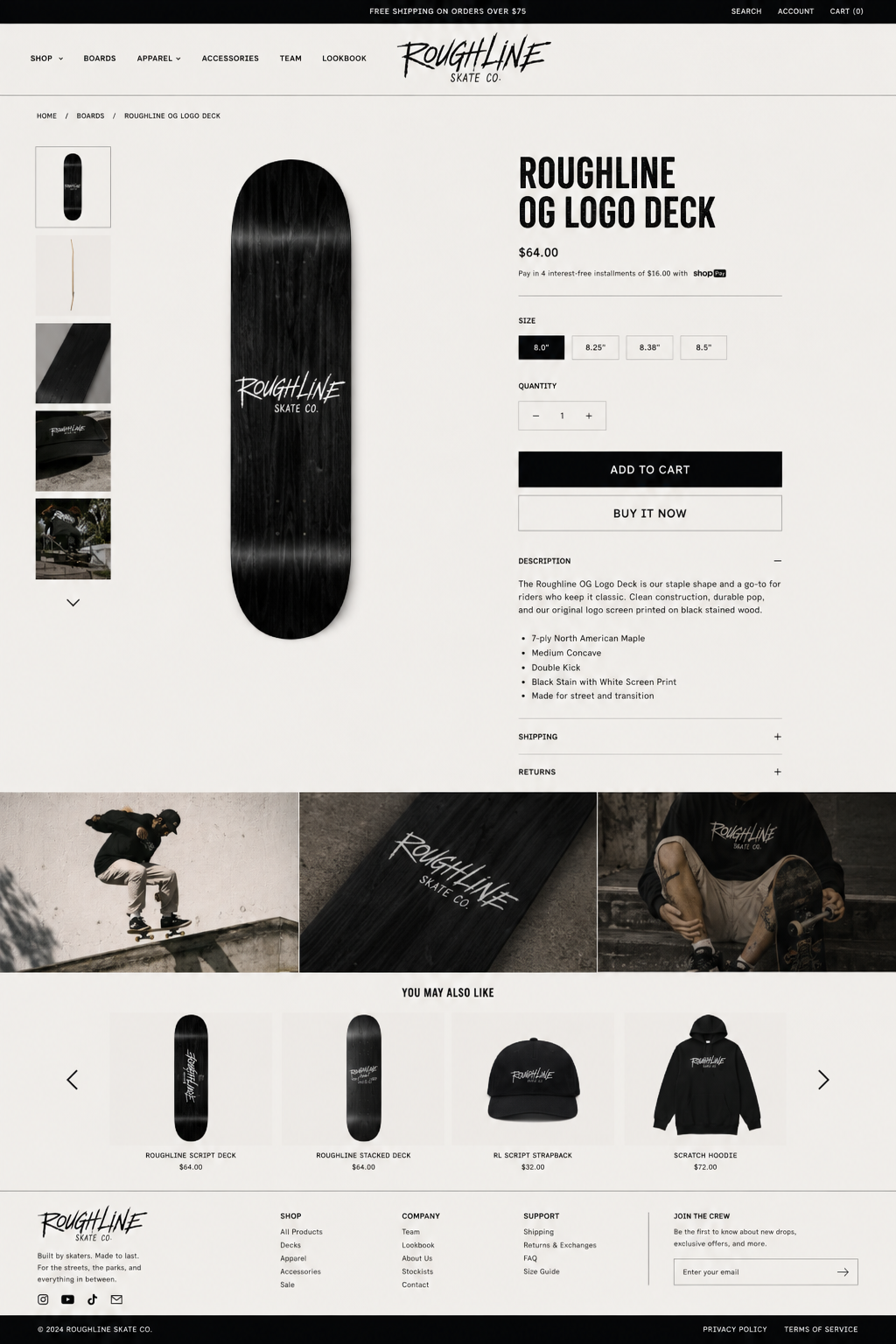
PRODUCT PAGE · VARIANT SELECTION AND PURCHASE CONFIDENCE
Clear category structure
Filters stay visible and understandable without overpowering the product grid.
Focused product decisions
Size, quantity, delivery and product details are grouped around the primary purchase action.
Consistent visual language
The same spacing, typography and monochrome product treatment carries throughout the store.
DESIGN PRINCIPLE
“Raw enough to feel authentic. Disciplined enough to shop.”
BRAND STORYTELLING
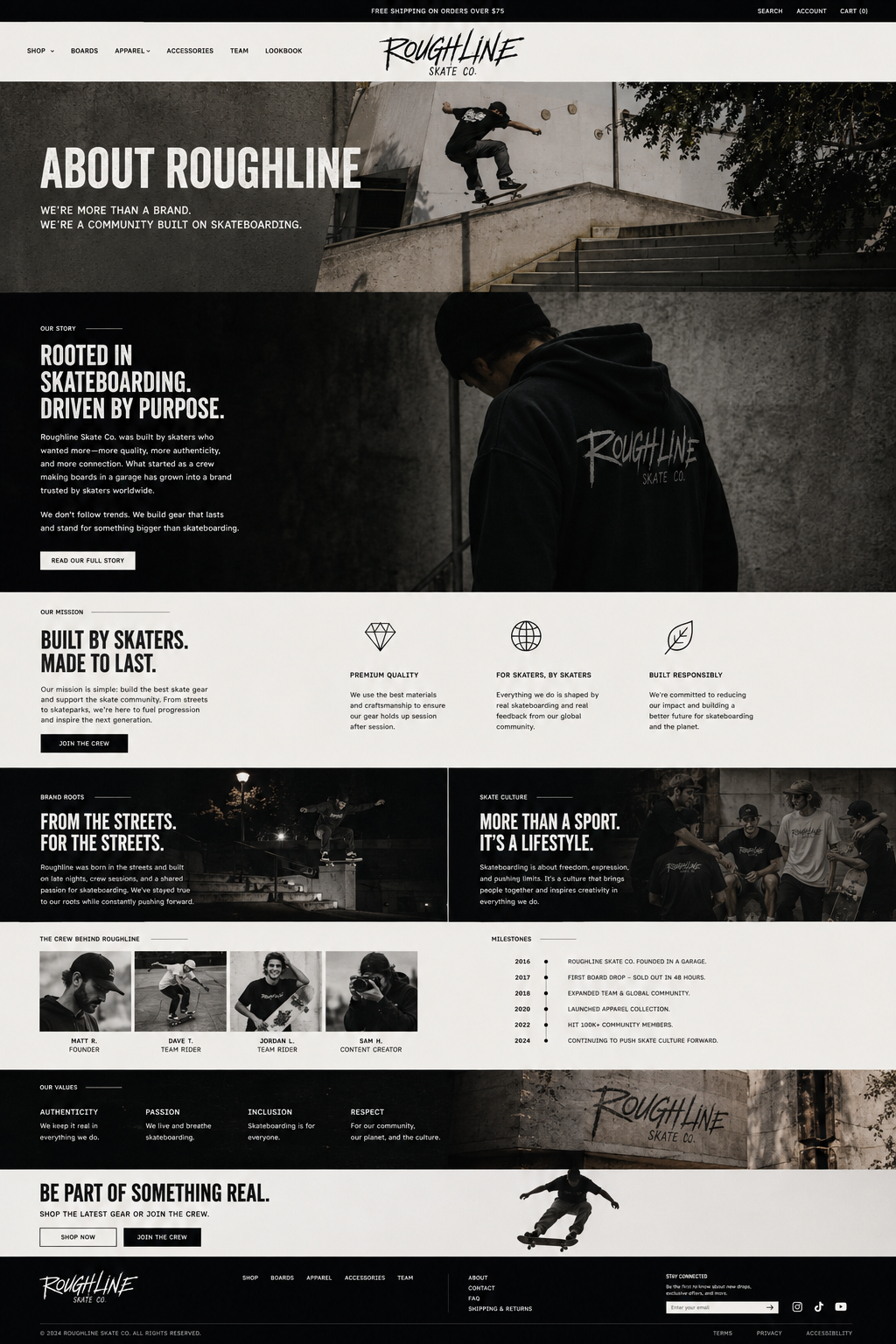
The About page turns identity into trust.
Rather than relying on a generic company biography, the page connects the brand to skating through mission, values, crew, culture and milestones. It helps the store feel like a real community rather than a catalogue with a logo.
DESIGN PRINCIPLES
What guided every decision.
The result is a concept that feels specialist and expressive, while remaining commercially useful and straightforward to navigate.
01
Culture before decoration
The visual style comes from the brand idea, not from adding random grunge effects.
02
Hierarchy before density
Large type and clear spacing let shoppers understand each screen quickly.
03
Confidence before novelty
Familiar ecommerce patterns reduce hesitation at important decision points.
04
Consistency before excess
A tight system gives photography, products and messages more impact.
THE OUTCOME
A complete brand experience ready for a portfolio, pitch or Shopify build.
Roughline demonstrates how brand identity and ecommerce UX can reinforce each other. The concept has a distinctive point of view, but every page remains structured around practical customer needs.

Distinctive and coherent visual identity
Complete desktop ecommerce journey
Reusable layout and component logic
Balanced culture, storytelling and conversion
Key Takeaways
01
Culture before decoration
The visual style grows from the brand idea rather than relying on random grunge effects.
02
Hierarchy before density
Large type and clear spacing help customers understand each screen quickly.
03
Confidence before novelty
Familiar ecommerce patterns reduce hesitation at important decision points.
START WITH THE PROBLEM
Have a product, store or digital experience that needs clearer thinking?
I help SaaS founders, Shopify brands and agencies diagnose friction, design better journeys and deliver interfaces that can actually be built.
Start a project
→
Book a UX audit
→


UX · PRODUCT · SHOPIFY · DEVELOPMENT
I solve usability problems before they become business problems — connecting UX, product thinking and build-ready delivery.

Available for selected remote projects


© 2026 Steve Roberts / ME&CO. All rights reserved.



MENU

CASE STUDIES
Portfolio
UX Design & Research
UI Design
Graphic Design
Just Branding
Alt Graphics
Development
PORTFOLIO CASE STUDY · ECOMMERCE · BRAND DESIGN
Roughline
Skate Co.
A gritty direct-to-consumer skate brand and ecommerce experience designed around clarity, culture and conversion.
Key Areas
Brand Identity Design
Ecommerce UX & UI
Shopify Storefront Design
Homepage & Campaigns
Collection & Filtering
Product Detail Design
Responsive Design
Visual Design System
Art Direction
End-to-End Creative Delivery
OVERVIEW
Building a credible skate brand from the ground up.
Roughline is a design for an independent skate company that needed to feel authentic without sacrificing usability. The work spans a distinctive visual identity and a complete storefront designed to make browsing, comparing and buying products effortless.
The identity uses a scratched handwritten wordmark, condensed editorial typography and a warm monochrome palette. Large photography creates energy, while restrained components keep navigation, filtering and purchasing clear.
The result is a specialist ecommerce concept where brand culture and conversion reinforce each other across every page.
ROLE
Brand designer · UX/UI designer · Ecommerce designer
DELIVERABLES
Identity · Art direction · Homepage · Collection · Product · About
TOOLS
Figma · Adobe Creative Suite · AI-assisted art direction
THE CHALLENGE
Make it feel raw.
Keep it easy to use.
Skate culture often leans on visual noise, but ecommerce depends on hierarchy and confidence. The challenge was to combine those two needs: a storefront with enough grit to feel credible, and enough restraint to remain fast to scan and simple to shop.
01
Create a recognisable identity
02
Give products room to lead
03
Support fast category browsing
04
Tell a credible brand story
BRAND DIRECTION
A rough edge with a disciplined system.
The identity uses a scratched handwritten wordmark, condensed editorial typography and a near-monochrome palette. Warm off-white backgrounds stop the experience feeling clinical, while large photography and direct language keep the brand rooted in real skate culture.
CORE PALETTE
#090909
#F6F3ED
#7A786E
#C4BDB0
DISPLAY VOICE
BUILT TO SHRED.
SUPPORTING VOICE
Direct, useful and confident. Product information remains practical while the larger messages carry the attitude.
The Strategy
The strategy used a disciplined editorial system: scratched display lettering for attitude, condensed typography for impact, a warm monochrome palette and familiar ecommerce patterns for confidence.
The homepage creates desire through campaign imagery; collection pages prioritise filters and scanning; product pages group decisions around the primary purchase action; and the About page turns mission, crew and culture into trust.
User Flow & Structure
The primary journey moves from campaign or category discovery into product detail, variant selection, cart and checkout. Clear navigation allows returning customers to reach decks, apparel or accessories directly.
Alternative paths support filtering, related products, sold-out options and brand storytelling without interrupting the central purchase flow.
The wireframes
One system across every stage of the journey.
The interface maintains a consistent rhythm from first impression through category discovery and product evaluation. Strong imagery creates desire; restrained components make the shopping tasks obvious.
THE ECOMMERCE EXPERIENCE
One system across every stage of the journey.
The interface maintains a consistent rhythm from first impression through category discovery and product evaluation. Strong imagery creates desire; restrained components make the shopping tasks obvious.
COLLECTION PAGE · FILTERING AND PRODUCT DISCOVERY
PRODUCT PAGE · VARIANT SELECTION AND PURCHASE CONFIDENCE
Clear category structure
Filters stay visible and understandable without overpowering the product grid.
Focused product decisions
Size, quantity, delivery and product details are grouped around the primary purchase action.
Consistent visual language
The same spacing, typography and monochrome product treatment carries throughout the store.
DESIGN PRINCIPLE
“Raw enough to feel authentic. Disciplined enough to shop.”
BRAND STORYTELLING
The About page turns identity into trust.
Rather than relying on a generic company biography, the page connects the brand to skating through mission, values, crew, culture and milestones. It helps the store feel like a real community rather than a catalogue with a logo.
DESIGN PRINCIPLES
What guided every decision.
The result is a concept that feels specialist and expressive, while remaining commercially useful and straightforward to navigate.
01
Culture before decoration
The visual style comes from the brand idea, not from adding random grunge effects.
02
Hierarchy before density
Large type and clear spacing let shoppers understand each screen quickly.
03
Confidence before novelty
Familiar ecommerce patterns reduce hesitation at important decision points.
04
Consistency before excess
A tight system gives photography, products and messages more impact.
THE OUTCOME
A complete brand experience ready for a portfolio, pitch or Shopify build.
Roughline demonstrates how brand identity and ecommerce UX can reinforce each other. The concept has a distinctive point of view, but every page remains structured around practical customer needs.
Distinctive and coherent visual identity
Complete desktop ecommerce journey
Reusable layout and component logic
Balanced culture, storytelling and conversion
Key Takeaways
01
Culture before decoration
The visual style grows from the brand idea rather than relying on random grunge effects.
02
Hierarchy before density
Large type and clear spacing help customers understand each screen quickly.
03
Confidence before novelty
Familiar ecommerce patterns reduce hesitation at important decision points.










START WITH THE PROBLEM
Have a product, store or digital experience that needs clearer thinking?
I help SaaS founders, Shopify brands and agencies diagnose friction, design better journeys and deliver interfaces that can actually be built.
Start a project
→
Book a UX audit
→


UX · PRODUCT · SHOPIFY · DEVELOPMENT
I solve usability problems before they become business problems — connecting UX, product thinking and build-ready delivery.
Available for selected remote projects


© 2026 Steve Roberts / ME&CO. All rights reserved.

ABOUT
UX CONSULTANT
UX RESEARCH
UI & GRAPHICS
SOFTWARE
PORTFOLIO
RESOURCES
BOOKS
BLOG
