SELF-INITIATED CAMPAIGN CONCEPT
RISE &
RITUAL
Building a functional coffee brand through campaign-led design.
I created and led the brand direction, packaging, campaign strategy, paid-social system, video concepts, creator briefs, conversion journey and optimisation framework.
CREATIVE DIRECTION
BRAND DESIGN
CAMPAIGN STRATEGY
Portfolio concept. Any performance figures shown are simulated and used to demonstrate the measurement framework.
PROJECT SUMMARY
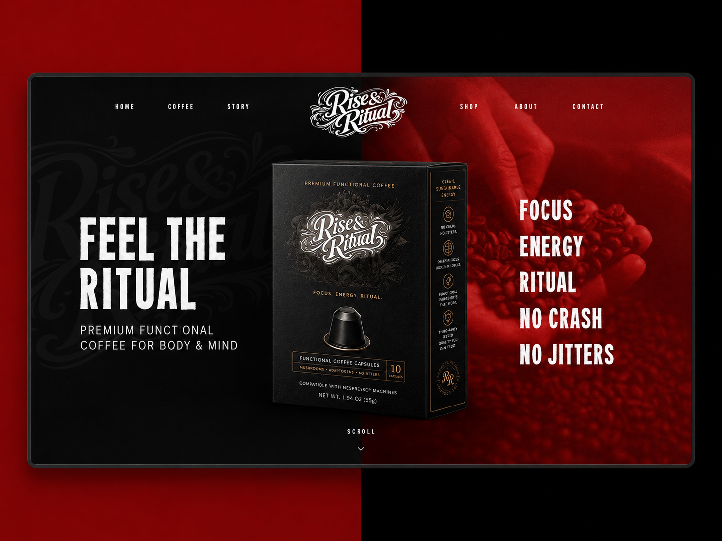
Brand identity, art direction and a complete ecommerce storefront covering discovery, product evaluation and brand storytelling.
OVERVIEW
A campaign-first brand built to convert attention into ritual.
The project was deliberately structured around a central brand promise, then expanded across identity, packaging, paid media, creator content, retargeting and a supporting ecommerce experience.
01
CENTRAL CAMPAIGN PLATFORM
08
ADVERTISING ANGLES
06+
CHANNEL ADAPTATIONS
15 sec
HERO VIDEO CONCEPT
End-to-end
CREATIVE LEADERSHIP
THE BRIEF
Create a distinctive coffee brand that could win attention and sustain a full-funnel campaign.
The category is crowded with familiar claims and visually similar products. I needed to create a recognisable position, a flexible campaign idea and a system capable of working across performance advertising without losing the premium brand feel.
THE CHALLENGE
Stand apart in a visually aggressive category without becoming generic or disposable.
THE OPPORTUNITY
Own the space between premium coffee, performance culture and a repeatable daily ritual.
MY LEADERSHIP
I set the brand position, creative platform, visual direction, campaign architecture and production standards across every touchpoint.
BRAND FOUNDATION
A bold identity designed to feel handcrafted, premium and performance-led.
The ornate wordmark creates distinction and heritage, while the compressed campaign typography adds urgency and clarity. Matte-black packaging, off-white marks, deep red and restrained gold create a recognisable visual system.
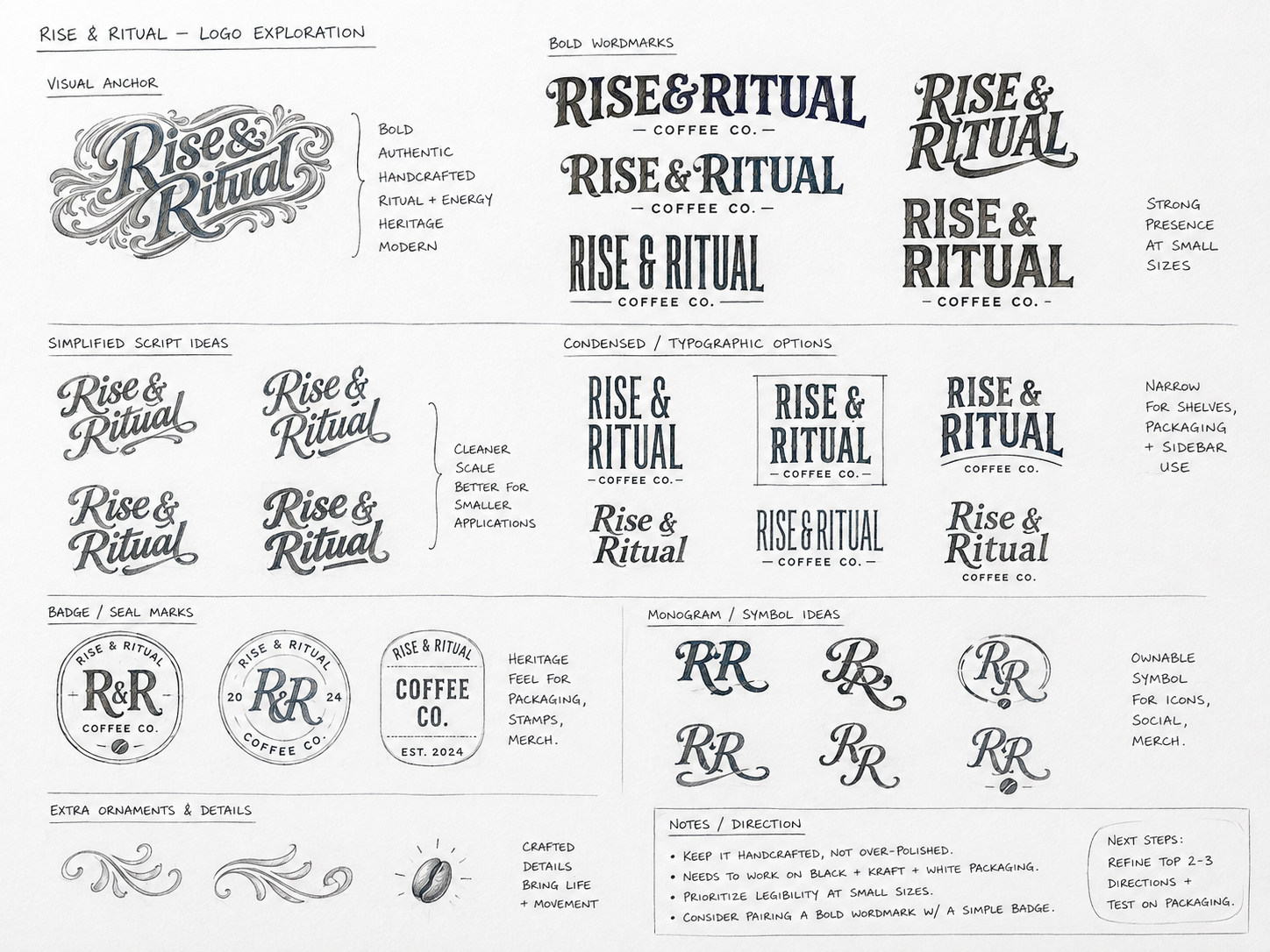
Identity exploration
I explored expressive scripts, condensed wordmarks, badges and monograms before settling on an ownable hero mark with flexible secondary assets.
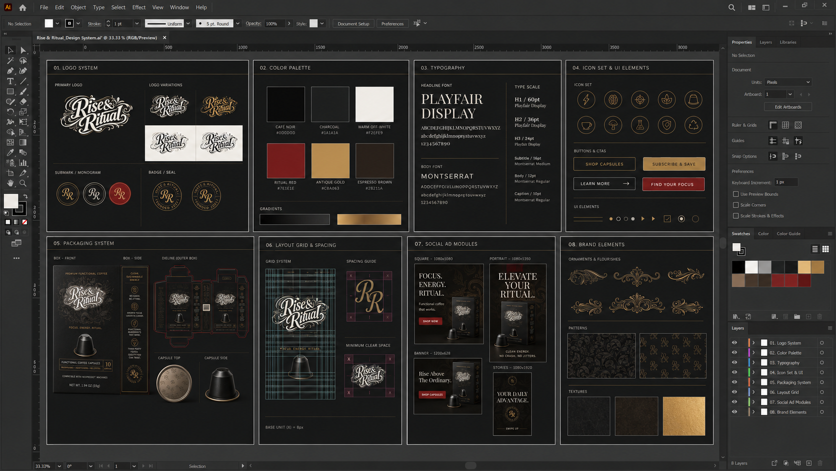
Packaging system
The packaging became the campaign anchor: premium enough for close-up product photography, simple enough to remain legible in fast-moving ads.
CAMPAIGN PLATFORM
Feel the Ritual.
I developed a central idea that could work as brand storytelling and direct-response advertising. Every execution returns to the same promise: focus, energy and ritual—without the crash or jitters.
FOCUS
Sharper concentration for meaningful work.
ENERGY
Clean, sustained energy without the slump.
RITUAL
A repeatable moment that builds affinity.
PROOF
Functional ingredients, testing and clear benefits.
PAID MEDIA
One campaign system, adapted for the behaviour of each platform.
Rather than simply resizing a master asset, I adjusted hierarchy, message density, CTA placement and product scale for feeds, stories, short-form video, search and retargeting environments.
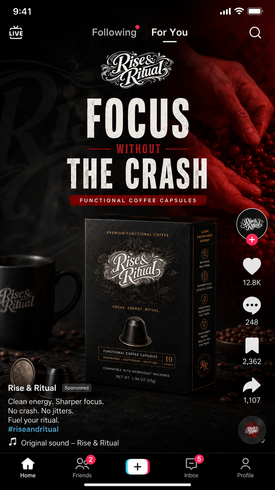
Hero direct-response creative
Product-first composition, immediate benefit language and a clear path to shop.
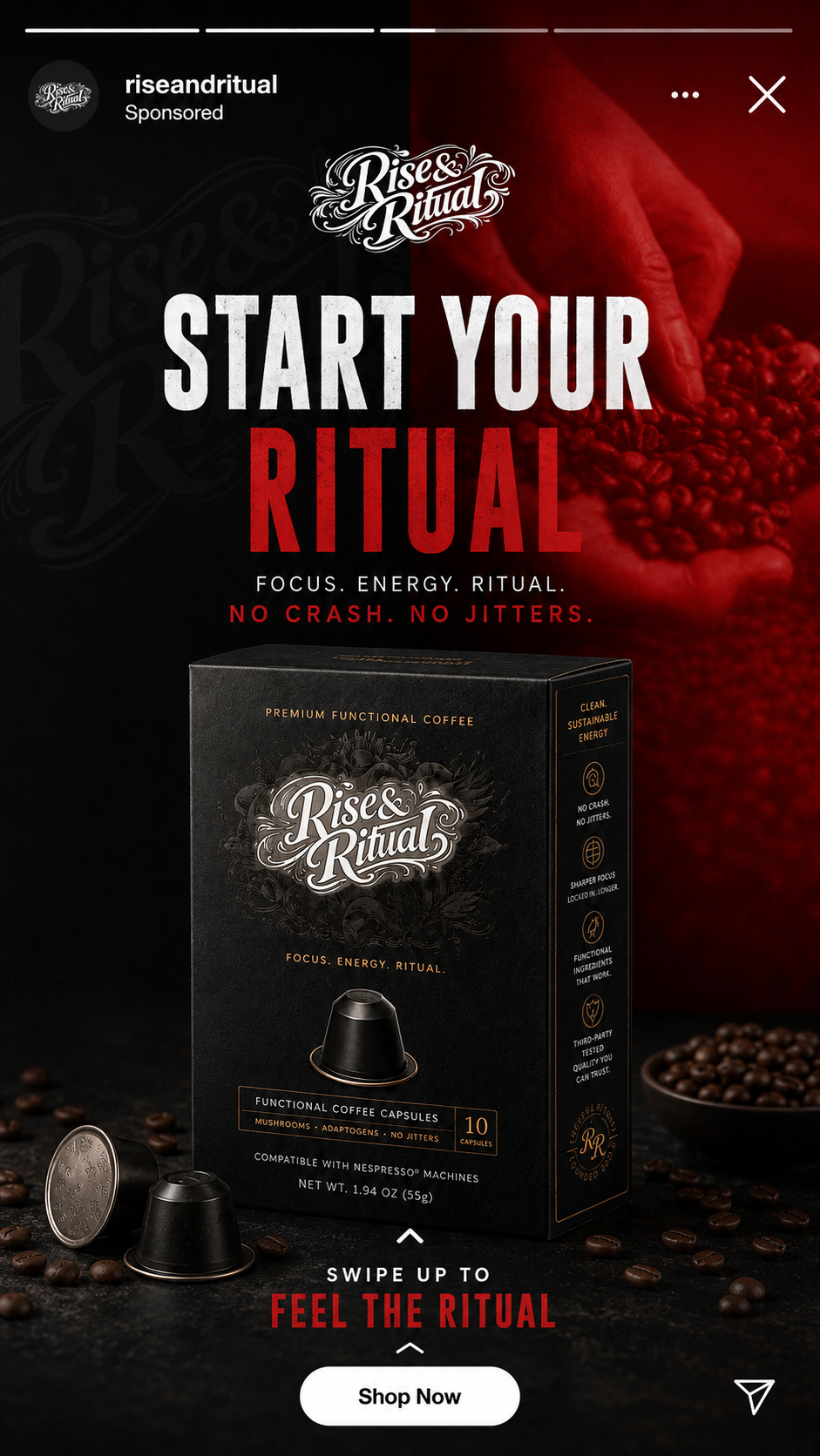
Native placement design
The creative was tested in context so that interface chrome, crop behaviour and competing content informed the final composition.
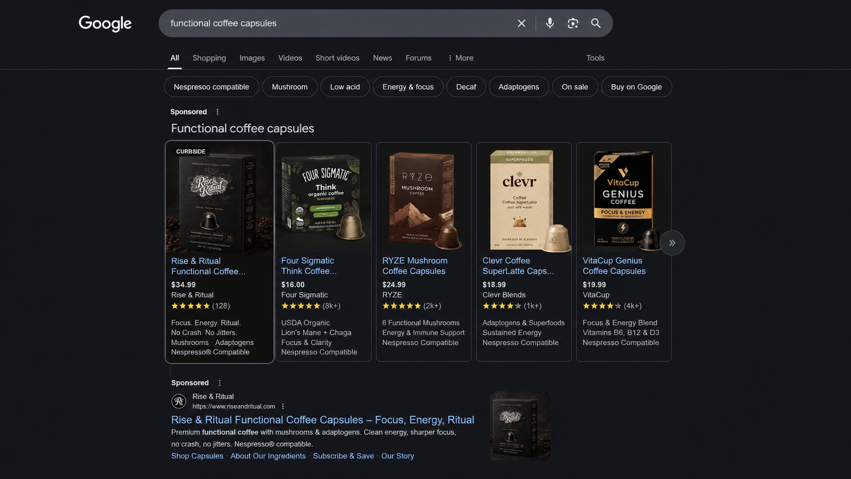
MOTION AND CREATOR CONTENT
From polished product film to credible creator-led proof.
I planned the campaign in layers: high-production hero content for brand impact, fast 6–15 second edits for paid media, and creator briefs designed to produce more natural, scalable proof.
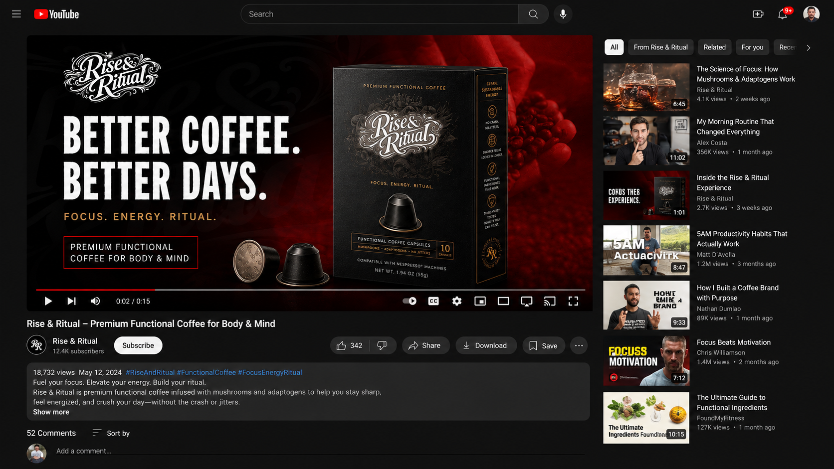
HOOK
Lead with the customer problem in the first two seconds.
PRODUCT
Reveal packaging and capsule preparation quickly and clearly.
BENEFIT
Translate ingredients into focus, energy and no-crash outcomes.
ACTION
End with one message, one product and one decisive CTA.
FROM ATTENTION TO ACTION
The campaign message remains intact from advert to landing page to checkout.
I designed the journey so that each click feels like a continuation, not a reset. Headline, imagery, offer and proof are repeated deliberately to reduce uncertainty and strengthen conversion intent.
OPTIMISATION FRAMEWORK
Creative decisions were designed to be testable—not defended by taste alone.
I defined controlled tests for imagery, hooks, offer presentation and creator style, then connected them to clear commercial measures. The dashboard below demonstrates how I would report the campaign; all figures are simulated.
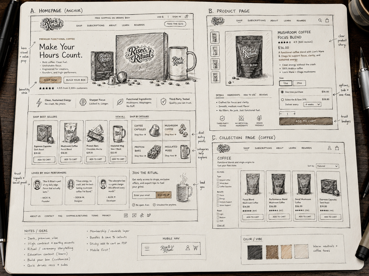
ECOMMERCE EXTENSION
A focused website designed to support the campaign—not compete with it.
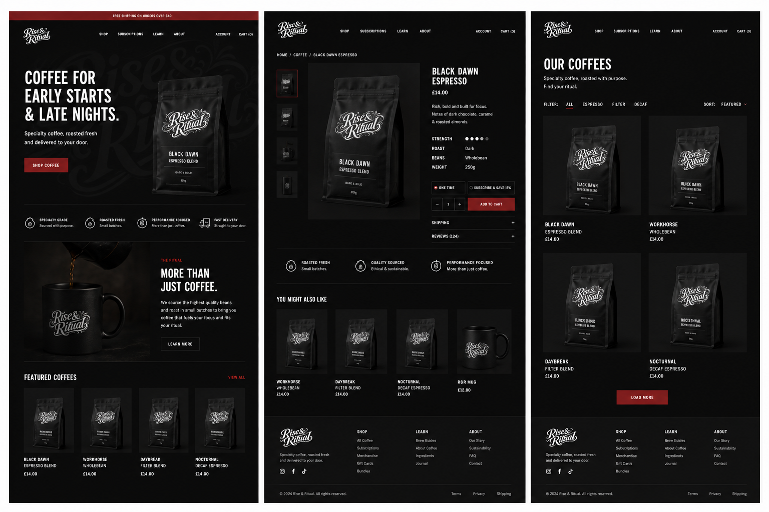
The final store uses the same contrast, product imagery and language as the advertising. I kept the interface intentionally simple so visitors could understand the benefit, compare products and purchase with minimal friction.
MESSAGE MATCH
Advertising headlines continue directly into the landing experience.
PRODUCT CLARITY
Packaging, benefits and purchase options are immediately visible.
LOW FRICTION
Simple navigation and clear CTAs keep attention on conversion.
CONSISTENCY
The brand feels continuous across media, store and packaging.
THE OUTCOME
A complete campaign ecosystem—built from one clear idea and led consistently from strategy to execution.
This project demonstrates how I combine brand thinking, creative direction, campaign design, conversion UX and commercial measurement. I did not treat the website, adverts and packaging as separate deliverables; I designed them as one connected customer experience.
STRATEGY
CREATIVE DIRECTION
IDENTITY
PACKAGING
PAID SOCIAL
VIDEO CONCEPTS
CREATOR BRIEFS
CONVERSION UX
OPTIMISATION

ABOUT
UX CONSULTANT
UX RESEARCH
UI & GRAPHICS


SOFTWARE
PORTFOLIO
RESOURCES
BOOKS
BLOG

START WITH THE PROBLEM
Have a product, store or digital experience that needs clearer thinking?
I help SaaS founders, Shopify brands and agencies diagnose friction, design better journeys and deliver interfaces that can actually be built.
Start a project
→
Book a UX audit
→


UX · PRODUCT · SHOPIFY · DEVELOPMENT
I solve usability problems before they become business problems — connecting UX, product thinking and build-ready delivery.

Available for selected remote projects


© 2026 Steve Roberts / ME&CO. All rights reserved.
SELF-INITIATED CAMPAIGN CONCEPT
RISE &
RITUAL
Building a functional coffee brand through campaign-led design.
I created and led the brand direction, packaging, campaign strategy, paid-social system, video concepts, creator briefs, conversion journey and optimisation framework.
CREATIVE DIRECTION
BRAND DESIGN
CAMPAIGN STRATEGY
Portfolio concept. Any performance figures shown are simulated and used to demonstrate the measurement framework.
PROJECT SUMMARY
Brand identity, art direction and a complete ecommerce storefront covering discovery, product evaluation and brand storytelling.
OVERVIEW
A campaign-first brand built to convert attention into ritual.
The project was deliberately structured around a central brand promise, then expanded across identity, packaging, paid media, creator content, retargeting and a supporting ecommerce experience.
01
CENTRAL CAMPAIGN PLATFORM
08
ADVERTISING ANGLES
06+
CHANNEL ADAPTATIONS
15 sec
HERO VIDEO CONCEPT
End-to-end
CREATIVE LEADERSHIP
THE BRIEF
Create a distinctive coffee brand that could win attention and sustain a full-funnel campaign.
The category is crowded with familiar claims and visually similar products. I needed to create a recognisable position, a flexible campaign idea and a system capable of working across performance advertising without losing the premium brand feel.
THE CHALLENGE
Stand apart in a visually aggressive category without becoming generic or disposable.
THE OPPORTUNITY
Own the space between premium coffee, performance culture and a repeatable daily ritual.
MY LEADERSHIP
I set the brand position, creative platform, visual direction, campaign architecture and production standards across every touchpoint.
BRAND FOUNDATION
A bold identity designed to feel handcrafted, premium and performance-led.
The ornate wordmark creates distinction and heritage, while the compressed campaign typography adds urgency and clarity. Matte-black packaging, off-white marks, deep red and restrained gold create a recognisable visual system.
Identity exploration
I explored expressive scripts, condensed wordmarks, badges and monograms before settling on an ownable hero mark with flexible secondary assets.
Packaging system
The packaging became the campaign anchor: premium enough for close-up product photography, simple enough to remain legible in fast-moving ads.
CAMPAIGN PLATFORM
Feel the Ritual.
I developed a central idea that could work as brand storytelling and direct-response advertising. Every execution returns to the same promise: focus, energy and ritual—without the crash or jitters.
FOCUS
Sharper concentration for meaningful work.
ENERGY
Clean, sustained energy without the slump.
RITUAL
A repeatable moment that builds affinity.
PROOF
Functional ingredients, testing and clear benefits.
PAID MEDIA
One campaign system, adapted for the behaviour of each platform.
Rather than simply resizing a master asset, I adjusted hierarchy, message density, CTA placement and product scale for feeds, stories, short-form video, search and retargeting environments.
Hero direct-response creative
Product-first composition, immediate benefit language and a clear path to shop.
Native placement design
The creative was tested in context so that interface chrome, crop behaviour and competing content informed the final composition.
MOTION AND CREATOR CONTENT
From polished product film to credible creator-led proof.
I planned the campaign in layers: high-production hero content for brand impact, fast 6–15 second edits for paid media, and creator briefs designed to produce more natural, scalable proof.
HOOK
Lead with the customer problem in the first two seconds.
PRODUCT
Reveal packaging and capsule preparation quickly and clearly.
BENEFIT
Translate ingredients into focus, energy and no-crash outcomes.
ACTION
End with one message, one product and one decisive CTA.
FROM ATTENTION TO ACTION
The campaign message remains intact from advert to landing page to checkout.
I designed the journey so that each click feels like a continuation, not a reset. Headline, imagery, offer and proof are repeated deliberately to reduce uncertainty and strengthen conversion intent.
OPTIMISATION FRAMEWORK
Creative decisions were designed to be testable—not defended by taste alone.
I defined controlled tests for imagery, hooks, offer presentation and creator style, then connected them to clear commercial measures. The dashboard below demonstrates how I would report the campaign; all figures are simulated.
ECOMMERCE EXTENSION
A focused website designed to support the campaign—not compete with it.
The final store uses the same contrast, product imagery and language as the advertising. I kept the interface intentionally simple so visitors could understand the benefit, compare products and purchase with minimal friction.
MESSAGE MATCH
Advertising headlines continue directly into the landing experience.
PRODUCT CLARITY
Packaging, benefits and purchase options are immediately visible.
LOW FRICTION
Simple navigation and clear CTAs keep attention on conversion.
CONSISTENCY
The brand feels continuous across media, store and packaging.
THE OUTCOME
A complete campaign ecosystem—built from one clear idea and led consistently from strategy to execution.
This project demonstrates how I combine brand thinking, creative direction, campaign design, conversion UX and commercial measurement. I did not treat the website, adverts and packaging as separate deliverables; I designed them as one connected customer experience.
STRATEGY
CREATIVE DIRECTION
IDENTITY
PACKAGING
PAID SOCIAL
VIDEO CONCEPTS
CREATOR BRIEFS
CONVERSION UX
OPTIMISATION
ABOUT
UX CONSULTANT
UX RESEARCH
UI & GRAPHICS
SOFTWARE
PORTFOLIO
RESOURCES
BOOKS
BLOG









START WITH THE PROBLEM
Have a product, store or digital experience that needs clearer thinking?
I help SaaS founders, Shopify brands and agencies diagnose friction, design better journeys and deliver interfaces that can actually be built.
Start a project
→
Book a UX audit
→


UX · PRODUCT · SHOPIFY · DEVELOPMENT
I solve usability problems before they become business problems — connecting UX, product thinking and build-ready delivery.
Available for selected remote projects


© 2026 Steve Roberts / ME&CO. All rights reserved.