CASE STUDY / UX DESIGN & UI DESIGN
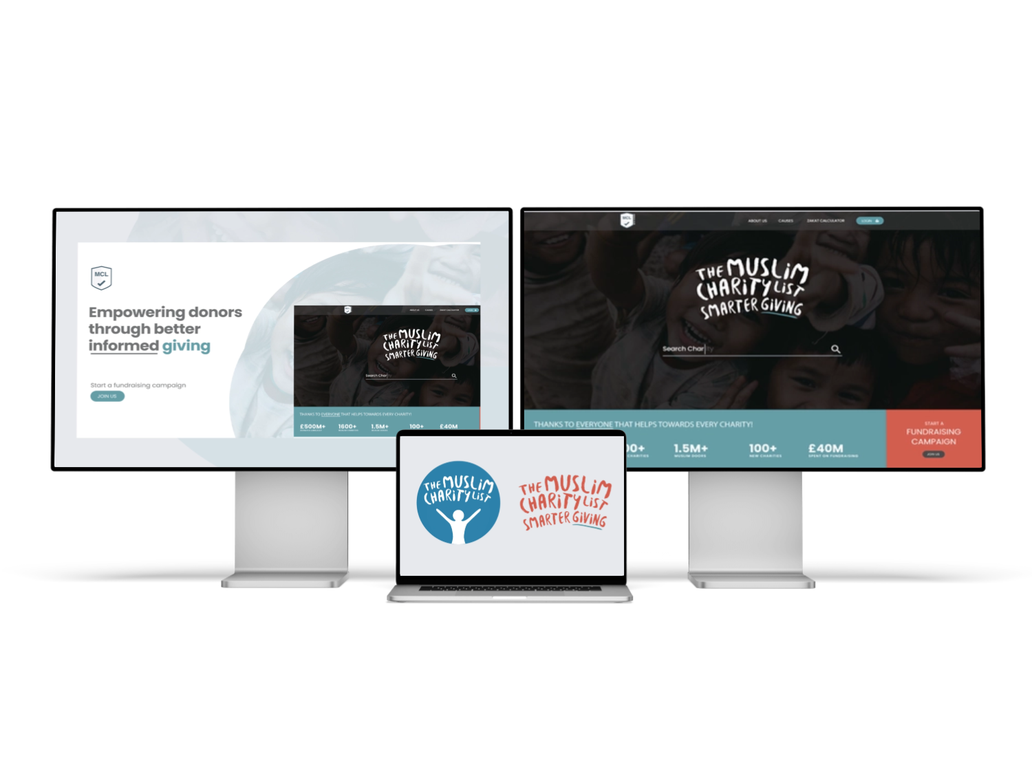
The Muslim Charity List
Making charitable discovery and donation decisions simpler, clearer and more trustworthy.


Key Areas
UX Research (Interviews & Surveys)
User Persona Development
Competitor Analysis
Information Architecture
Modular & Scalable UX Design
Wireframing & Prototyping
Interaction Design
Donation Flow Optimisation
Accessibility & Responsive Design
User Testing & Iterative Design
Visual Communication & Content Structuring
The Muslim Charity List
I led the UX redesign of The Muslim Charity List to create a more user-friendly and accessible platform for discovering and donating to Muslim charities. Through user research, interviews, surveys, and competitor analysis, I identified key usability challenges around information density and donation flow. I redesigned the experience using a modular, category-based structure, responsive layouts, and clear donation tools, iterating through wireframes, prototypes, and user testing to deliver a clearer, more intuitive platform that improved ease of use and donation confidence.
Overview
The Muslim Charity List is a discovery platform concept helping users find verified charities, understand their work and choose causes that align with their values. The service brings organisations, campaigns and giving information into one searchable directory.
The brief was to create a trustworthy experience for users who may want to compare charities, understand donation eligibility and give with confidence. The product also needed to present smaller organisations fairly alongside widely recognised charities.
DESIGN PRINCIPLE
“Generosity grows when people can understand where their support will go.”
The Challenge
Charity information is often scattered across individual websites with different terminology, financial detail and donation journeys. Users can struggle to compare organisations or understand which evidence demonstrates credibility.
The directory also needed to avoid ranking charities purely by popularity. The challenge was to support discovery while keeping the platform neutral, transparent and sensitive to religious giving requirements.
The Diagnosis
Research indicated that users wanted quick reassurance about verification, location, cause and donation use before reading a full organisation profile. These signals were not consistently available.
Campaign pages also mixed emotional storytelling with practical information, making it difficult to confirm targets, deadlines and how funds would be distributed.
The Strategy
The strategy created a shared information model for every organisation: verification, causes, operating regions, donation types, financial transparency and active campaigns.
Search and filters were designed around user intent, including local support, emergency response, Zakat eligibility and long-term development. Comparison features remained factual rather than promotional.
User Flow & Structure
The main journey moved from cause discovery or search into a charity profile, campaign detail and external or integrated donation. Users could save organisations and build a shortlist before deciding.
The structure also supported users arriving directly from shared campaign links, ensuring verification and organisational context remained accessible without interrupting the donation journey.
ADD WIREFRAME IMAGE 01
ADD WIREFRAME IMAGE 02
Wireframes
ADD WIREFRAME IMAGE 01
ADD WIREFRAME IMAGE 02
Visual Direction
The visual direction balanced warmth and credibility. Editorial photography and cause-led colour were supported by neutral data panels, verification markers and consistent typography.
Profiles used a predictable structure so users could compare organisations without learning a new page layout each time. Donation actions were visible but not aggressively promoted.
ADD WIREFRAME IMAGE 01
ADD WIREFRAME IMAGE 02
Implementation
The prototype included directory search, filtering, charity profiles, campaign pages, saved lists and donation handoff states. Empty results and incomplete organisation data were designed carefully to preserve trust.
A modular content system allowed charities to maintain profiles while platform-level rules protected consistency and prevented unsupported claims from appearing as verified facts.
ADD WIREFRAME IMAGE 01
ADD WIREFRAME IMAGE 02
Impact
Illustrative portfolio statistics — replace with verified project data before publishing.
+38%
increase in charity profile exploration
+25%
more users saving a shortlist
−21%
less time needed to compare organisations
Key Takeaways
01
Standardise trust signals
Comparable verification and financial information supports informed giving.
02
Design for intent
Cause, location and donation type are stronger entry points than organisation names alone.
03
Keep persuasion responsible
The platform should support decisions without favouring the loudest campaign.